Visualize data with matplotlib
In this tutorial, you will learn to visualize data by using the Matplotlib library. While learning, you will perform the following tasks:
Find out which US airport had the highest ratios of delayed and cancelled flights in 2003-2016.
See how that ratios changed over time.
Highlight some general trends.
Prerequisites
Before you start, make sure that:
You have installed DataSpell. This tutorial was created in DataSpell 2022.2.1.
You have Python 3.6 or newer on your computer. If you're using macOS or Linux, your computer already has Python installed. You can get Python from python.org.
Prepare an example
If you have completed the previous tutorial, just proceed to Transform data. Otherwise, download the data set and add it to the DataSpell workspace as described in the section Add data to the workspace.
In this tutorial, we will use the "Airline Delays from 2003-2016" dataset by Priank Ravichandar licensed under CC0 1.0. This dataset contains the information on flight delays and cancellations in the US airports for the period of 2003-2016.
You should have a notebook with the following cell:
You can also download the full notebook and add it to your DataSpell workspace: ds_visualize_tutorial.ipynb
Transform data
Our first goal is to find the airport with the highest ratios of delayed and cancelled flights. For that purpose we need only the following columns:
Airport.CodeStatistics.Flights.Total(total number of flights)Statistics.Flights.Delayed(number of delayed flights)Statistics.Flights.Cancelled(number of cancelled flights)
Let's select the required columns from the data DataFrame and put them into airport_data by adding the following code to the first cell:
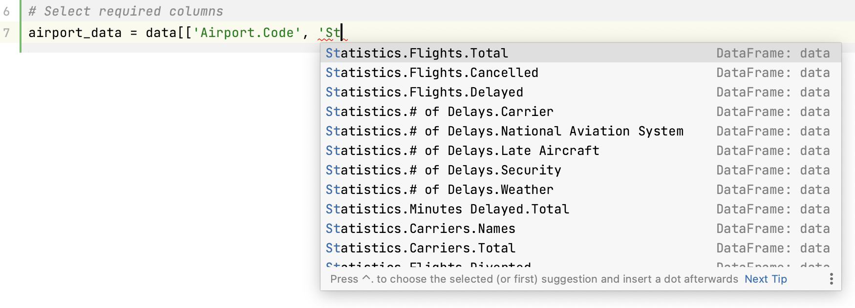
Note that DataSpell provides automatic completion for column headers:
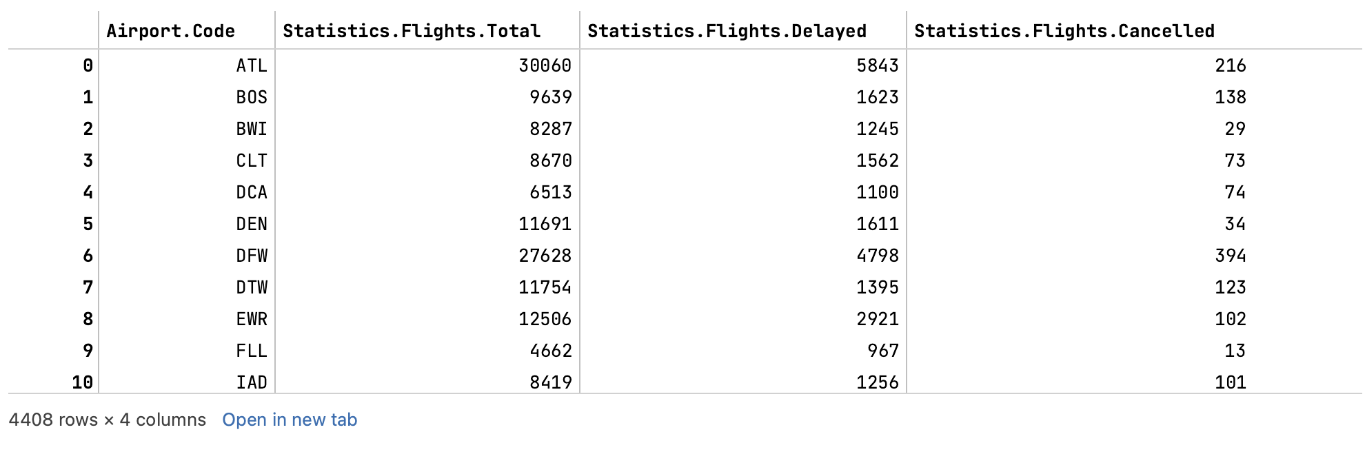
This is what you'll see in the output after you run the cell by pressing Ctrl+Enter or clicking :
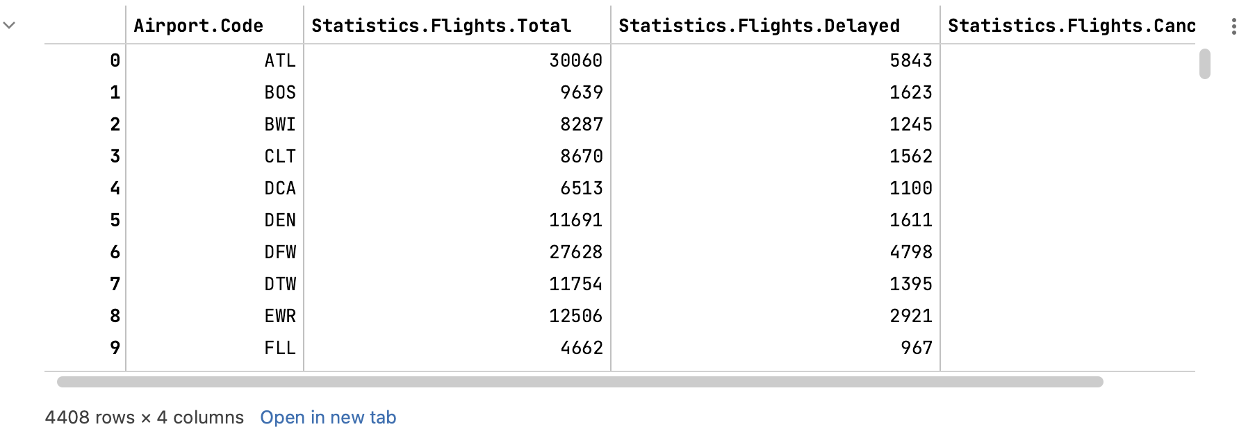
Scroll the rows down. You see that each row contains data for one month in one specific airport. We need statistics for the whole period, so let's group data by airport codes and summarize the values:
Here is the full code of the cell:
... and its output:
Before we continue, let's create another code cell. Click Add Code Cell Below in the cell toolbar:

We will compare the airports by the ratios of delayed and cancelled flights. Looks like we should add some data to the DataFrame. Let's create two new columns: Ratio Delayed.Total and Ratio.Cancelled Total. The data in those columns will result from calculations. The variables are introduced for code readability:
Run the cell to make sure that two columns have been added to the DataFrame:

Visualize data
Let's start with visualizing our newly created airport_data DataFrame in the form of a bar chart.
You need to add import matplotlib.pyplot as plt to the beginning of your first code cell. Don't forget to rerun that cell after editing, for example, by clicking or pressing Shift+Enter.
Create a bar chart
First of all, let's improve the readability of the future chart and sort the rows in
airport_databy using the sort_values method:airport_data = airport_data.sort_values(by='Ratio Delayed.Total', ascending=False)Now assign the variables:
airport_code = airport_data.index delayed = airport_data['Ratio Delayed.Total'] cancelled = airport_data['Ratio Cancelled.Total']Note that when we created the
airport_dataDataFrame, theAirport.Codecolumn became the index column. It means that airport codes are used as row addresses in this DataFrame, and you shouldn't specify the column name to read them.The following code creates a figure with the specific width and height in inches, as well as a Matplotlib Axes. They will contain all the elements of the future bar chart.
fig, ax = plt.subplots(figsize=(15,5))To plot a bar chart, use the bar() method. It accepts the x and y coordinates as the first two positional arguments. The label will be used to render the chart legend.
ax.bar(airport_code, delayed[airport_code], bottom=cancelled[airport_code], label='Delayed') ax.bar(airport_code, cancelled[airport_code], label='cancelled')When plotting the first bar chart, we use an additional
bottomparameter to stack the delays bars on top of the cancellations bars.Set the labels for axes, the chart title, and show the legend:
ax.set_xlabel('Airport codes') ax.set_ylabel('Ratio') ax.set_title('Ratio of delayed and cancelled flights to total flights') ax.legend()Finally, use
plt.show()to render the whole thing. This is the full code of the cell:# Sort DataFrame rows airport_data = airport_data.sort_values(by='Ratio Delayed.Total', ascending=False) # Assign variables airport_code = airport_data.index delayed = airport_data['Ratio Delayed.Total'] cancelled = airport_data['Ratio Cancelled.Total'] # Create a figure and set its size to 15x5 in. fig, ax = plt.subplots(figsize=(15,5)) # Plot bar charts ax.bar(airport_code, delayed[airport_code], bottom=cancelled[airport_code], label='Delayed') ax.bar(airport_code, cancelled[airport_code], label='cancelled') # Add axes labels and title ax.set_xlabel('Airport codes') ax.set_ylabel('Ratio') ax.set_title('Ratio of delayed and cancelled flights to total flights') # Show legend ax.legend() # Show plot plt.show()And here is the result:
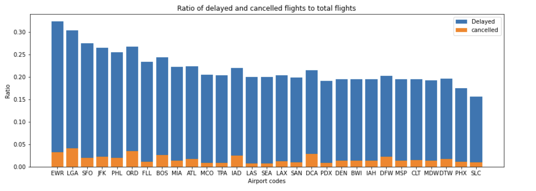
You can see that the highest ratio of delayed flights was in the Newark Liberty International airport (EWR). Let's continue researching the data for this particular airport. It would be interesting to find out how the number of cancelled and delayed flights changed over time.
Create a line chart
Let's start with selecting the necessary data from the dataset:
ewr_data = data[data['Airport.Code']=='EWR']This code can be translated as "select the rows from
datathat have EWR in theAirport.Codecolumn and put them into theewr_dataDataFrame".Assign the variables:
date = ewr_data['Time.Label'] delayed = ewr_data['Statistics.Flights.Delayed'] cancelled = ewr_data['Statistics.Flights.Cancelled']Again, create a figure and an Axes:
fig, ax = plt.subplots(figsize=(15,5))For line charts, use the plot() method:
ax.plot(date, delayed, label='Delays') ax.plot(date, cancelled, label='Cancellations')Add the axes labels, the title, and the legend:
ax.set_xlabel('Year/Month') ax.set_ylabel('Flights (delayed/cancelled)') ax.set_title('Cancellations and delays in EWR 2003-2016') ax.legend()Here is the full code cell for copy-pasting:
# Select rows with 'EWR' in the first column ewr_data = data[data['Airport.Code']=='EWR'] # Assign variables date = ewr_data['Time.Label'] delayed = ewr_data['Statistics.Flights.Delayed'] cancelled = ewr_data['Statistics.Flights.Cancelled'] # Create a figure and set its size to 15x5 in. fig, ax = plt.subplots(figsize=(15,5)) # Plot line charts ax.plot(date, delayed, label='Delays') ax.plot(date, cancelled, label='Cancellations') # Add axes labels ax.set_xlabel('Year/Month') ax.set_ylabel('Flights (delayed/cancelled)') # Add title and legend ax.set_title('Cancellations and delays in EWR 2003-2016') ax.legend() # Show plot plt.show()And the output:
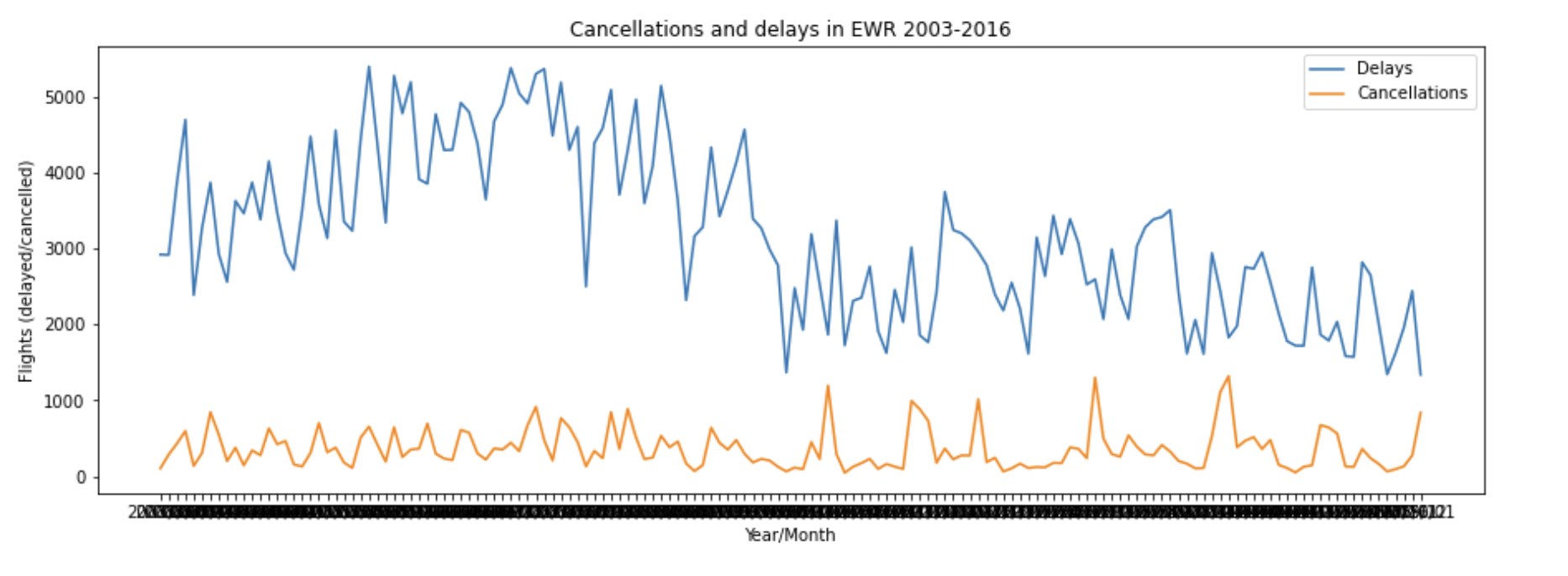
There are too many ticks on the x-axis. To show only every 12th of them, put the following line before
plt.show():ax.set_xticks(date[::12])It looks better now:
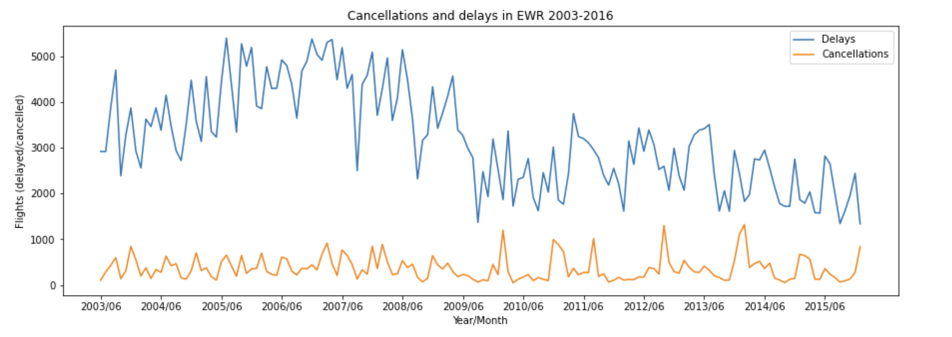
As you can see, the number of cancellations didn't change much over time. But there is a clearly visible fall in the number of delayed flights somewhere in the end of 2009. Did they hire a new manager? Or maybe that's somehow connected with the total number of flights? Let's check!
Show more data
We will add another line chart with the total number of flights. But that numbers are far greater than delays. The solution is to add another Axes that will share the same x-axis but have its own y-axis. That can be done by using the twinx() method:
total = ewr_data['Statistics.Flights.Total'] ax2=ax.twinx() ax2.plot(date, total, '--', color='g', label='Total flights') ax2.set_ylabel('Flights (total)') ax2.legend(loc='upper center')Note the third positional argument of the
plot()method. Dashes will result in a dashed line. The color is also customizable. We also specified the location of the legend, so that it doesn't interfere with another one.The full code:
# Select rows with 'EWR' in the first column ewr_data = data[data['Airport.Code']=='EWR'] # Assign variables date = ewr_data['Time.Label'] delayed = ewr_data['Statistics.Flights.Delayed'] cancelled = ewr_data['Statistics.Flights.Cancelled'] total = ewr_data['Statistics.Flights.Total'] # Create a figure and set its size to 15x5 in. fig, ax = plt.subplots(figsize=(15,5)) # Plot line charts ax.plot(date, delayed, label='Delays') ax.plot(date, cancelled, label='Cancellations') # Add axes labels ax.set_xlabel('Year/Month') ax.set_ylabel('Flights (delayed/cancelled)') # Add title and legend ax.set_title('Cancellations and delays in EWR 2003-2016') ax.legend() # Decrease the density of ticks on x-axis ax.set_xticks(date[::12]) # Plot another chart with extra y-axis ax2=ax.twinx() ax2.plot(date, total, '--', color='g', label='Total flights') ax2.set_ylabel('Flights (total)') # Add legend in center ax2.legend(loc='upper center') # Show plot plt.show()And the chart:
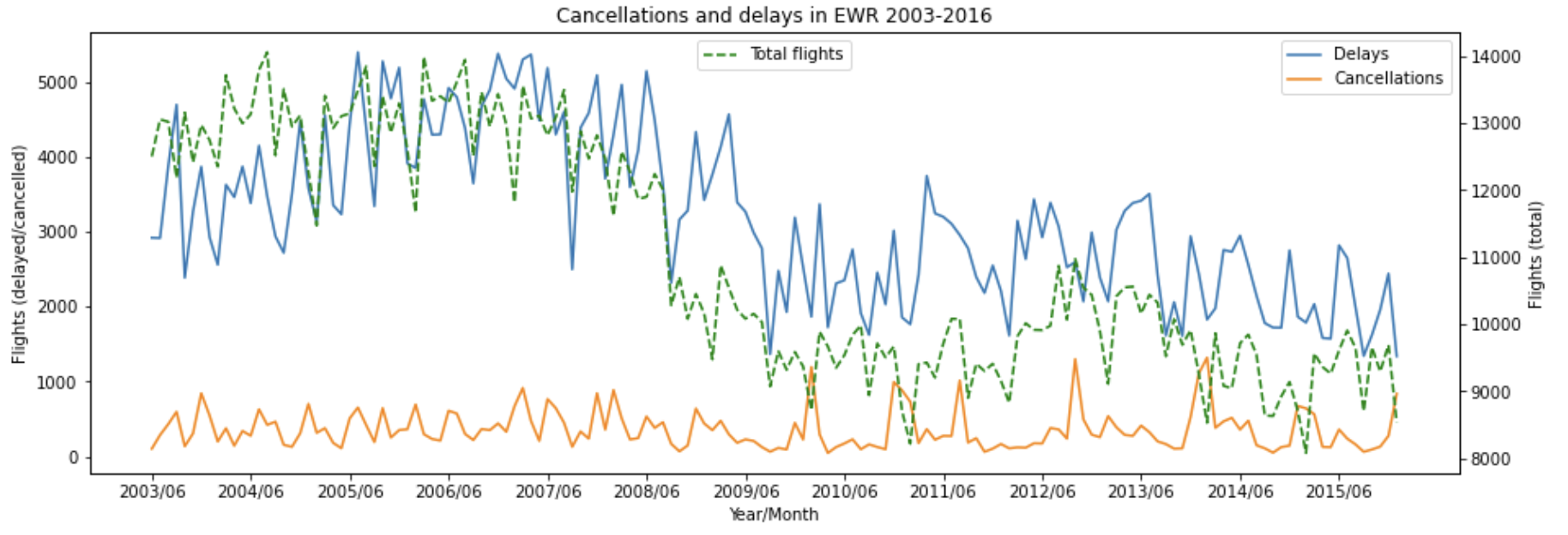
So, there is no magic. The overall number of flights decreased significantly in the middle of 2008, which naturally resulted in fewer delays.
Keep researching
What happened in 2008? Did the number of flights decrease only in EWR? Let's find out by analyzing the whole dataset.
Now we are interested only in dates and numbers. Let's just group the rows of the data DataFrame by the time label in YYYY/MM format, and then summarize the values. There will be invalid values in some columns (like Time.Month and Time.Year), but we won't use them. All the rest is similar to the previous tutorial steps:
And yes, there was a drop in total flights in all US airports:
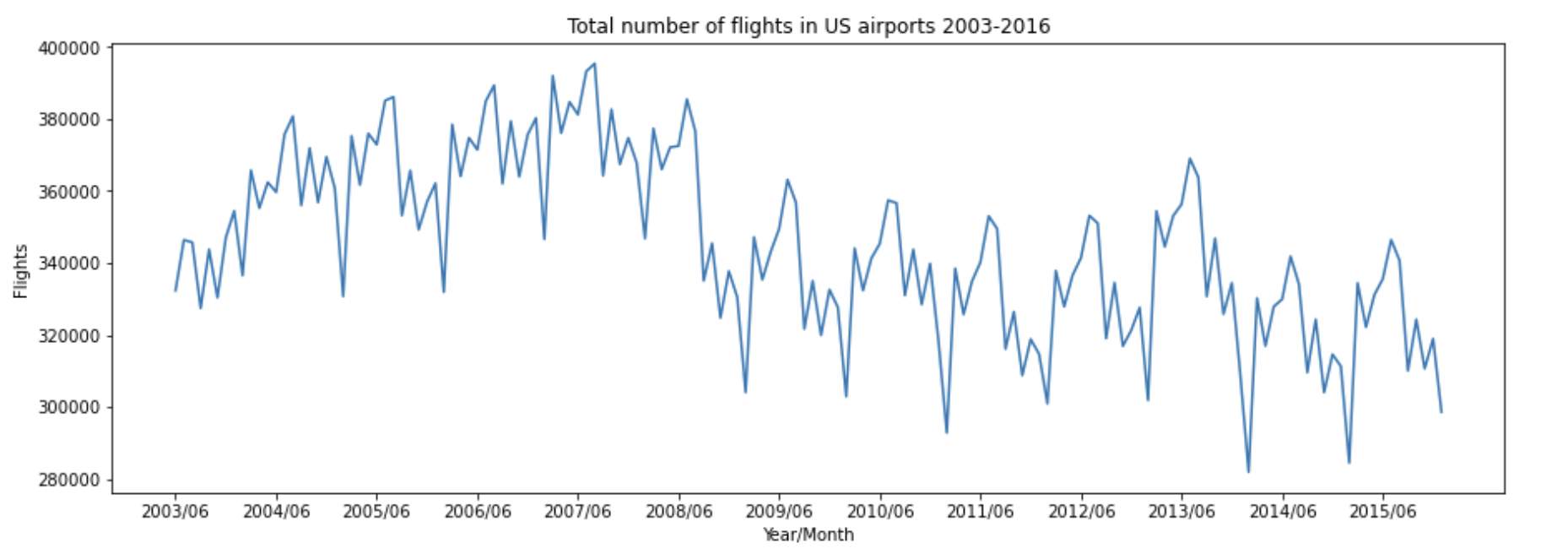
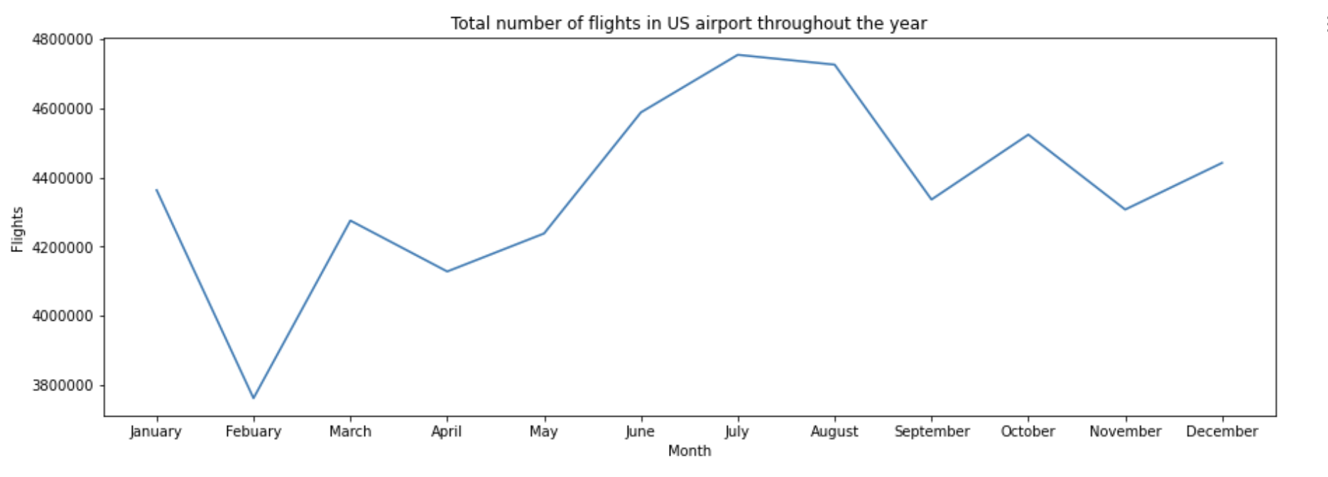
Speaking about drops, do you see that periodic negative peaks on the chart? Seems like they repeat every year. Let's build a chart to see how did the total number of flights change throughout the year.
This time we will group the data by month name. The sort_values(by='Time.Month') part is needed to range the months in chronological order:
Definitely, February is the low season for the US civil aviation:
Summary
You have completed the matplotlib visualization tutorial. Here's what you have done:
Selected necessary data and transformed it
Built bar charts and line charts
Discovered statistical trends