Editor
Once the structure for your language is defined, you will probably go and create the means to allow developers to conveniently build ASTs with it. Manipulating the ASTs directly would not be very intuitive nor productive. To hide the AST and offer the user comfortable and intuitive interaction is the role for language editors.
Editor Overview
An editor for a node serves as its view as well as its controller. An editor displays the node and lets the user modify, replace, delete it and so on. Nodes of different concepts have different editors. A language designer should create an editor for every concept in his/her language.
In MPS, an editor consists of cells, which themselves contain other cells, some text, or a UI component. Each editor has its concept for which it is specified. A concept may have no more than one editor declaration (or can have none). If a concept does not have an editor declaration, its instances will be edited with an editor for the concept's nearest ancestor that has an editor declaration.
To describe an editor for a certain concept (i.e. which cells have to appear in an editor for nodes of this concept), a language designer will use a dedicated language simply called editor language. You see, MPS applies the Language Oriented Programming principles to itself.
The description of an editor consists of descriptions for cells it holds. We call such descriptions "cell models." For instance, if you want your editor to consist of a unique cell with unmodifiable text, you create in your editor description a constant cell model and specify that text. If you want your editor to consist of several cells, you create a collection cell model and then, inside it, you specify cell models for its elements. And so on.
Fallback to reflective editor in case of problems
When the editor definition fails to initialize due to an exception at run-time, the default reflective editor is shown for the corresponding cell. A descriptive error is displayed in the Messages tool window allowing the user to get a complete stacktrace as well as to navigate to a the problem cell. 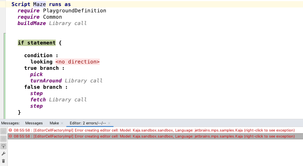
Type over existing text
Type over existing text further blurs the distinction between textual and projectional editors. When typing into a textual cell and the character you just typed is already present at cursor position then the cursor will move right as if you just overwrote the existing character on screen. This feature is only triggered if the keystroke cannot be gracefully processed and would otherwise be ignored (e.g. in constant cells) or make the cell content invalid. The feature if ON by default and can turned OFF in Settings / Editor / General tab.
Types Of Cell Models
Constant cell | |
|---|---|
Collection cell | A cell which contains other cells. Can be horizontal Collection cells can also specify a Context assistant, which will provide intuitive visual actions to the user. Check out the Context assistant documentation for details. |
Property cell | |
Child cell | |
Referent cell | |
Child list cell | |
Indent cell | |
UI component cell | |
Model access | |
Next applicable editor | A more specific editor may reuse a less specific editor of the same concept through the new next applicable editor editor cell. The next applicable editor cell is used as a place holder, which will re-apply the logic for finding the less specific editor and insert the found editor in its place. For example, an editor specific to a particular context hint may provide some visual ceremony around a next applicable editor cell. By removing the context hint on the next applicable editor cell, MPS will reevaluate the editor-discovery logic and supply the found editor into the next applicable editor cell. |
Tooltip | Allows a helpful message to be displayed in a little tooltip popup window when the user hovers mouse over a part of the editor. The jetbrains.mps.lang.editor.tooltips language must be imported into the editor model. The language was adopted into MPS from the mbeddr project. The jetbrains.mps.lang.editor.tooltips language provides an editor hint that upon pressing the Control key highlights cells with a tooltip. |
Custom cell | |
Editor Components and editor component cells
Sometimes two or more editor declarations for different concepts have a common part, which is duplicated in each of those editors. To avoid redundancy, there's a mechanism called editor components. You specify a concept for which an editor component is created and create a cell model, just as in concept editor declaration. When written, the component could then be used in editor declarations for any of the specified concept's descendants. To use an editor component inside your editor declarations, one will create a specific cell model: editor component cell model, and set your editor component declaration as the target of this cell model's reference.
Cell layouts
Each collection cell has property "cell layout", which describes how child nodes will be placed. There is several layouts:
indent layout - places cells like text.
horizontal layout - places cells horizontally in row.
vertical layout - places cells vertically.
The indent layout cell offers several properties to customize the layout, some are applicable to the layout cell itself, some to the cells inside the layout cell:
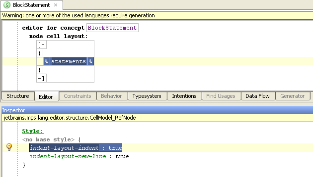
indent-layout-indent - this cell will have an indent prepended, if displayed as first on a line
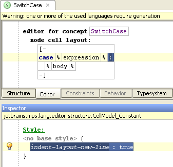
indent-layout-new-line - this cell will be the last on a line
indent-layout-on-new-line - this cell will be first on the next line
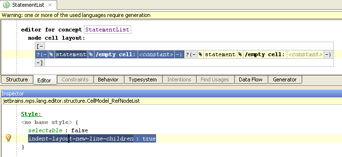
indent-layout-new-line-children - all children cells of this collection cell will be displayed on separate lines
indent-layout-wrap-anchor - when the children cells of this collection cell exceed the width of the screen, they will be wrapped to vertically align with this collection
indent-layout-indent-anchor - all subsequent indents will be calculated relative to the indentation of the current collection cell
indent-layout-no-wrap - The cell must never be wrapped so that it ends up first on a new line
Styles
Styling the editor cells gives language designers a very powerful way to improve readability of the code. Having keywords, constants, calls, definitions, expressions, comments and other language elements displayed each in different colors or fonts helps developers grasp the syntax more easily. You can also use styling to mask areas of the editor as read-only, so that developers cannot edit them.
Each cell model has some appearance settings that determine the cell's presentation. They are, for instance, font color, font style, whether a cell is selectable, and some others. Those settings are combined into an entity called stylesheet. A stylesheet could be either inline, i.e. be described together with a particular cell model, or it could be declared separately and used in many cell models. Both inline stylesheet and style reference are specified for each cell in its Inspector View.
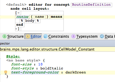
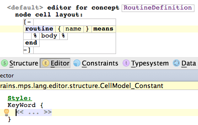
The settings do not have to be specified by a single value. A query option is also available for all settings, in which case a concept function needs to be implemented by the developer, which returns the desired value:
It is a good practice to declare a few stylesheets for different purposes. Another good practice is to have a style guideline in mind when developing an editor for your language, as well as when developing extensions for your language. For example, in BaseLanguage there are styles for keywords (applied to those constant cells in the BaseLanguage editor, which correspond to keywords in Java), static fields (applied to static field declarations and static field references), instance fields, numeric literals, string literals, and so forth. When developing an extension to BaseLanguage, you should apply keyword style to new keywords, field style to new types of fields, and so forth.
A stylesheet is quite similar to CSS stylesheets; it consists of a list of style classes, in which the values for some style properties are specified. MPS additionally provides a mechanism for extending styles as well as for property value overriding.
Style properties
Boolean style properties
selectable - whether the cell can be selected. True by default.
read-only - whether one can modify the cell and the nested cells or not. False by default. Designed for freezing fragments of cell tree.
editable - whether one can modify text in a cell or not. By default is false for constant cell models, true for other cell models.
draw-border - whether border will be drawn around a cell
draw-brackets - whether brackets will be drawn around a cell
first-position-allowed / last-position-allowed - for text-containing cells, specifies whether it is allowed that a caret is on the first/last position (i.e. before/after the whole text of a cell)
You can either choose a property value from a completion menu or specify a query i.e. a function which returns a boolean value.

Padding properties.
padding-left/right/top/bottom - a floating point number, which specifies the padding of a text cell, i.e. how much space will be between cell's text and cell's left and right sides, respectively.
Punctuation properties.
All cells in a collection are separated with one space by default. Sometimes we need cells placed together.
punctuation-left - if this property is true, space from left side of the cell is deleted and first position in cell becomes not allowed.
punctuation-right - if this property is true, space from right side of the cell is deleted and last position in cell becomes not allowed.
horizontal-gap - specifies gap size between cells in collection. Default value is 1 space.
For example in code
we don't want spaces between "(" and "1", and between "1" and ")". So we should add property punctuation-right to the cell "(", and property
punctuation-left to the cell ")".
Color style properties
Text foreground color - cell text's color (affect text cells only)
Text background color - cell text's background color (affects text cells only)
Background color - the background color of a cell. Affects any cell. If a text cell has non-zero padding and some text background color, the cell's background color will be the color of its margins.
You can either choose a color from the completion menu or specify a query i.e. a function which returns a color.
Indent layout properties
indent-layout-indent - all lines will be placed with indent. This property can be used for indent in code block.
indent-layout-new-line - after this cell there will be a new line marker.
indent-layout-on-new-line - this cell will be placed on a new line
indent-layout-new-line-children - all children of collection will be placed on new line
indent-layout-no-wrap - the line won't be wrapped before this cell
Other style properties
- font family
- font size
font style - can be either plain, bold, italic, or bold italic.
- layout constraint -
- For flow layout
none - default behavior
punctation - means that previous item in flow layout should always be placed on the same line as the item, which this constraint is assigned to.
noflow - excludes a cell from flow layout. Current line is finished and item is placed below it. After this item a new line is started and normal flow layout is applied. This style can be used to embed a picture inside of text.
- For flow layout
underlined - Can be either underlined, not underlined, or as is ('as is' means it depends on properties of the enclosing cell collection).
Style properties propagation
While some style properties affect only the cell to which they are applied, values of other properties are pushed down the cell subtree (nested cells) and applied to them until some of the child cells specifies its own value for the property. Such inheritable properties that are pushed down the cell hierarchy include text-foreground-color, text-background-color, background-color, font-style, font-size and many others.
Custom styles
Language designers can define their own style attributes in Style Sheets and then use them in the editor. This increases the flexibility of the language editor definition. The attributes may hold values of different types and can optionally provide default values.
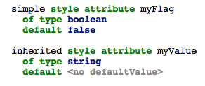
There are two types of custom style attributes:
simple - applied to a single editor cell only
inherited - applied to a cell and all its descendant cells recursively
In order to use the style attribute in an editor definition, your language has to import the language defining the attribute and the editor aspect has to list the defining language among the used languages.
To refer to the custom attribute from within BaseLanguage code, you need to import jetbrains.mps.lang.editor to get access to the StyleAttributeReferenceExpression concept.
Style inheritance
To be truly usable, style classes need an extension mechanism in order to describe that a particular style class inherits values of all style properties, which are not overridden explicitly. We can use a special style property apply to copy values of all properties specified in the parent style class into our style class. Using the apply property is semantically equivalent to copy-pasting all of the properties from the parent style class. An apply-if variant is also available to apply a style property value conditionally. Unlike traditional style-extension, the apply mechanism allows multiple classes to be inherited from.
The unapply property allows style classes to cease the effect of selected inherited properties. For example, a style class for commented-out code will push down styles that make code elements look all gray. Yet, links may need to be rendered in their usual colors so that the user can spot them and potentially click on them.
Potential conflicts between properties specified in parent styles and/or the ones defined explicitly in the inheriting cell are resolved on the order basis.The last specified value overrides all previous values of the same style property.
For example, the ConsoleRoot concept provides a read-only editor with only a single point (the commandHolder cell), where edits are allowed. First the readOnly style class is set on the editor:
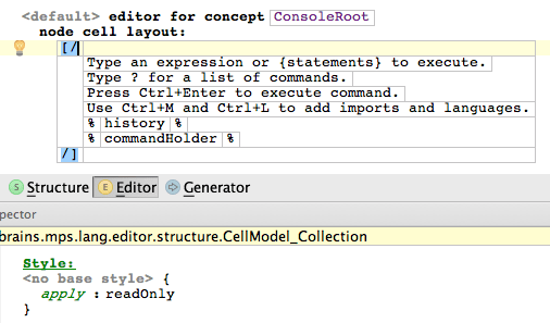
and then the readOnly style class is unapplied for the commandHolder cell:
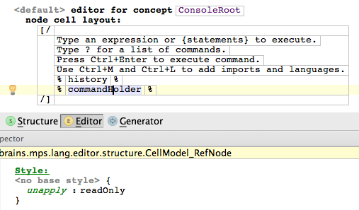
The readOnly style class is defined as follows:

Style priorities
A style class can be declared to take precedence over some other style class or multiple classes.
If a style class does not dominate over anything, it is a low-level style class.
If a style class declares to dominate, but does not specifies a style class that it dominates over (no style class is specifies but words dominate over present), the style class is considered dominating over all low-level style classes.
The domination relation is transitive, cycles are not allowed.
The domination relation makes sense only for styles with inheritable attributes. When one value of some style property is pushed down from parent and another value for the same property is specified in the style class applied to the current cell, the resulting behavior depends on the relationship between the two style classes:
If both style classes are low-level, the value pushed from parent will be ignored and replaced with value from style class of current cell.
If one of style classes dominates over the other, both values are kept and pushed down, but values from the style class, which dominates, hides the values from the other style class.
If, however, in some child cell the style class that dominates is unapplied (with special style property unapply), values from the other style class will become resulting values for this property.
For example, a comment containing the word TODO should be styled more prominently then a plain comment. Thus the language concept representing a comment needs to apply a TODO-aware style (TODO_Style), which declares its dominance over a plain Comment_Style. The actual styling properties are, however, only applied if the comment really contains the TODO text (isToDo()), otherwise the plain Comment_Style properties are used.

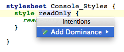
Use the "Add Dominance" intention to append the dominates over clause to a style:
Cell actions
Every cell model may have some actions associated with it. Such actions are meant to improve usability of editing. You can specify them in an inspector of any cell model.
Key maps
You may specify a reference to a key map for your cell model. A key map is a root concept - a set of key map items each consisting of a keystroke and an action to perform. A cell generated from a cell model with a reference to a certain key map will execute appropriate actions on keystrokes.
In a key map you must specify a concept for which a key map is applicable. For instance, if you want to do some actions with an expression, you must specify Expression as an applicable concept; then you may specify such a key map only for those cell models which are contained inside editor declarations for descendants of Expression, otherwise it is a type error.
If a key map property "everyModel" is "true," then this key map behaves as if it is specified for every cell in the editor. It is useful when you have many descendants of a certain concept which have many different editors, and your key map is applicable to their ancestor. You need not specify such a key map in every editor if you mark it as an "every model" key map.
A key map item consists of the following features:
A function which is executed when a key map item is triggered (returns nothing)
A set of keystrokes which trigger this key map item
A boolean function which determines if a key map item is applicable here (if not specified, then it's always applicable). If a key map item is not applicable the moment it is triggered, then it will not perform an action.
You may specify caret policy for a key map item. Caret policy says where in a cell a caret should be located to make this key map item enabled. Caret policy may be either first position, last position, intermediate position, or any position. By default, caret policy is "any position." If a caret in a cell does not match the caret policy of a key map item the moment it is triggered, then this key map item will not perform an action.
Action maps
A cell model may contain a reference to an action map. An action map overrides some default cell actions for a certain concept. An action map consists of several action map items. In an action map, you must specify a concept for which the action map is applicable.
An action map item contains:
an action description which is a string,
and a function which performs an action (returns nothing).
An action map item may override one of the default actions (see Actions). For instance, when you have a return statement without any action maps in its editor, and you press Delete on a cell with the keyword "return," the whole statement is deleted. But you may specify an action map containing a delete action map item, which instead of just deleting return statement replaces it with an expression statement containing the same expression as the deleted return statement.
action DELETE description: <no description> execute: (node, editorContext)->void { node < ExpressionStatement > expressionStatement = node. replace with new ( ExpressionStatement ); expressionStatement. expression. set ( node. expression ); }The SELECT_ALL action, which selects the whole contents of the editor and is triggered by Ctrl+A, can also be customised through action maps. The jetbrains.mps.nodeEditor.selection.SelectUpUtil class with executeWhile method can be leveraged to specify an upper selection boundary for this action.
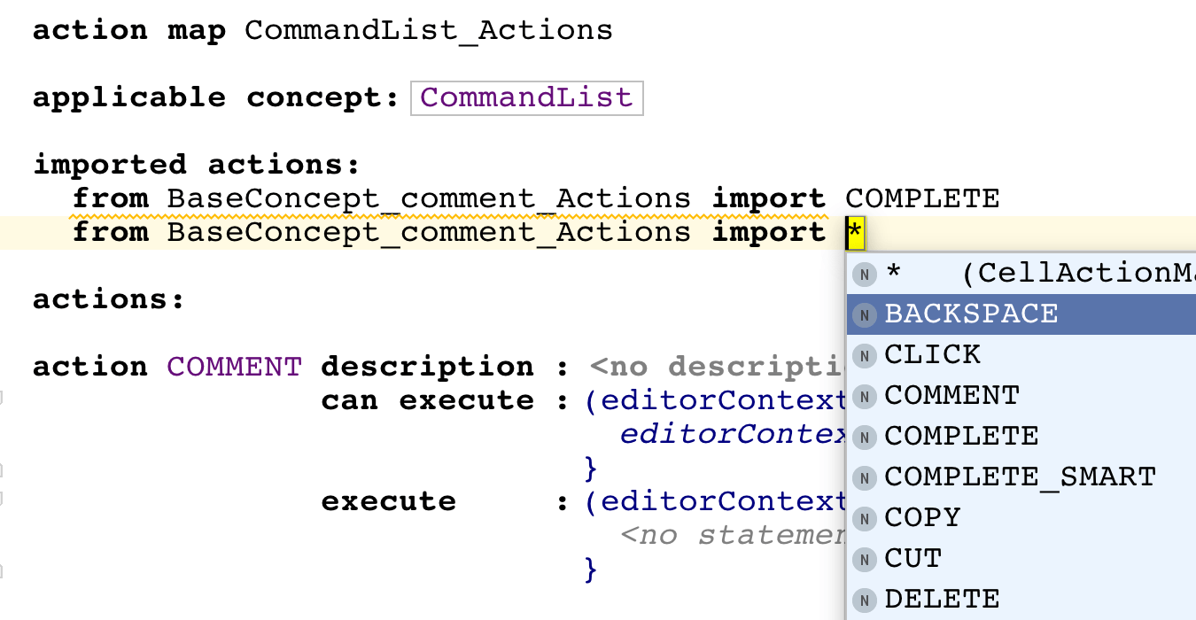
Action map items from an existing action map can be reused in a new action map via imports. The users have two options:
to import all items from an action map
to import only the item with a given action ID
Importing actions follows the following rules:
Imports work transitively.
Actions defined in the current cell action map have priority over actions defined in any of the imported cell action maps.
If multiple imported maps define an action of the same type, the most recently imported one takes precedence.
Cyclic imports are not allowed.
The applicable concept of any imported cell action map has to be the same concept or a super-concept of the applicable concept of this map.
Action map imports work cross-language: an action map in the editor aspect of one language can import an action map from the editor aspect of another language.
The DELETE and BACKSPACE action handlers have specific semantics. If an action map defines or imports a DELETE handler and does not define or import a BACKSPACE handler, a default BACKSPACE handler identical to the one for DELETE is registered automatically.
The resolution of imported action handlers is dynamic (happens at run-time. When action map A imports items from action map B, the exact action handlers that will be registered are not resolved at generation time of action map A. Instead, code is generated that will register handlers provided by action map B at runtime. As a result, action map A does not have to be regenerated when action map B changes.
Cell menus
One may specify a custom completion menu for a certain cell. Open an inspector for your cell declaration, find a table named Common, find a row named menu, create a new cell menu descriptor. Cell menu descriptor consists of menu parts, which are of differend kinds, which are discussed below.
Property values menu part
This menu part is available on property cells, it specifies a list of property values for your property which will be shown in completion. One should write a function which returns a value of type list<String>.
Property postfix hints menu part
This menu part is available on property cells, it specifies a list of strings which serve as "good" postfixes for your property value. In such a menu part one should write a function which returns a value of type list<String>. Such a menu is useful if you want MPS to "guess" a good value for a property. For instance, one may decide that it will be a good variable name which is a variable type name but with the first letter being lowercased, or which ends with its type name: for a variable of type "Foo" good names will be "foo", "aFoo", "firstFoo", "goodFoo", etc. So one should write in a variable declaration's editor in a menu for property cell for variable name such a menu part:
property postfix hints postfixes: (scope, operationContext, node)->list<String> { list < String > result; node < Type > nodeType = node. type; if ( nodeType != null ) { result = MyUtil.splitByCamels( nodeType. getPresentation() ); } else { result = new list < String > { empty }; } return result; }where splitByCamels() will be a function which returns a list of postfixes of a string starting with capitals (for instance MyFooBar -> MyFooBar, FooBar, Bar).
Primary replace child menu
It's a cell menu part which returns primary actions for child (those by default, as if no cell menu exists).
Primary choose referent menu
It's a cell menu part which returns primary actions for referent (those by default, as if no cell menu exists).
Replace node menu (custom node's concept)
This kind of cell menu parts allows to replace an edited node (i.e. node on which a completion menu is called) with instances of a certain specified concept and its subconcepts. Such a cell menu part is useful, for example, when you want a particular cell of your node's editor to be responsible for replacement of a whole node. For instance, consider an editor for binary operations. There's a common editor for all binary operations which consists of a cell for left operand, a cell for operation sign which is a cell for concept property "alias" and a cell for right operand.
[> % leftExpression % ^{{ alias }} % rightExpression % <]It is natural to create a cell menu for a cell with operation sign, which will allow to replace an operation sign with another one, (by replacing a whole node of course). For such a purpose one will write in the cell for operation sign a replace node menu part:
replace node (custom node concept) replace with: BinaryOperationThe former left child and right child are added to newly created BinaryOperation according to Node Factories for BinaryOperation concept.
Replace child menu (custom child's concept)
Such a cell menu part is applicable to a cell for a certain child and specifies a specific concept which and subconcepts of which will be shown in completion menu (and instantiated when chosen and the instance will be set as a child). To specify that concept one should write a function which returns a value of a type node<ConceptDeclaration>.
Replace child menu (custom action).
This kind of cell menu parts is applicable to a cell for a certain child and allows one to customize not only child concept, but the whole replace child action: matching text (text which will be shown in completion menu), description text (a description of an action, shown in the right part of completion menu), and the function which creates a child node when the action is selected from completion menu. Hence, to write such a menu one should specify matching text, description text and write a function returning a node (this node should be an instance of a target concept specified in a respective child link).
Generic menu item
This kind of cell menu part allows one to make MPS perform an arbitrary action when a respective menu item will be selected in a completion menu. One should specify matching text for a menu item and write a function which does what one wants. For instance, one may not want to show a child list cell for class fields if no class fields exist. Hence one can't use its default actions to create a new field. Instead, one can create somewhere in a class' editor a generic menu item with matching text "create field" which creates a new field for a class.
generic item matching text: add field handler: (node, model, scope, operationContext)->void { node. field. add new ( <default> ); }Action groups
An action group is a cell menu part which returns a group of custom actions. At runtime, during the menu construction, several objects of a certain type, which are called parameter objects, are collected or created. For that parameter object type of an action group functions, which return their matching text and description text, are specified. A function which is triggered when a menu item with a parameter object is chosen is specified also.
Thus, an action group description consists of:
a parameter object type;
a function which returns a list of parameter objects of a specified type (takes an edited node, scope and operation context);
a function which takes a parameter object of a specified type and returns matching text (a text which will be shown in a completion menu);
a function which takes a parameter object of a specified type and returns description text for a parameter object;
a function which performs an action when parameter object is chosen in a completion menu.
A function which performs an action may be of different kinds, so there are three different kinds of cell action group menu parts:
Generic action group. Its action function, given a parameter object, performs an arbitrary action. Besides the parameter object, the function is provided with edited node, its model, scope and operation context.
Replace child group. It is applicable to child cells and its action function, given a parameter object, returns a new child, which must have a type specified in a respective child link declaration. Besides the parameter object, the function is provided with edited node, its model, current child(i.e. a child being replaced), scope and operation context.
Replace node group. Its action function, given a parameter object, returns a node. Usually it is some referent of an edited node (i.e. node on which a completion menu is called). Besides the parameter object, the function is provided with edited node, its model, scope and operation context.
Cell menu components
When some menu parts in different cells are equal one may want to extract them into a separate and unique entity, to avoid duplications. For such a purpose cell menu components are meant. A cell menu component consists of a cell menu descriptor (a container for cell menu parts) and a specification of an applicable feature. A specification of applicable feature contains a reference to a feature (i.e. child link declaration, reference link declaration or property declaration), to which a menu is applicable. For instance if your menu component will be used to replace some child its child link declaration should be specified here; etc.
When a cell menu component is created, it can be used in cell menus via cell menu component menu part, which is a cell menu part which contains a reference to a certain menu component.SModel language
Customizing reference presentation
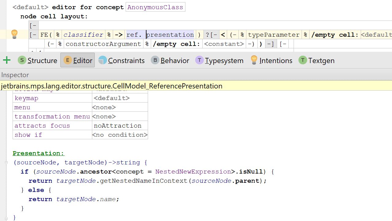
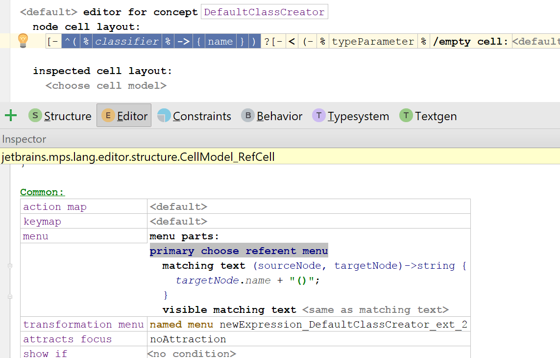
Specification of the matching text and in-editor textual presentation for references can be done directly in the editor aspect.
The ref. presentation cell can have the displayed text customized:
The cell menu can customise the text displayed in the completion menu:
This functionality was previously achieved through Constraints.
Migration of presentation query in reference constraints
The design of the reference presentation part in the constraints aspect has been showing its its age and so has been replaced with the new functionality described above.Most of the code will be migrated automatically. Some code that produced with migration can be simplified so consider to review it.
There is a case when a presentation query can not be migrated: suppose you have an editor for a concept with reference link and then have a reference constraint with defined presentation part for its reference in one of its subconcepts. If editor component doesn't overriden in subconcept, MPS doesn't know where this presentation part should be inlined. In this case, you should manually migrate the presentation part usage to prevent uncorrected reference presentation in user code. There are several alternatives to do it:
Simply override the editor in subconcept. Move the code from presentation part to the proper reference cell.
Extract the reference cell into a separate component and override the component for subconcept.
Create new behavior method that provides a presentation for the reference. Make reference cell delegates to created method. Override this method in subconcept.
If you are expecting that your language may be extended in another project by someone else, do not remove deprecated presentation parts. Otherwise, extending languages may be migrated improperly.
Two-step deletion
In projectional editor it is sometimes hard to predict what part of the code will be deleted when you press Delete or Backspace. For example, when the caret is on the semicolon of the baseLanguage statement and you press Backspace, the whole statement will be deleted. With two step deletion, you now can see what part of the code which will be deleted.
Here how it works: you press Delete or Backspace and the part of the code, which is to be deleted, becomes highlighted. If it suits you, you press Delete or Backspace again and the code will be deleted. If after highlighting you realize that you don't want to delete this piece of code you can press Escape or just move the caret and the highlighting will disappear.
Let's see the example:
Put the caret to the statement semicolon.

Press Backspace. The whole statement is highlighted. This means that if you press Backspace again, the statement will be deleted.

Press Backspace again. The statement is deleted.

The same works by default for other nodes.
To turn on the two step deletion, check the "two step deletion" checkbox in Preferences > Editor > General.
Invoking two-step deletion from code
The language designer may include the two step deletion scenario in her custom delete actions. The ApproveDelete_Operation in jetbrains.mps.lang.editor is introduced for that purpose. This operation is applied to the node:

This operation returns true iff it succeed and the node has not been approved for deletion before. More formally all the following conditions need to be met:
1) The two-step deletion preferences option is checked.
2) The node has not been fully selected.
3) The node has not been approved for deletion already.
When all of these conditions are met, the node approved for deletion gets highlighted and the custom delete action may stop at this point.
If the same custom delete action is called immediately after approving the deletion, the approveDelete operation will return false (because the node has been approved already) and the action will proceed with the deletion.
Let's see the typical scenario from the baseLanguage:

This is the part of the delete action for the Dot_Expression's operation. This action first tries to approve the operation for the deletion and if it succeeds the action stops. If ir does not succeed, that means that either node's operation has already been approved (= highlighted), or the node has been selected by the user or the "two step deletion" preferences option is turned off. In this case, we delete the operation and replace it with the node of the abstract concept.
More complex cases
Sometimes the customized delete action needs to be more complicated than just deleting the current node.
Let's see an example scenario: we press delete on the "final" keyword on the IncompleteMemberDeclaration. There is a custom action, which sets the final property to false. In the editor, there is the cell, which is shown only if the final property of the node is true, so after the action, the cell wouldn't be shown.
If we want to highlight the final keyword before hiding it (by setting the final property to false), we approve it for the deletion this way:

Custom style and priority of completion items (EXPERIMENTAL)

The language designers can set the style and the priority for the items in a completion menu. In order to do so the language designer should create the Completion Styling root in the editor aspect of the language. In order to specify the style of a completion menu item the language designer should first specify the item.
We currently provide two possible selectors of the completion items:
Items which modify instances of a specific concept.This selector selects items which appear in the completion menu when the user puts the caret on the node of the concept (or it's properties, references, or children) and presses Control + Space
Items which create instances of a specific concept. Those are mainly the substitute actions. For example, when user selects the ReturnStatement which is in the StatementListand presses Control + Space, the items in the completion menu are creating the instances of Statement and replace the ReturnStatement with those instances. So the selector for actions creating instances of Statement will select those items.
It is important that one item could be selected by several selectors. For example, in the situation above several selectors will match one completion item:
for actions creating the instances of Statement (because the item will replace the current node with another Statement)
for actions modifying instances of Statement (because the current node is ReturnStatement which is also Statement)
for actions modifying instances of StatementList:statement (because the menu item will paste a new node into the statement role of parent StatementList)
So you should prefer the most specific selector possible. For example, a selector or an actions modifying instances of BaseConcept is the least specific selector and will affect all completion menu items

Once the selector matches a menu item, the language designer could customize it's style. The style object serves this purpose.
Currently it is possible to:
make the item's font bold
make the item's font italic
strike out the item's text (useful for deprecating the concepts)
set the item's background and text color
hide an item
set the item's priority
Note that all the styles accumulate:
If at least one styler sets any of the bold/italic/hide styles, the item will be bold/italic/hidden.
If the background or the text colors conflict, the first one specified will be used.
The priorities are used to sort the items. The biggest value set as a priority for an item by the stylers is used.
Items are first sorted by priorities and then by the level of matching the user's text. Currently there is no way to override this level.
There are several parameters the language designer can use. They are stored in the item.
Information parameters:
matchingText - the text appearing on the left side of the item. This text is used to filter the items when the user types the text in the completion menu.
descriptionText - the text appearing on the right side of the item.
parameterObject - some of the items can be parameterized with an object. For example, items which change the node's reference are parameterized with the target of the reference which they will set when executed.
outputConcept - some actions, like substitute actions create new nodes, the output concept is the concept of the new node.
A few notable examples of stylers in baseLanguage:
ReturnStatementStyling which makes a return item bold and sets its priority to non-zero, if it is last in the current statement list.

VariableReferencePriority which sets the items priority to non-zero if the item references a variable declaration.

IMPORTANT NOTE:
This feature is experimental and its design could be changed a lot in the future. The feedback regarding this feature will be very appreciated and will help us improve it. There is a possibility to turn this functionality off: Settings->Editor->General->Use completion styling


