Work with outputs
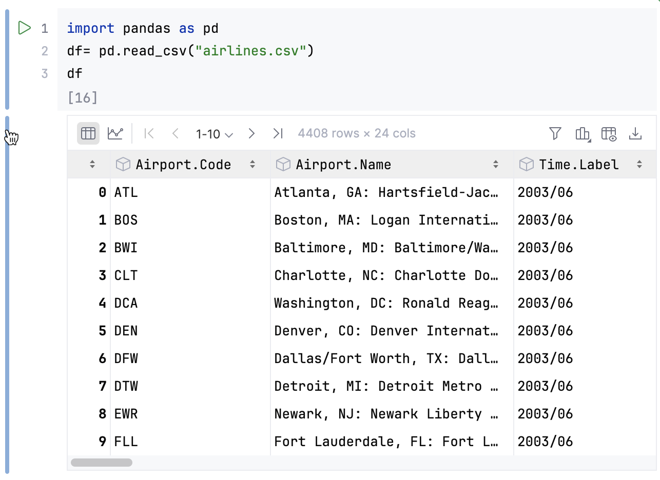
When you execute a code cell, its output is shown below. You can save the results or clear the output.
You can manage the length of the notebook by expanding and collapsing cell outputs.
Click the cell handle in the gutter next to the cell output.

Right-click the output cell.
Disable the Scrolling for Outputs option. The entire output will be displayed without limiting the number of lines.
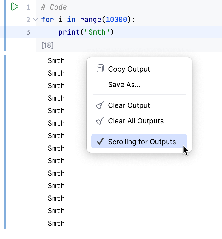
Right-click the output and select Save As from the context menu.
If you are using a dark UI theme, the colors in charts are adapted for better readability by default. To change this behavior, perform the following steps:
Press to open settings and then select Languages & Frameworks | Jupyter.
Disable the Invert image outputs for dark themes checkbox.
Restart the editor to apply the changes.
Move the mouse pointer to the bottom of the cell so that the pointer becomes a double arrow.
Click and drag the cell border up or down to reach the required size.
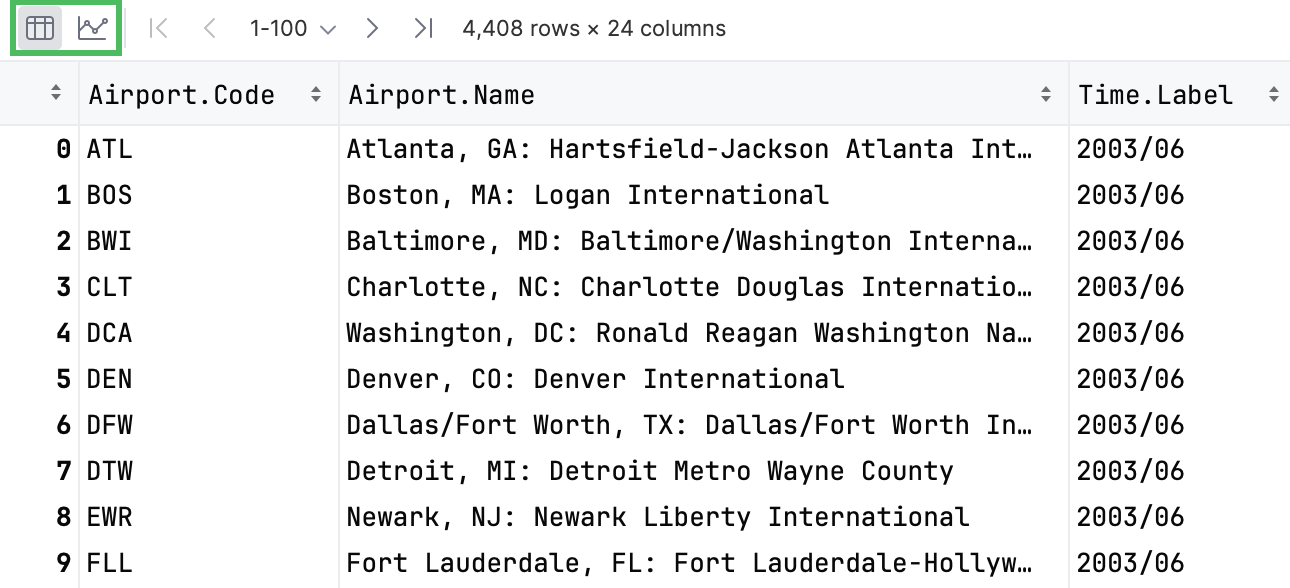
Dataframes and series can be displayed in tabular or graphical form. By default, tables are shown. To toggle the view mode, use the corresponding icons in the upper left corner.
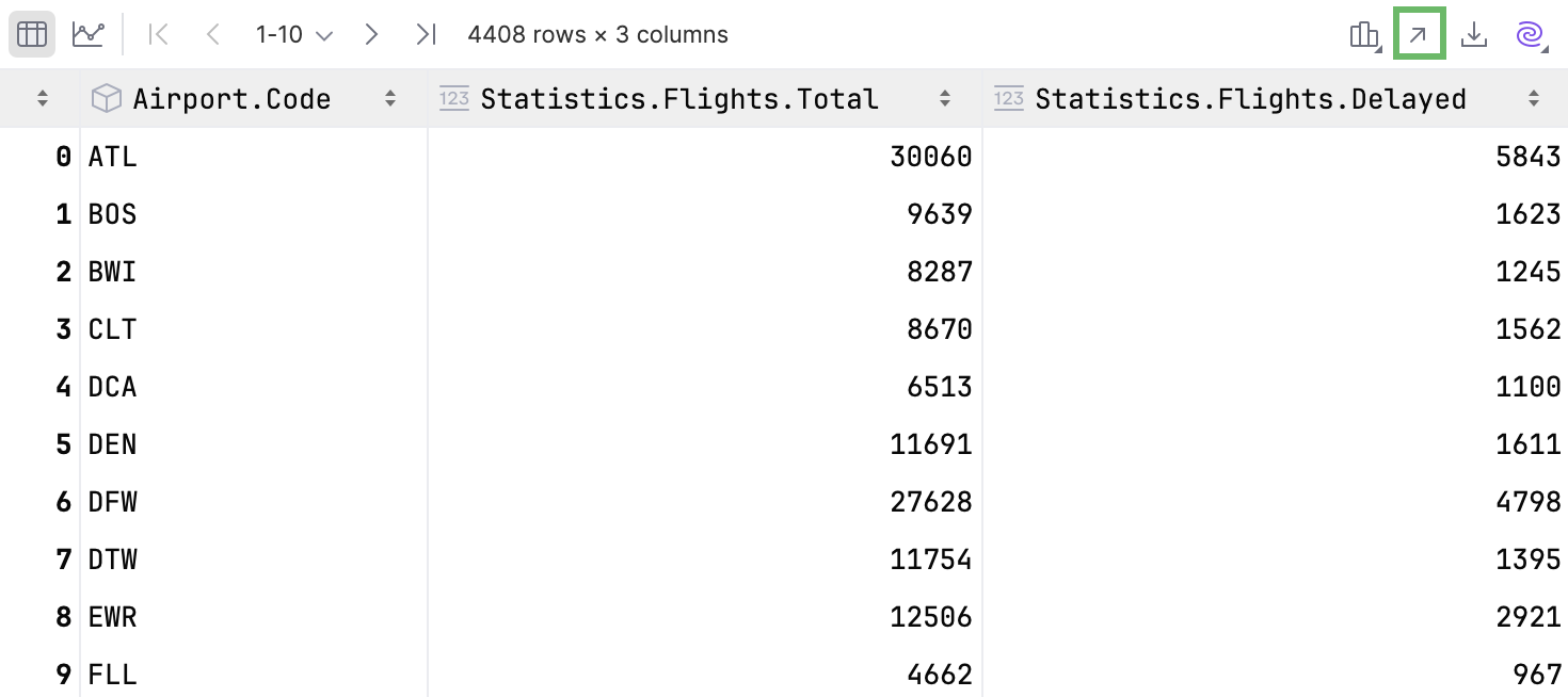
To open the table in a separate editor tab, click in the upper-right corner of the table.
To open the table search bar, click the table and press .
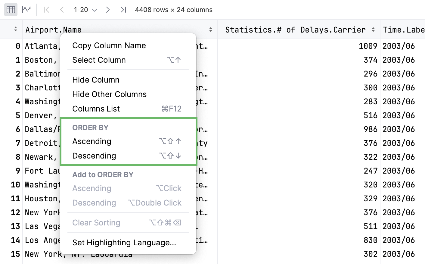
To open the context menu, right-click the column name:
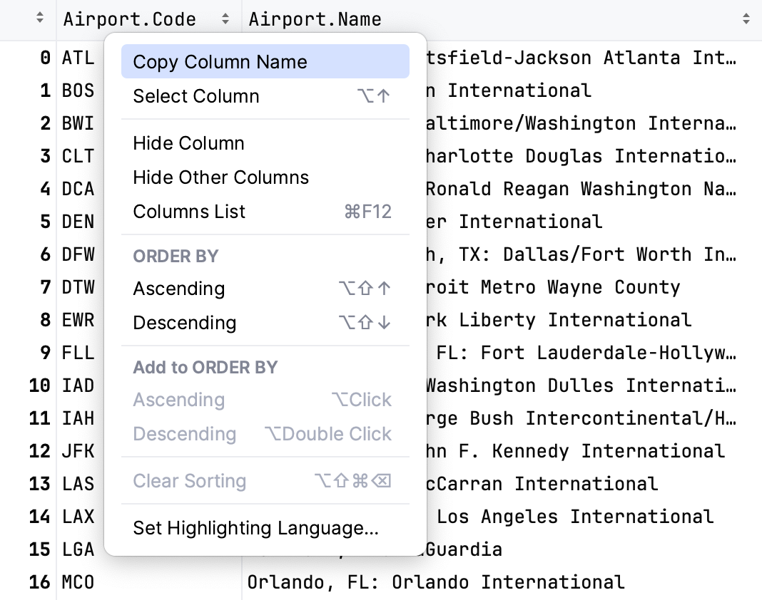
To copy the column name to the clipboard, select Copy Column Name.
To select the entire column, select Select Column.
To hide a column, select Hide Column. Hide Other Columns will hide all columns except the selected one.
To display hidden columns, click Show Column List . The hidden columns are shown strikethrough. Select a column and press to toggle its visibility. To search through the column list, start typing a column name in the Show Column List window.
To assign a language to a column, use Set Highlighting Language. For more information, refer to Inject a language for a column.
To toggle and configure cell coloring, click Table Coloring Options.

Click
New Cell and select Import Data.
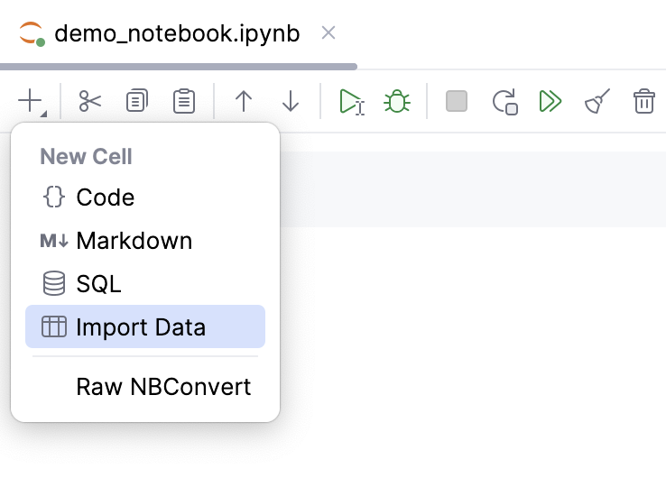
Do one of the following:
Drag and drop TSV, CSV or Excel XLSX file from your project to the cell.
Click Browse file and select the file in the dialog that opens.
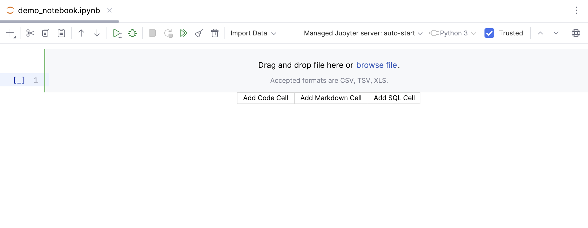
Run the cell and continue to work with the table using UI elements or Python code.
Click
Export Data to File.
Choose an extractor and configure additional settings.
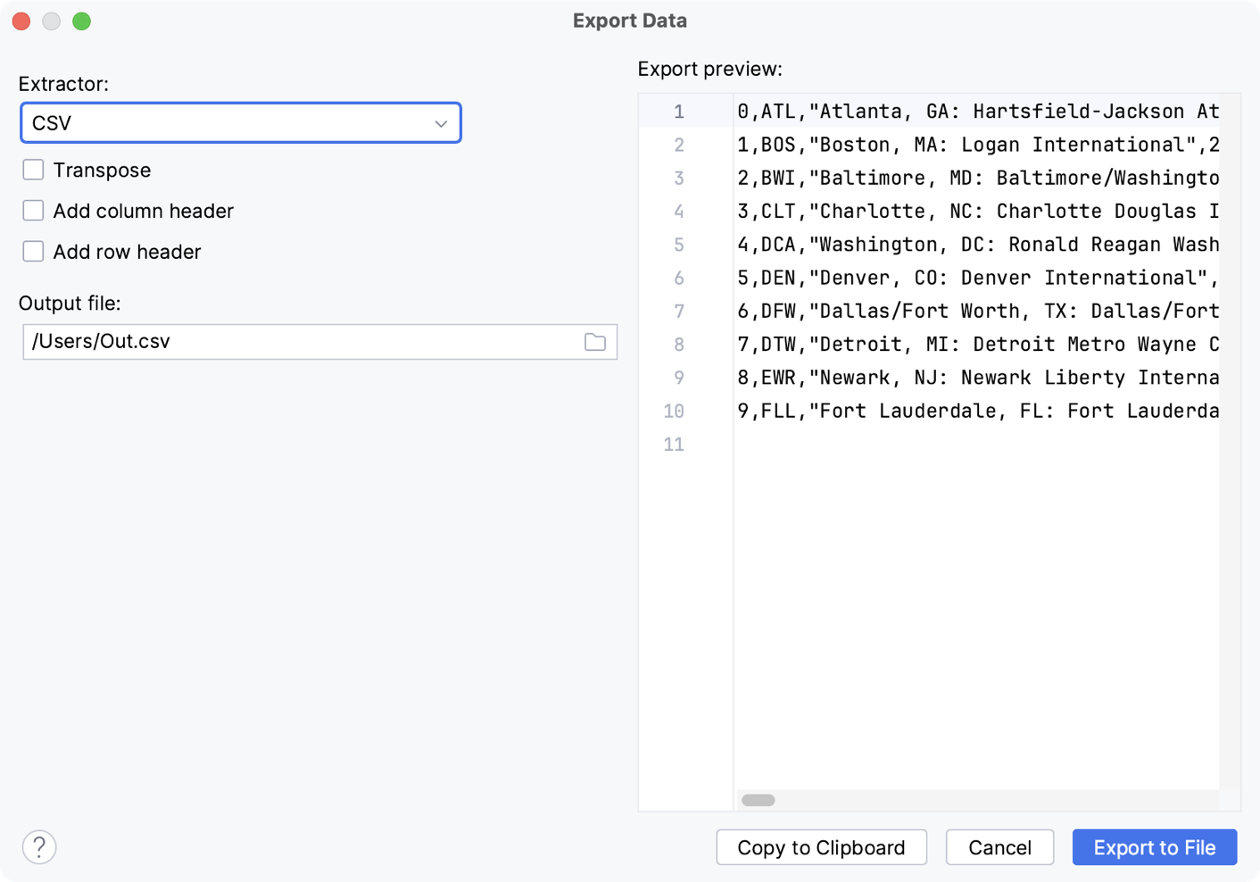
Click
Browse to choose the location for your file.
Click Export to File to save the data as a file.
To sort the table data based on the column values, you can either click the column name or select Ascending or Descending from the ORDER BY section in the context menu.
To add another column to sorting, you can either click the column name while pressing or select Ascending or Descending from the Add to ORDER BY section in the context menu.
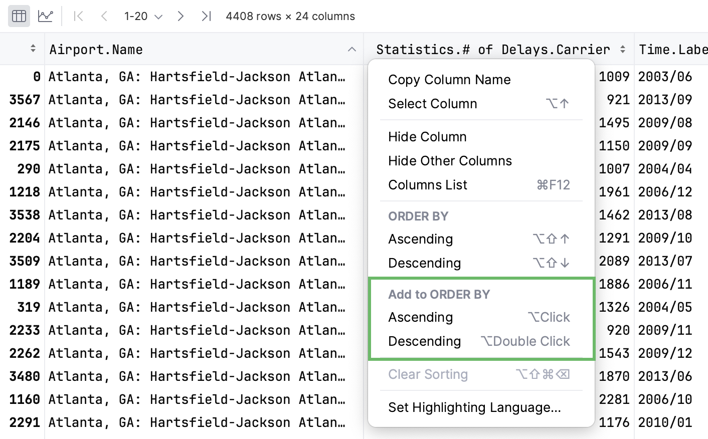
The data will be sorted by selected columns.

note
Value column cannot be added to sorting if sorting by the index column is active.
State
Description

Indicates that the data is not sorted in this column. The initial state of the sorting marker.

The data is sorted in the ascending order.

The data is sorted in the descending order.

The number to the right of the marker (1 on the picture) is the sorting level. You can sort by more than one column. In such cases, different columns will have different sorting levels.
Click Open Filter View in the upper-right corner of the table.
In the dialog that opens, select the column where you want to apply the filter and specify the filter criteria.
tip
You can add your existing variables from RunTime or create a new variable right in the Enter value field.
If you want to use additional filters, click Add filter and specify the new filter criteria.
Click Apply to filter data.
To remove or duplicate a filter, click Additional Filter Actions and select the required option from the list.
Click
More Actions and select Format Table...
In the dialog that opens, specify the format and click OK.
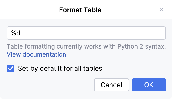
DataSpell supports Python 2 formatting syntax.
You can use Expression Input to display multidimensional data in a two-dimensional table format.
Click
More Actions and select Show Expression Input.
Write your expression in the input field that appears on top of the table and press .
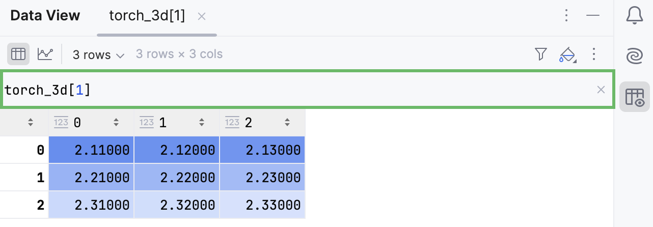
By default, column statistics are shown above the columns in a Compact mode, which includes only the None Count statistics.
To change the default mode, navigate to Settings | Languages & Frameworks | Tables.
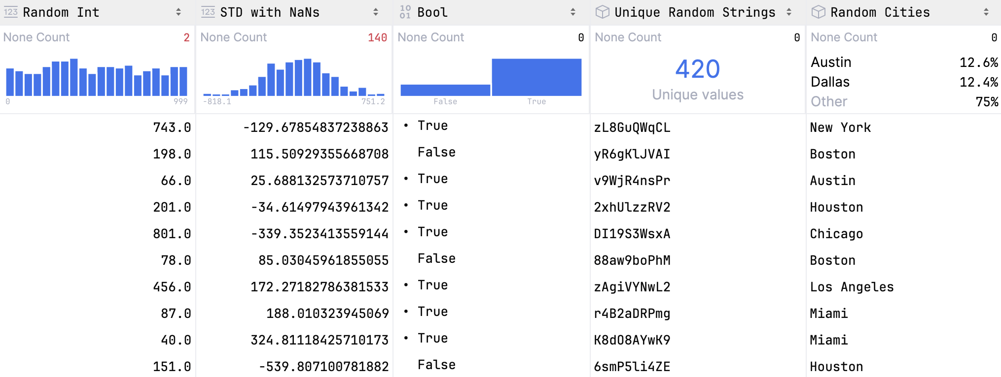
For numeric data, histograms are plotted and shown together with statistics. Hover over the histogram to view detailed information about each bar.
To view detailed column statistics, do one of the following:
Hover over a column name. A popup with column statistics appears.
Click
Show Column Statistics and select Detailed.
The detailed statistics are shown above the columns.
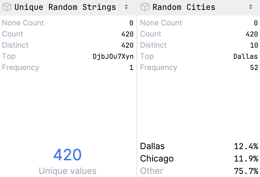
- None Count
Shows the number of
Nonevalues in the column- Count
Shows the total number of items in a column
- Distinct
Shows the number of unique values
- Top
Shows the most popular value
- Frequency
Shows the number of times an element occurs
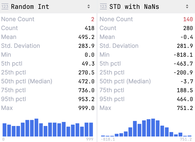
- None Count
Shows the number of
Nonevalues in the column- Count
Shows the total number of items in a column
- Mean
Shows the average number of all values in the column
- Std. Deviation
Shows the standard deviation value
- Min
Shows the minimum value in the column
- Pctl
Shows values for 5th, 25th, 50th( Median) and 95th percentiles
- Max
Shows the maximum value in the column
note
Viewing column statistics in table outputs is equivalent to using the
describe()method forSeries. For more information, refer to pandas.Series.describe and polars.Series.describe.
To view dataframes or series in a graphical form, click Show Chart.
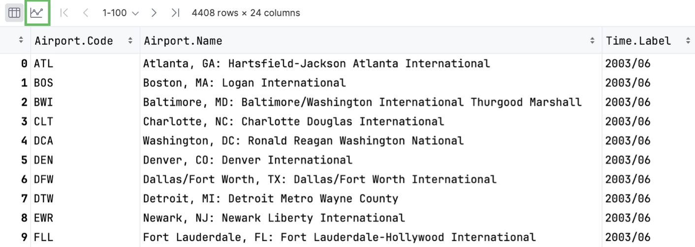
The data will be displayed in the form of a chart. You can change the type of chart and configure additional settings.
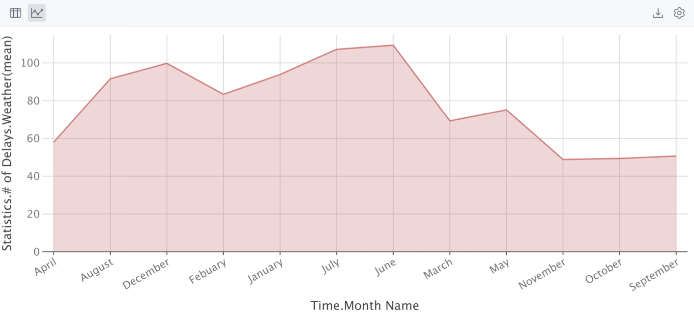
Click
Show series settings to change the initial settings of the chart.
Select the chart type and configure the settings. You can choose one of the following chart types:
Bar
Pie
Area
Line
Scatter
Bubble
Stock
AreaRange
Histogram
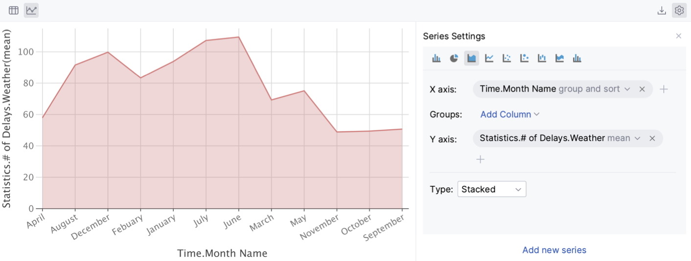
Click the Add new series link to add more series to the chart.
Click
Export to PNG to save the generated chart in the .png format.
Enter the filename and click Save.
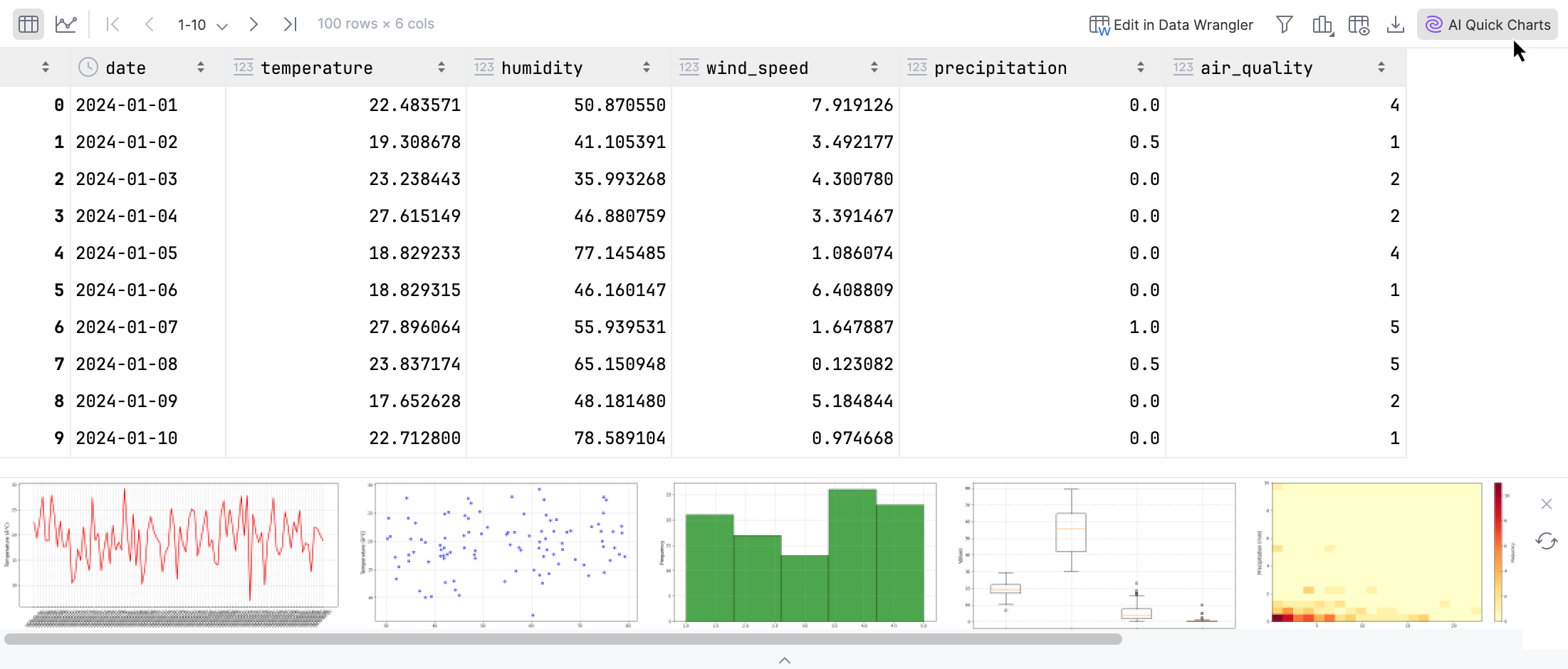
You can generate a number of preview-charts for a DataFrame using AI. These previews can then be transformed into notebook cells.
Click
AI Quick Charts in the upper-right corner of the table.
You will see the suggested charts under the table. Click any of them to insert the corresponding visualization code as a notebook cell.
To view variables representing NumPy 1D, 2D or 3D arrays as images, click View as image in the upper-right corner of the table.

In the window that opens, you can use the following toolbar options to work with the image.
Item | Description |
|---|---|
| Click this button to toggle a chessboard background. |
| Click this button to toggle a visible grid over the image. |
| Click this button to expand the image. |
| Click this button to compress the image. |
| Click this button to restore the actual size of the image. |
| Click this button to make a larger image fit the window size. |
| Click this button to open the Color Picker window. |
| Click this button to save the image on your device. |
| Click this button to copy the image to the clipboard. |
Select Image display mode | Use this dropdown to select one of the following image display modes:
Or click |