Plugin
Last modified: 14 September 2021Plugin is a way to integrate your code with the MPS IDE functionality.
The jetbrains.mps.lang.plugin and jetbrains.mps.lang.plugin.standalone languages give you a number of root concepts that can be used in your plugin. This chapter describes all of them.
Plugin instantiation
While developing a plugin, you have a solution holding the plugin and want the plugin classes to be automatically reloadable so as not to have to restart MPS after each change to see its effect. To set the development phase correctly, do the following:
Create a new solution for your plugin
Create a model in this solution named <solution_name>.plugin
Import j.m.lang.plugin and j.m.lang.plugin.standalone languages into the solution and the model
Create a root StandalonePluginDescriptor in the model (it comes from the j.m.lang.plugin.standalone language)
Set the solution's Solution Kind to Other

You can now edit your plugin model and see the changes applied to the current MPS instance just after generation. You can also distribute the solution and have the plugin successfully working for the users.
Actions and action groups
One can add custom actions to any menu in MPS by using action and action group entities.
An action describes one concrete action. Action groups are named lists of actions intended for structuring of actions - adding them to other groups and MPS groups (which represent menus themselves) and combining them into popup menus. You can also create groups with dynamically changing contents.
How to add new actions to existing groups?
In order to add new actions to existing groups, the following should be done:
actions should be described
described actions should be composed into groups
these groups should be added to existing groups (e.g. to predefined MPS groups to add new actions to MPS menus).
Predefined MPS groups are stored in the jetbrains.mps.ide.actions model, which is an accessory model to jetbrains.mps.lang.plugin language, so you don't need to import it explicitly into your model.
Action structure
Action properties
Name - The name of an action. You can give any name you want, the only obvious constraint is that the names must be unique in the scope of the model.
Mnemonic - if mnemonic is specified, the action will be available via the alt+mnemonic shortcut when any group that contains this action is displayed. Note that the mnemonic (if specified) must be one of the chars in action's caption. Mnemonic is displayed as an underlined symbol in the action's caption.
Execute outside command - all operations with MPS models are executed within commands. A command is an item in the undo list (you don't control it manually, MPS does it for you), so the user can undo changes brought into the model by action's execution. Also, all the code executed in a command, has read-write access to the model. The catch is that if you show visual dialogs to the user from inside of a command, it can cause a deadlock by blocking while holding the read/write locks. It is thus recommended to have the execute outside command option set to false, only if you are not using UI in your action. Otherwise it should be set to true and proper read/write access locking should be performed manually with the read action and command statements within the action.

Also available in - currently, this can only be set to "everywhere", which means the action will not only be available in the context, where you can invoke it through the completion menu, but also in any other context. E.g. if some action is added to the editor context menu group, but the author wants it to be available when the focus is in the logical view, or just when all the editors are closed, "also available in" should be set to "everywhere".
Caption - the string representing the action in menus
Description - this string (if specified) will be displayed in the status bar when this action is active (selected in any menu)
Icon - this icon will be displayed near the action in all menus. You can select the icon file by pressing the "..." button. Note that the icon must be placed near your language (because it's stored not as an image, but as a path relative to the language's root)
Construction parameters
Each action can be parameterized at construction time using construction parameters. This can be any data determining action's behavior. Thus, a single action that uses construction parameters can represent multiple different behaviors. To manage actions and handle keymaps MPS needs a unique identifier for each concrete behavior represented by an action. So, the toString function was introduced for each construction parameter (can be seen in the inspector). For primitive types there is no need to specify this function explicitly - MPS can do it automatically. For more complex parameters, you need to write this function explicitly so that for each concrete behavior of an action there is a different set of values returned from the toString() functions.
Enable/disable action control
Is always visible flag - if you want your action to be visible even in the disabled state (when the action is not applicable in the current context), set this to true, otherwise to false.
Context parameters - specifies which items must be present in the current context for the action to be able to execute. They are extracted from the context before any action's method is executed. Context parameters have conditions associated with them - required and custom are the two most frequently used ones. If some required parameters were not extracted, the action state is set to disabled and the isApplicable/update/execute methods are not executed. If all required action parameters were extracted, you can use their values in all the action methods. Custom context parameters give you the option to decide whether the context parameter is mandatory on case-by-case basis using the supplied function.
There are 2 types of action parameters - simple and complex action parameters.
Simple action parameters (represented by ActionDataParameterDeclaration) allow to simply extract all available data from the current data context. The data is provided "by key", so you should specify the name and the key in the declaration. The type of the parameter will be set automatically.
Complex action parameters (represented by ActionParameterDeclaration) were introduced to perform some frequently used checks and typecasts. Now there are 3 types available for the context parameter of this type:
node<concept> - currently selected node, which is an instance of a specified concept. Action won't be enabled, if the selected node isn't an instance of this concept.
nlist<concept> - currently selected nodes. It is checked that all nodes are instances of the concept (if specified). As with node<concept>, the action won't be enabled if the check fails.
model - the current model holding the selected node
tip
The available keys that the user can type into the context parameters declaration are obtained automatically from all imported models. MPS searches the imported models for subclasses of the CommonDataKeys (com.intellij.openapi.actionSystem) class. Typical such subclasses are:
PlatformDataKeys (com.intellij.openapi.actionSystem)
MPSCommonDataKeys (jetbrains.mps.ide.actions)
MPSEditorDataKeys (jetbrains.mps.ide.editor)
MPSDataKeys (jetbrains.mps.workbench)
Be sure to import these models (Ctrl+M) in order to see them in the completion menu for context parameters.
Is Applicable / update - In cooperation with the context parameters, this method controls the enabled/disabled state of the action. You can pick either of the two options:
The isApplicable method returns the new state of an action
The update method is designed to update the state manually. You can also update any of your action's properties (caption, icon etc.) by accessing action's presentation via event.getPresentation(). Call the setEnabledState() method on an action to enable or disable it manually.
These methods are executed only if all required context parameters have been successfully extracted from the context.
Note: The this keyword refers to the current action, use action<...> to get hold of any visible action from your code.
tip
Do not use the isApplicable() method if you want to modify the presentation manually. Although no errors would be reported from within isApplicable(), it is not guaranteed to work in all cases properly. The update() method is a more suitable place for complex presentation manipulations.
Execute - this method is executed when the action is performed. It is guaranteed that it is executed only if the action's update method for the same event left the action in active state (or isApplicable returned true) and all the required context parameters are present in the current context and were filled in.
Methods - in this section you can declare utility methods.
Group structure
Group describes a set of actions and provides the information about how to modify other groups with current group.
Presentation
Name - The name of the group. You can give any name you want, the only obvious constraint is that the names must be unique in the scope of the model.
is popup - if this is true, the group represents a popup menu, otherwise it represents a list of actions.
When "is popup" is true:
Caption - string that will be displayed as the name of the popup menu
Mnemonic - if mnemonic is specified, the popup menu will be available via the alt+mnemonic shortcut when any group that contains it is displayed. Note that the mnemonic (if specified) must be one of the chars in caption. Mnemonic is displayed as an underlined symbol in the popup menu caption.
Is invisible when disabled - if set to true, the group will not be shown in case it has no enabled actions or is disabled manually in the update() method. Call the enable()/disable() methods on an action group to enable or disable it manually.
Contents
There are 3 possibilities to describe group contents:
Element list - this is just a static list of actions, groups and labels (see modifications). The available elements are:
->name - an anchors. Anchors are used for modifying one group with another. See Add statement section for details.
<---> - separator
ActionName[parameters] - an actions.
Build - this alternative should be used in groups, the contents of which is static, but depends on some initial conditions - the group is built once and is not updated ever after. Use the add statement to add elements inside build block.
Update - this goes for dynamically changing groups. Group is updated every time right before it is rendered.
tip
In the update/build blocks use the add statement to add group members.
Modifications and labels
Add to <group> at position <position> - this statement adds the current group to a <group> at the given position. Every group has a <default> position, which tells to add the current group to the end of the target group. Some groups can provide additional positions by adding so-called anchors into themselves. Adding anchors is described in the contents section. The anchor itself is invisible and represents a position, in which a group can be inserted.
tip
You shouldn't care about the group creation order and modifications order - this statement is fully declarative.
If A is added into B, B into C, C will contain A
actionGroup <...> expression
There is a specific expression available in the jetbrains.mps.lang.plugin language to access any registered group - actionGroup< group > expression.
Bootstrap groups
Bootstrap groups are a way to work with action groups that have been defined outside of MPS (e.g. groups contributed by IDEA or some IDEA plugin).
In this case, a bootstrap group is defined in MPS and its internal ID is set to the ID of the external group. After having this done, you can work with the bootstrap group just like with a normal one - insert it into your groups and vice versa.
A regular user rarely needs to use bootstrap groups.
tip
A quick and simple tutorial by Federico Tomassetti on how to create action and show it in a context menu is available here:
Please bear in mind that this tutorial uses an older version of MPS and the actual workings in MPS have changed since then, Especially we now recommend to use plugin solutions instead of the plugin aspect of a language to hold your actions. The tutorial may still give you some guidelines and useful insight.
Touch Bar Support on MacOS
Custom user actions and action groups can be added to the Touch Bar by adding to one of predefined InterfaceGroups:
IDEATouchBarDefault
IDEATouchBarDefault_alt
IDEATouchBarDefault_cmd
IDEATouchBarDefault_cmd_alt
IDEATouchBarDefault_shift
IDEATouchBarDebug
Displaying progress indicators
Long-lasting actions should indicate their activity and progress to the user. Check out the Progress indicators page for details on how to use progress bars, how to allow for cancellation and how to enable actions for running in the background.
KeyMap Changes
The KeymapChangesDeclaration concept allows the plugin to assign key shortcuts to individual actions and group them into shortcuts schemes.
Any action can have a number of keyboard shortcuts. This can be specified using the KeyMapChanges concept. For a parameterized action, which has a number of "instances" (one instance per parameter value), a function can be specified, which returns different shortcut for a different parameter value.
In MPS, there are some "default keymaps", which you can see in Settings->Keymaps. The for keymap section allows you to specify a keycap that the KeyMapChanges definition is contributing to. E.g. one can set different shortcuts for the same action in the MacOS and the Windows keymaps.
tip
If you add a keyboard shortcut to the Default keymap, all keymaps are altered with this shortcut.
tip
Note that by default ctrl is changed to cmd in MacOs keymap. If you want your action to have a ctrl + something shortcut on MacOs, you should re-define this shortcut for the MacOs keymap.
All the actions added by plugins are visible in Settings->Keymap and Settings->Menus and Toolbars. This means that any user can customize the shortcuts used for all MPS actions.

A KeyMap Change should be given a name unique within the model, it must specify the Keymap that is being altered (or Default to change all keymaps) and then assign a keystroke to actions that should have one. The keystroke can either be SimpleShortcutChange with a directly specified keystroke or ParametrizedShortcutChange, which gives you the ability to handle parametrized actions.
NonDumbAwareActions
If your action uses platform indices (which is very rare), add it to NonDumbAwareActions. Those actions will be automatically disabled while the indices are being built.
Editor Tabs
If you look at any concept declaration you will certainly notice the tabs at the bottom of the editor. You are able to add the same functionality to the concepts from your language.
What is the meaning of these tabs? The answer is pretty simple - they contain the editors for some aspects of the "base" node. Each tab can be either single-tabbed (which means that only one node is displayed in it, e.g. editor tab) or multi-tabbed (if multiple nodes can be created for this aspect of the base node, see the Typesystem tab, for example).
How the editor for a node is created? When you open some node, call it N, MPS tries to find the "base" node for N. If there isn't any base node, MPS just opens the editor for the selected node. If the node is found (call it B), MPS opens some tabs for it, containing editors for some subordinate nodes. Then it selects the tab for N and sets the top icon and caption corresponding to B.
When you create tabbed editors, you actually provide rules for:
finding the base node
finding subordinate nodes
optionally an algorithms of subordinate nodes creation
The tabs that match the requested base concept are displayed and organized depending on their relative order rules specified in their respective order constraints sections.
Editor Tab Structure
Name - The name of the rule. You can give any name you want, the only obvious constraint is that the names must be unique in the scope of the model.
Icon - this icon will be displayed in the header of the tab. You can select the icon file by pressing the "..." button. Note that the icon must be placed near your language (because it's stored not as an image, but as a path relative to the language's root)
Shortcut char - a char to quickly navigate to the tab using the keyboard
Order constraints - an instance of the Order concept. Orders specify an order, in which the current tab should be displayed relative to the other tabs. You can either refer to an external order or specify one in-place.
Base node concept - the concept of the base node for this as well as all the related tabs.
Base Node - this is a rule for searching for the base node given a known node. It should return null, if the base node is not found or this TabbedEditor can't be applied.
Is applicable - indicates whether the tab can be used for the given base node
command - indicated whether the node creation should be performed as a command, i.e. whether it should be undoable and uses no additional UI interaction with the user.
getNode/getNodes - should return the node or a list of nodes to edit in this tab
getConcepts - return the concepts of nodes that this tab can be used for to edit
Create - if specified, this will be executed when user asks to create a new node from this tab. It is given a requested concept and the base node as parameters.
Tools
Tool is an instrument that has a graphical presentation and aimed to perform some specific tasks. For example, Usages View, Todo Viewer, Model and Module repository Viewers are all tools. MPS has rich UI support for tools - you can move it by drag-and-drop from one edge of the window to another, hide, show and perform many other actions.
Tools are created "per project". They are initialized/disposed on class reloading (after language generation, on "reload all" action etc.)
Tool structure
Name - The name of the tool. You can give any name you want, the only obvious constraint is that the names must be unique in the scope of the model.
Caption - this string will be displayed in tool's header and on the tool's button in tools pane
Number - if specified, alt+number becomes a shortcut for showing this tool (if it s available)
Icon - the icon to be displayed on the tool's button. You can select the icon file by pressing "..." button. Note that the icon must be placed near your language (because it's stored not as an image, but as a path relative to the language's root)
Position - on of top/bottom/left/right to add the tool to the desired MPS tool bar
Init - initialize the tool instance here
Dispose - dispose all the tool resources here
getComponent - should return a Swing component (instance of a class which extends JComponent) to display inside the tool's window. If you are planning to create tabs in your tool and you are familiar with the tools framework in IDEA, it's better to use IDEA's support for tabs. Using this framework greatly improves tabs functionality and UI.
Fields and methods - regular fields and methods, you can use them in your tool and in external code.
Tool operation
We added the operation (GetToolInProjectOperation concept) to simply access a tool in some project. Use it as project.tool<toolName>, where project is an IDEA Project. Do not forget to import the jetbrains.mps.lang.plugin.standalone language to be able to use it.
note
This operation can't currently be used in the dispose() method
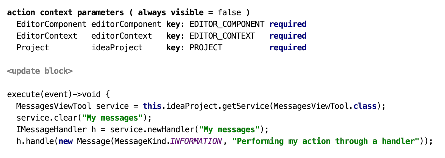
For example, to output to the Messages tool window use the following code in an action:

Tabbed Tools
It's same as tool window, but additionally can contain multiple tabs
Tool structure
Name - The name of the tool. You can give any name you want, the only obvious constraint is that the names must be unique in the scope of the model.
Caption - this string will be displayed in tool's header and on the tool's button in tools pane
Number - if specified, alt+number becomes a shortcut for showing this tool (if it s available)
Icon - the icon to be displayed on the tool's button. You can select the icon file by pressing "..." button. Note that the icon must be placed near your language (because it's stored not as an image, but as a path relative to the language's root)
Position - on of top/bottom/left/right to add the tool to the desired MPS tool bar
Init - initialize the tool instance here
Dispose - dispose all the tool resources here
Fields and methods - regular fields and methods, you can use them in your tool and in external code.
Preferences components
Sometimes you may want to be able to edit and save some settings (e.g. your tools' settings) between MPS startups. We have introduced preferences components for these purposes.
Each preferences component includes a number of preferences pages and a number of persistent fields.Preferences page is a dialog for editing user preferences. They are accessible through File->Settings.
Persistent fields are saved to the .iws files when the project is closed and restored from them on project open. The saving process uses reflection, so you don't need to care about serialization/deserialization in most cases.
tip
Only primitive types and non-abstract classes can be used as types of persistent fields. If you want to store some complex data, create a persistent field of type org.jdom.Element (do not forget to import the model org.jdom), annotate it with com.intellij.util.xmlb.annotations.Tag and serialize/deserialize your data manually after read / before write
Preferences component structure
name - component name. You can give any name you want, the only obvious constraint is that the names must be unique in the scope of the model.
fields - these are the persistent fields. They are initialized before after read and pages creation, so their values will be correct in every moment they can be accessed. They can have default values specified, as well.
after read / before write - these blocks are used for custom serialization purposes and for applying/collecting preferences, which have no corresponding preferences pages (e.g. tool dimensions)
pages - preferences pages
Preferences page structure
name - the string to be used as a caption in Settings page. The name must be unique within a model.
component - a UI component to edit preferences.
tip
The uiLanguage components can be used here
icon - the icon to show in Settings window. The size of the icon can be up to 32x32
reset - reset the preferences values in the UI component when this method is called.
commit - in this method preferences should be collected from the UI component and commited to wherever they are used.
isModified - if this method returns false, commit won't be executed. This is typically useful for preferences pages with long-running commit method.
PreferenceComponent expression
We added an expression to simply access a PreferenceComponent in some project. You can access it as project.preferenceComponent<componentName>, where project is an IDEA Project. Do not forget to import the jetbrains.mps.lang.plugin.standalone language to use it.
note
This operation can't currently be used in the dispose() method
Custom plugin parts (ProjectPlugin, ApplicationPlugin)
Custom plugin parts are custom actions performed on plugin initializing/disposing. They behave exactly like plugins. You can create as many custom plugins for your language as you want. There are two types of custom plugins - project and application custom plugins. The project custom plugin is instantiated once per project, while the application custom plugin is instantiated once per application and therefore it doesn't have a project parameter.
Thanks for your feedback!