New UI
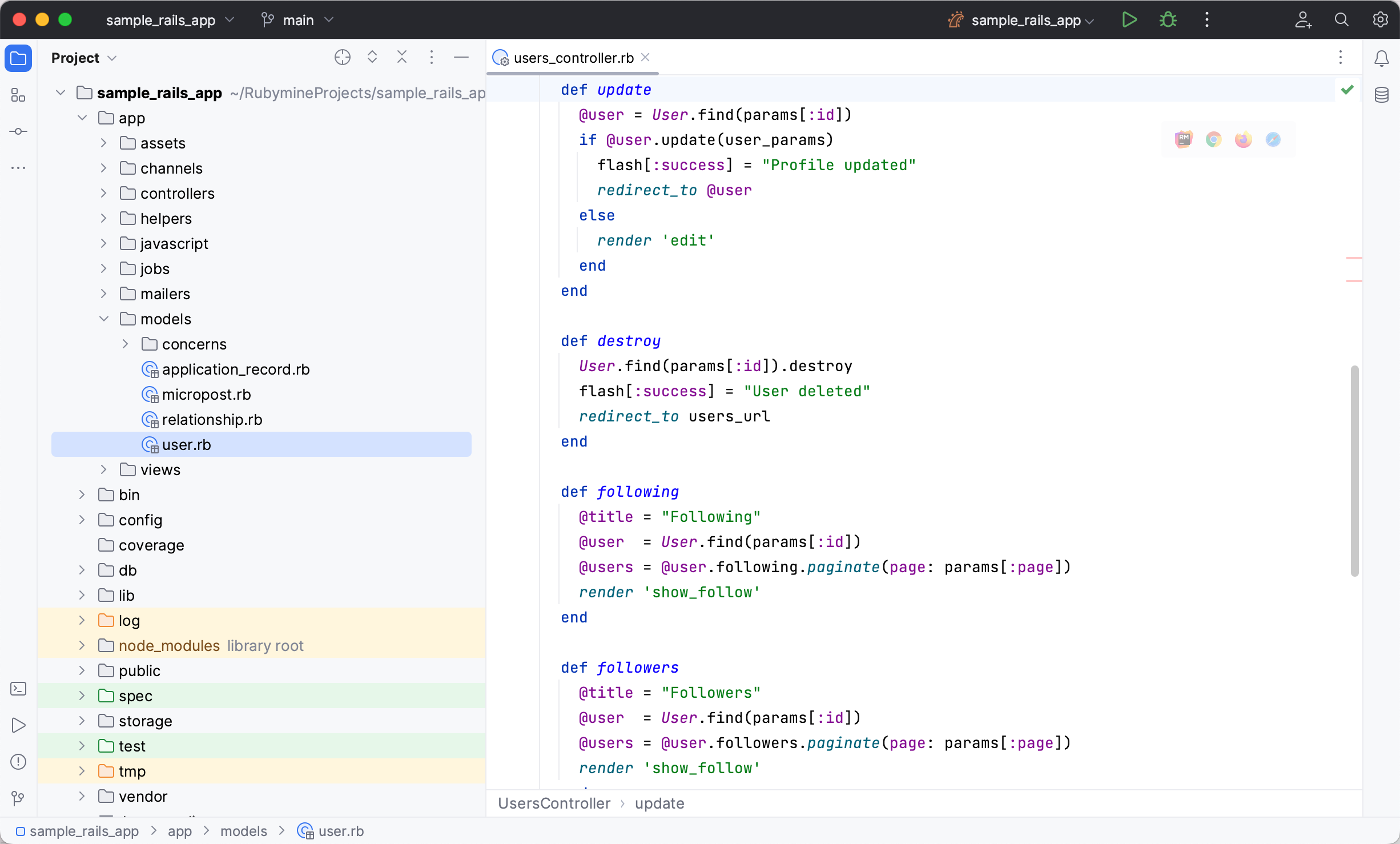
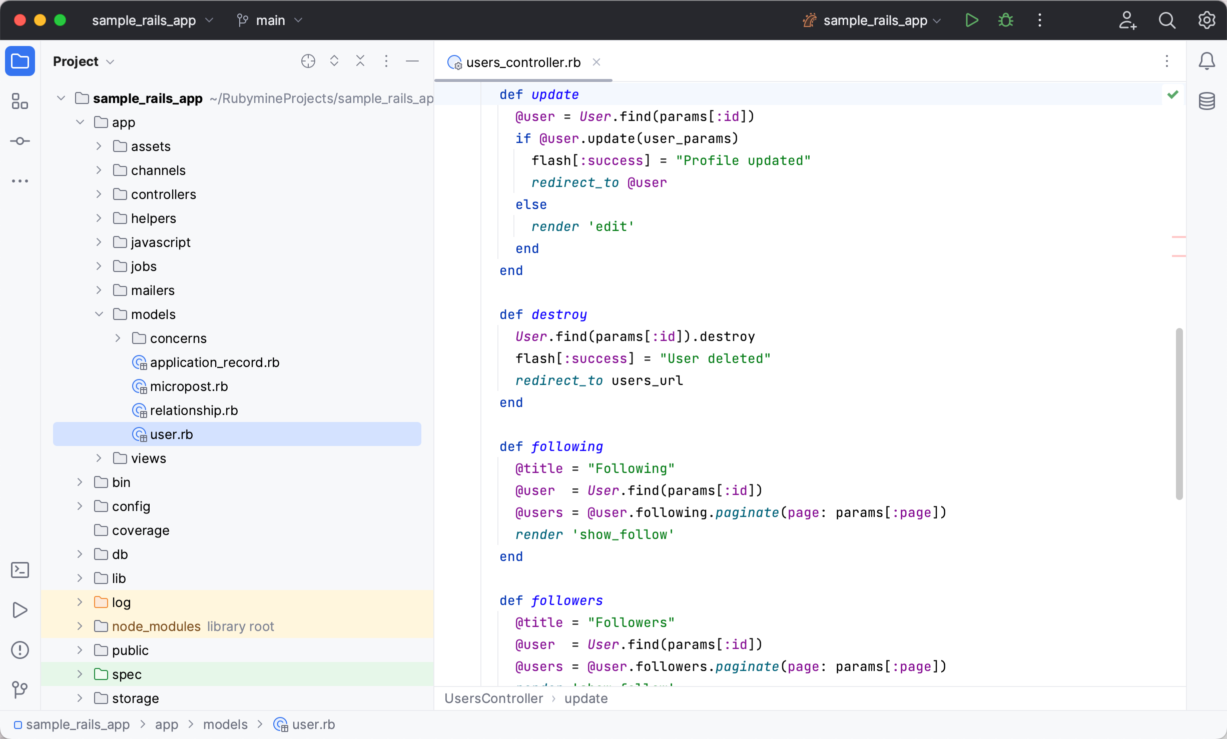
The new user interface (UI) is a new redesigned look of RubyMine. It has been created to reduce visual complexity, provide easy access to essential features, and progressively disclose complex functionality as needed – resulting in a cleaner look and feel.
Among the key changes are the simplified main toolbar, new tool window layout, new themes, and updated icons.
Enable the new UI
Press Control+Alt+S to open the IDE settings and then select .
Select the Enable new UI checkbox and apply the changes. Restart the IDE.
Main changes
Themes, icons, fonts
The new Light, Dark, and Light with Light Header color themes have improved contrast and a consistent color palette.


The Inter font is used for the UI on all supported OSs.
A new icon set has more distinguishable shapes and colors designed for legibility and visual balance.
Window header
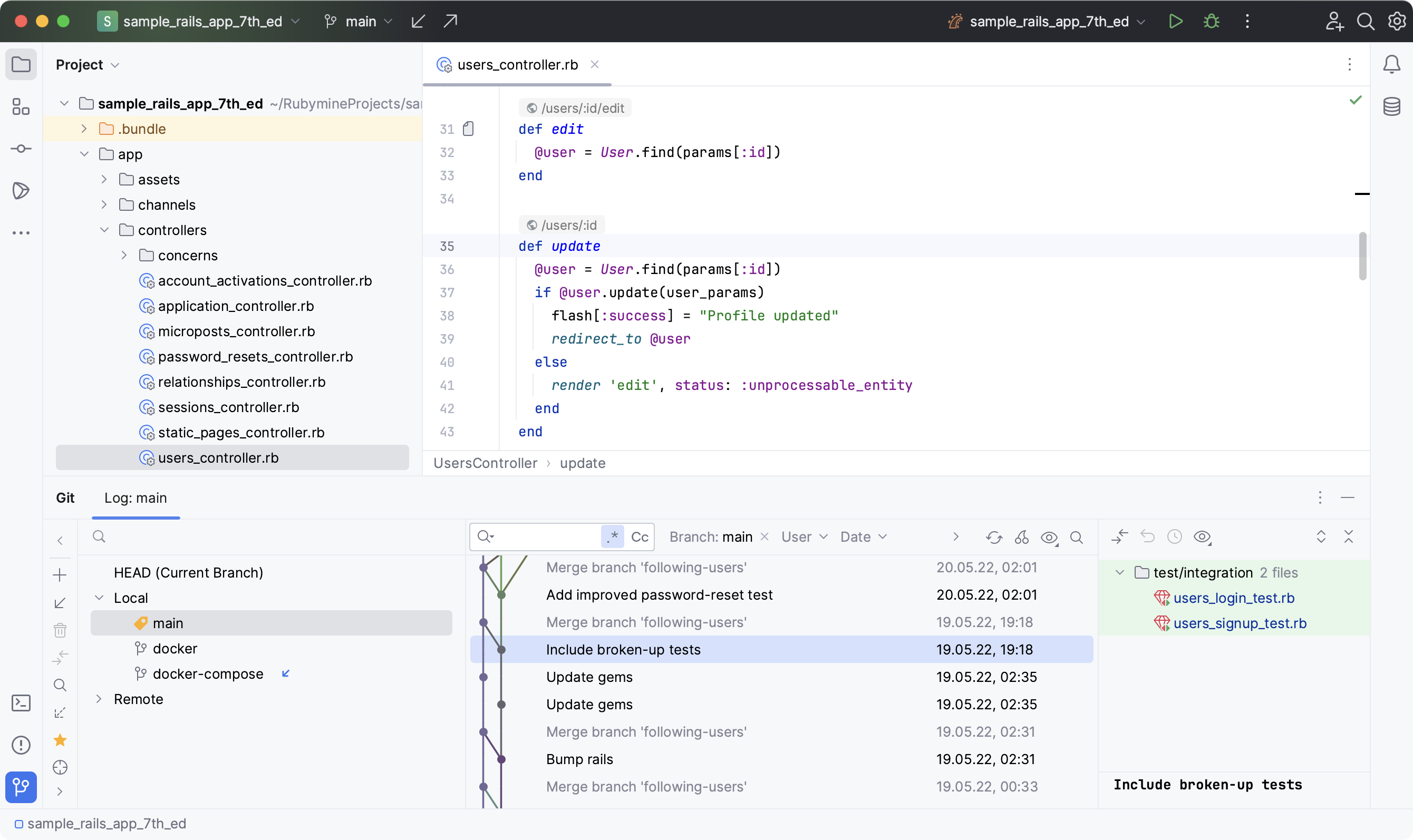
Several new widgets are located in the main window header. From left to right:

Main menu (Windows and Linux only)
The main menu is now hidden under the hamburger icon. To access menu categories, click the icon or press Alt+\. The elements will appear horizontally over other header widgets.
You can display the main menu as a separate toolbar: go to and enable the Show main menu in a separate toolbar option. Alternatively, from the main menu, select and enable Main Menu as Separate Toolbar.
Project widget
The widget shows the current project's name, allows switching between recent projects, creating new projects, and opening existing ones.
VCS widget
The widget shows the current branch, allows switching branches, and provides the most popular VCS actions like update project, commit and push changes.
It has replaced the branch widget previously located in the status bar at the bottom of the main window, and VCS actions icons previously located in the navigation bar in the upper right corner.
Run widget
The widget allows you to start run/debug configurations, select other configurations to run, and change the mode for the current configuration (run or debug). You can edit, pin, or delete configurations using this widget.
When a process is running, you can restart or stop it using the widget.
While giving access to more features right from the main toolbar, new window header widgets hide actions in drop-down menus to simplify the layout.
Tool windows
Tool windows have a new layout and behavior:
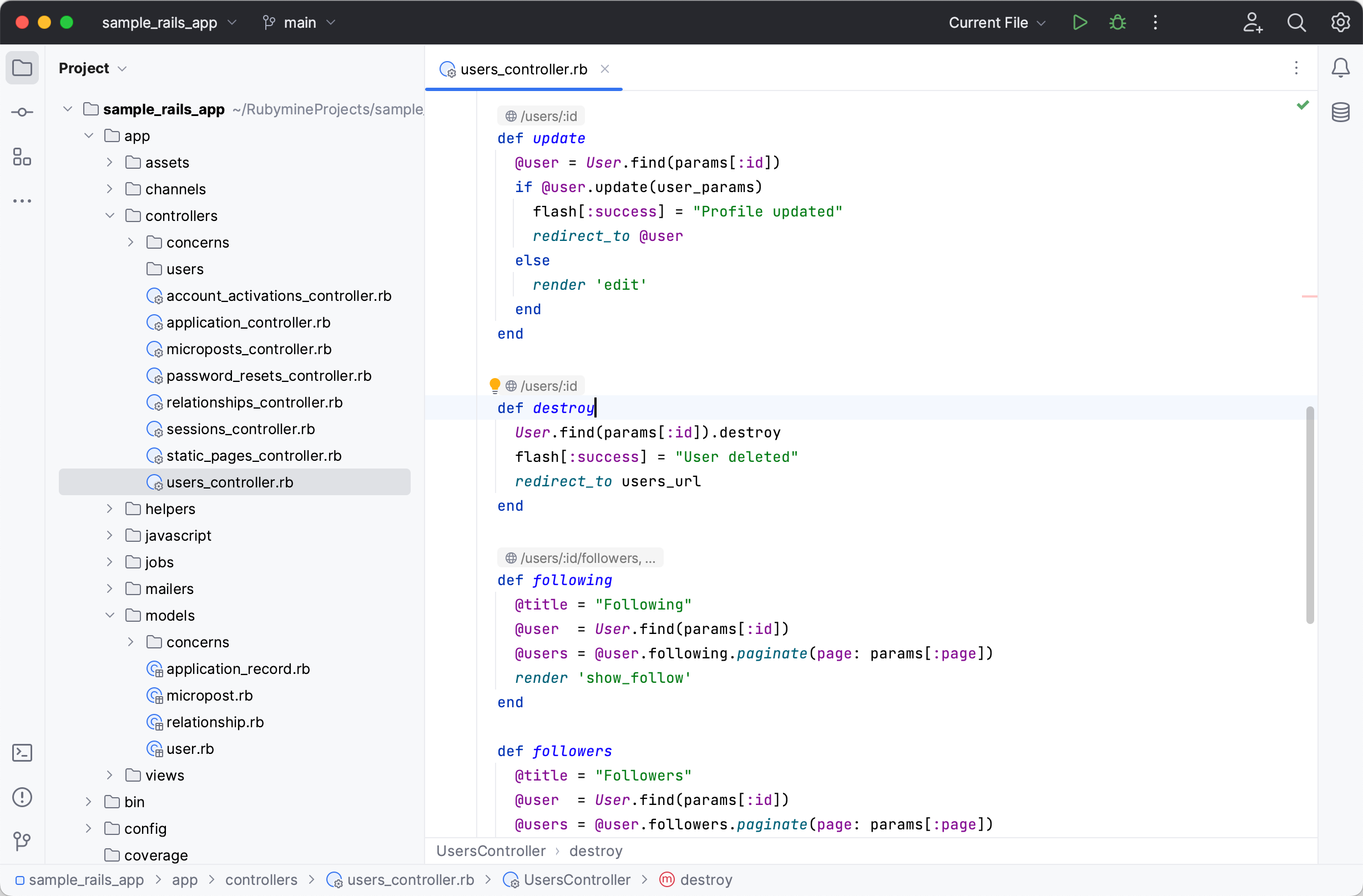
The tool window bars have big icons for easier visual navigation and a cleaner look. You can opt for smaller icons in the compact mode. To see a tool window's name, hover over its icon for a tooltip.

Tool window icons in the upper parts of the left and right bars open vertical tool windows on the left and right sides of the IDE window.
The icons in the bottom parts of the bars open horizontal tool windows at the bottom of the IDE window.
Use the vertical and horizontal split to arrange tool windows: drag a tool window icon along the sidebar and drop it under the separator for the vertical split or on the other sidebar for horizontal split.
The More tool windows button shows tool windows not yet present on any of the tool window stripes. When a tool window is selected, it is opened and its button appears on the default stripe for this tool window.
Editor tabs
Tabs use more space and a bigger font for better legibility.
Working with multiple editor tabs is now more convenient: if tabs do not fit the screen, you can choose between using a scroll bar or squeezing the tabs to place all of them on the screen. Go to and select the required option.
File colors are temporarily turned off for editor tabs as we are working on an improved presentation of file colors. If needed, you can bring back the previous file colors in .

Gutter
Breakpoints are now placed over line numbers by default to save horizontal space.
You can place breakpoints near line numbers: press Control+Shift+A, type Breakpoints Over Line Numbers, and disable the option.

Folding icons have been updated. Icons for unfolded areas show up on hover for a less cluttered look.
You can configure the IDE to always display folding icons: go to and select Always next to Show code folding arrows.

Annotations (Git Blame) have an updated color palette to help you see the recent changes faster.

Debug tool window
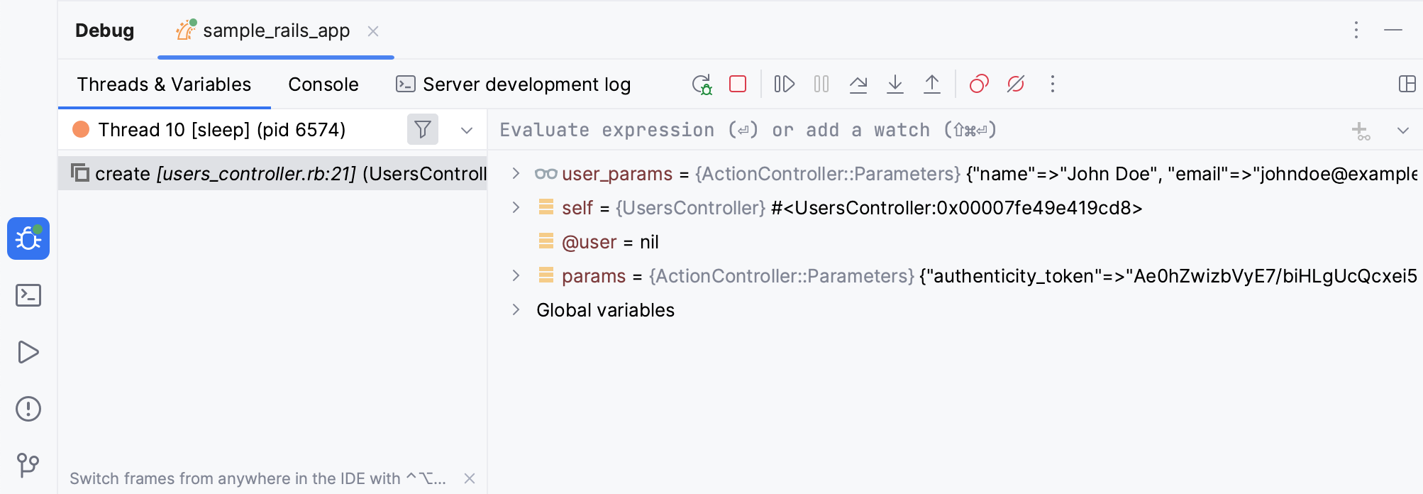
Two separate toolbars with the main debug actions were streamlined and moved to a single toolbar near the tool window tabs for better screen space management.
Tabs for switching between the Threads & Variables view and Console now also appear in the tool window tabs when there is a single running configuration.
Run tool window
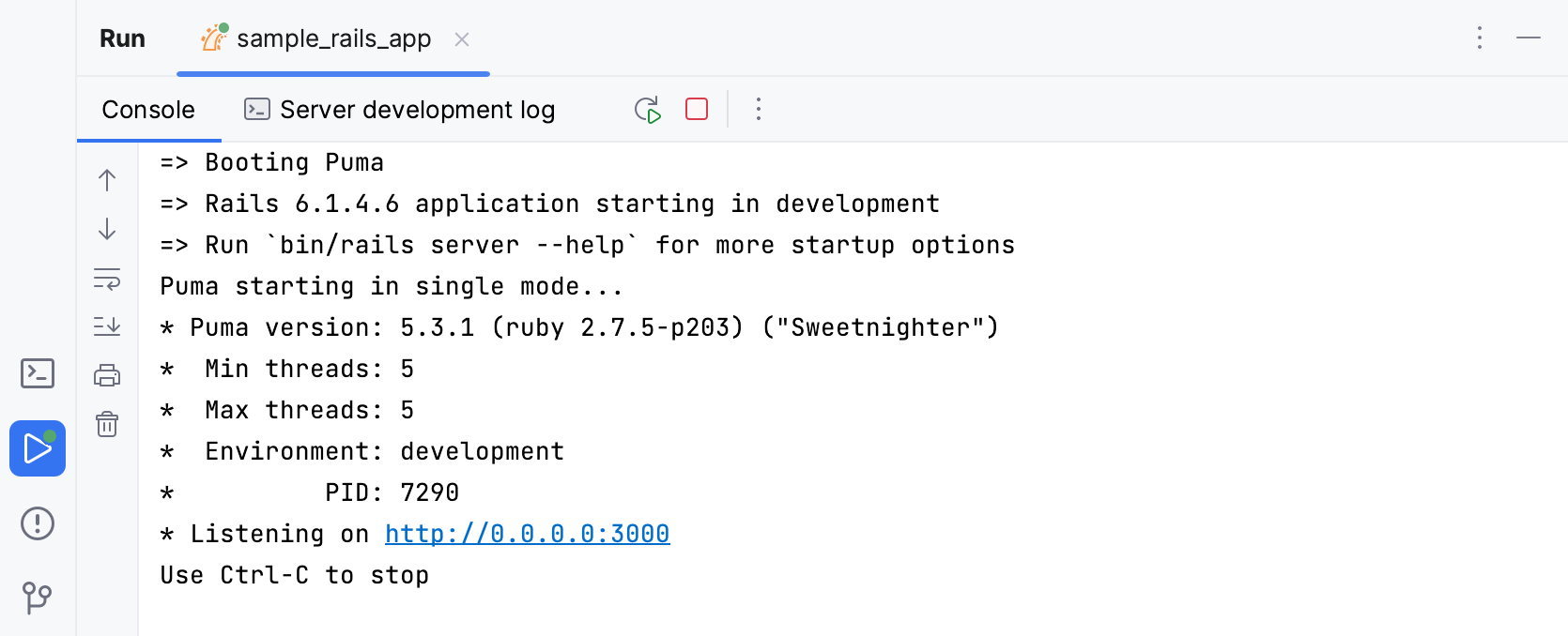
The toolbar with run actions was also moved to the tool window tabs for consistency with the Debug tool window.
Navigation bar
The navigation bar is now located in the status bar at the bottom of the main window.
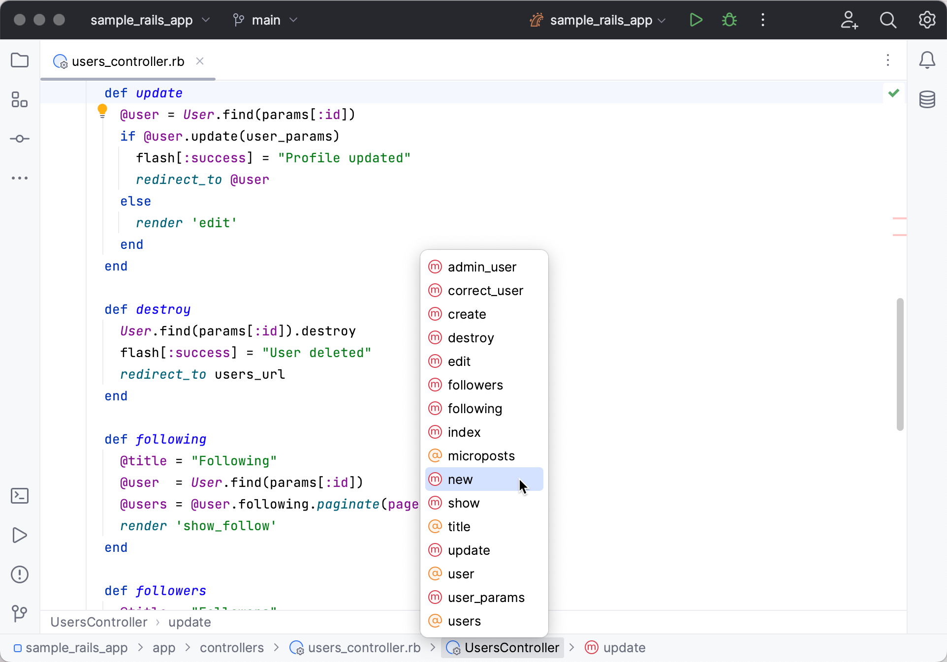
If you prefer the former location, you can move it back to the top, or even turn it off completely. To do so, go to the main menu and select .
Compact mode
If you work on a smaller screen, you can enable the compact mode. In this mode, the IDE has the reduced heights for toolbars and tool window headers, scaled-down spacings and paddings, and smaller icons and buttons.
Enable Compact mode
From the main menu, select .
Press Control+Alt+S to open the IDE settings, select , and enable the Compact mode option.
