Theme plugin: JSON keys reference
This topic explains the keys used in the JSON file to encode the light theme in JetBrains Fleet. It describes the main sections, default key values, and provides some examples.
The meta section defines the main properties of your theme, such as its name, version, and type. These properties help identify and manage multiple themes or their versions.
The theme subsection specifies key attributes of the JSON configuration for a theme: its name, version, or fallback options.
Key | Value | Type | Description |
|---|---|---|---|
|
|
| The default theme applied when a field from this JSON configuration is not specified. |
|
|
| The name of the custom theme. |
|
|
| The version number of the theme. |
Specifies colors for UI elements like buttons, headers, and backgrounds.
Fallback rules: if a theme does not have a color key, it falls back to the corresponding key in the default Light or Dark theme, as defined by the theme.kind key in meta.
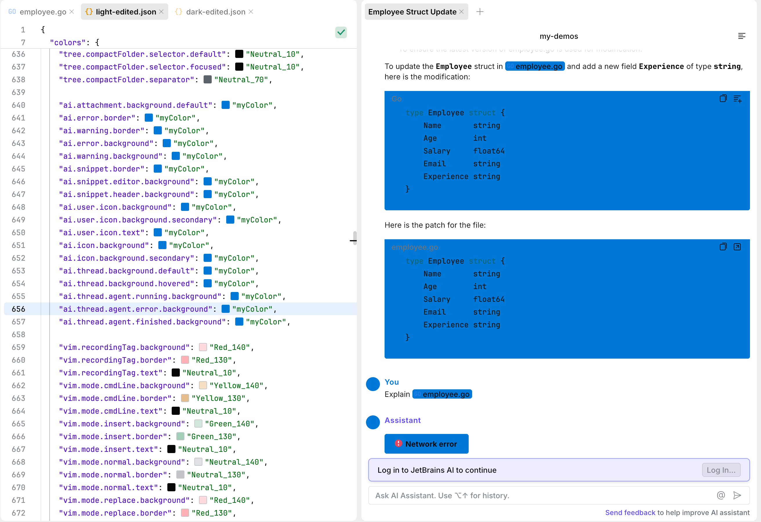
The ai section defines colors used for working with the AI Assistant. Keys in this section cover the following functionality:
Attachment and snippet styling.
Error and warning indicators.
Icons.
Threads and agent states.
Hover styling.
On the following screenshot, some of these elements are displayed in blue.
Key | Value | Type |
|---|---|---|
|
|
|
|
|
|
|
|
|
|
|
|
|
|
|
|
|
|
|
|
|
|
|
|
|
|
|
|
|
|
|
|
|
|
|
|
|
|
|
|
|
|
|
|
|
|
|
|
|
|
|
|
|
|
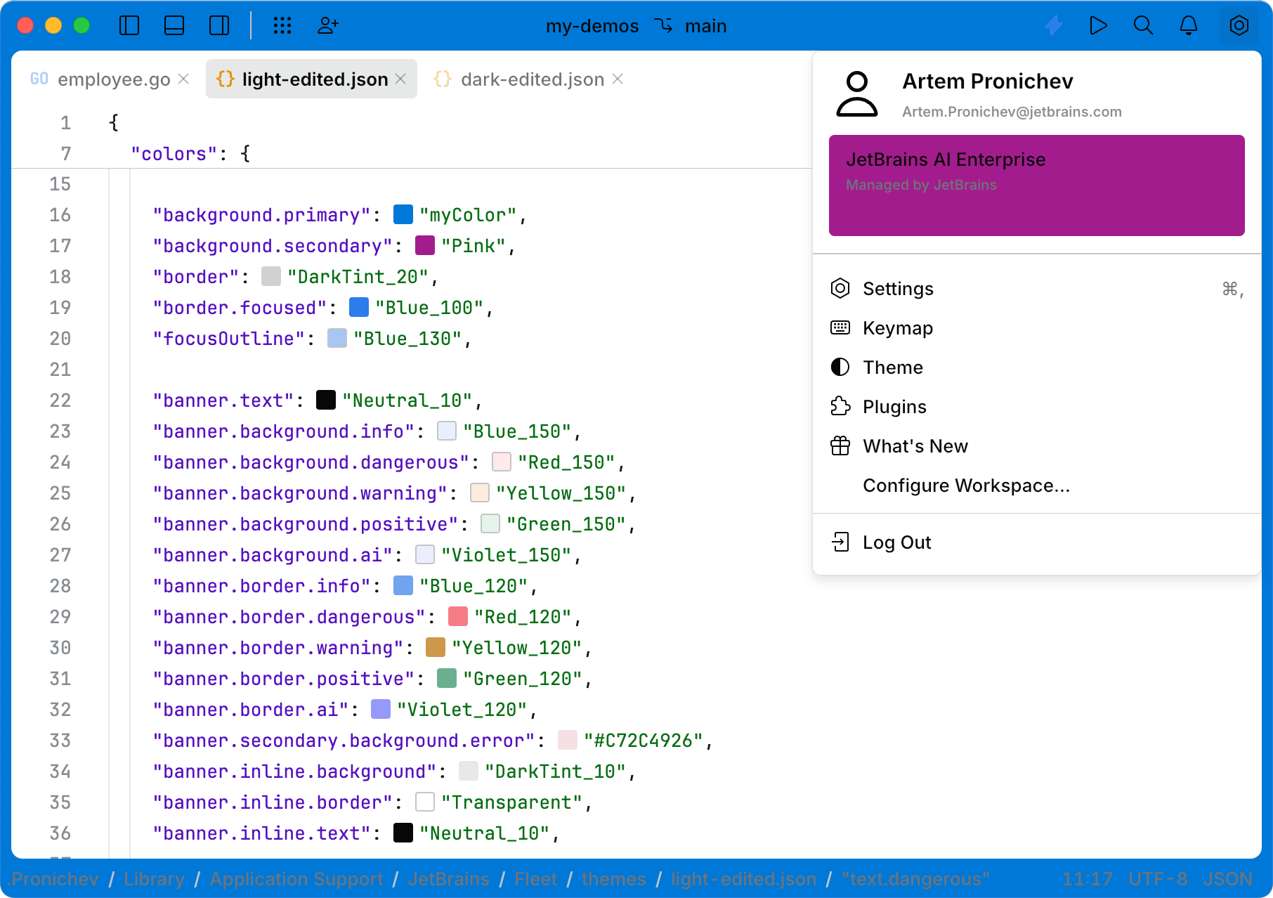
The background section defines the background colors of the code editor interface.
background.primary: controls the color of the window beneath various panels, including the header of the code editor. On the following screenshot, these elements have the blue color (defined by themyColorkey in thepalettesection).background.secondarymanages the colors of elements inside menus, such as the settings menu. On the following screenshot, this element has the pink color.It is also used in other places, such as the footer of the quick-fix popup () and in interlines. It is applied when there is a need to visually separate some information from the primary background.
Key | Value | Type |
|---|---|---|
|
|
|
|
|
|
Banners are visual components used to display important messages or statuses.
There are two types of banners:
Floating banner (
banner.*): shown in the top-middle part of the screen. It is used for transient messages, such as:When smart mode is starting.
When an AI feature suggests logging in.
Inline banner (
banner.inline.*): displayed inside the islands layout. It is used in places like AI Assistant.
Key | Value | Type |
|---|---|---|
|
|
|
|
|
|
|
|
|
|
|
|
|
|
|
|
|
|
|
|
|
|
|
|
|
|
|
|
|
|
|
|
|
|
|
|
|
|
|
|
|
|
|
|
|
Borders and separators are visual elements used to define boundaries or highlight focus within the user interface. They provide separation between components and improve visual organization.
Borders are applied in the following contexts:
border: a generic border or separator that can be applied anywhere, such as in lists. It is used for elements that do not have a unique key for their border or separator. For example, the border appears as green in the screenshot.border.focused: used for the border of focused elements that do not have their own unique key for focus styling. For example:A focused border of code in the interline.
Other generic components without dedicated focus border keys.

Key | Value | Type |
|---|---|---|
|
|
|
The button section defines colors for buttons.
The keys provided define detailed styling for different types of buttons in JetBrains Fleet, including their states (default, hovered, pressed, disabled) and visual components (background, border, text, separator).
Buttons are categorized by their purpose and function, each with unique styling. Button categories include:
dangerous: indicate actions with potentially irreversible consequences (for example, delete).
positive: represent confirmatory actions or success operations.
primary: used for important or urgent actions. Typically, there is only one primary button in a menu to maintain visual clarity.
secondary: used for actions that are not as critical as those assigned to the primary button.
warning: highlight cautionary or important actions.
ai: used for AI-specific operations.
Each button type has specific keys for different styling components and states:
background: defines the background color for default, hovered, pressed, and disabled states.border: configures the border color for various states, including focused borders.focus: highlights the button outline when it is in focus.separator: defines the visual style for separators used within buttons. Separators visually divide button components.Separators are currently used only in split buttons. A split button consists of two parts:
Left part that performs the default action assigned to the button.
Right part that opens a menu with additional options.

text:determines the color of the button text, including states like default, disabled, and hint text.
Each button type responds visually to different user interactions:
default: the normal state of the button, without the user interaction.hovered: when the mouse pointer is over the button.pressed: when the button is clicked or pressed.disabled: when the button is unavailable for interaction.
Key | Value | Type |
|---|---|---|
|
|
|
|
|
|
|
|
|
|
|
|
|
|
|
|
|
|
|
|
|
|
|
|
|
|
|
|
|
|
|
|
|
|
|
|
|
|
|
|
|
|
|
|
|
|
|
|
|
|
|
|
|
|
|
|
|
|
|
|
|
|
|
|
|
|
|
|
|
|
|
|
|
|
|
|
|
|
|
|
|
|
|
|
|
|
|
|
|
|
|
|
|
|
|
|
|
|
|
|
|
|
|
|
|
|
|
|
|
|
|
|
|
|
|
|
|
|
|
|
|
|
|
|
|
|
|
|
|
|
|
|
|
|
|
|
|
|
|
|
|
|
|
|
|
|
|
|
|
|
|
|
|
|
|
|
|
|
|
|
|
|
|
|
|
|
|
|
|
|
|
|
|
|
|
|
|
|
|
|
|
|
|
|
|
|
|
|
|
|
|
|
|
|
|
|
|
|
|
|
|
|
|
|
|
|
|
|
|
|
|
|
|
|
|
|
|
|
|
|
|
|
|
|
|
|
|
|
|
|
|
|
|
|
|
|
|
|
|
|
|
|
|
|
|
|
|
|
|
|
|
|
|
|
|
|
|
|
|
|
|
|
|
|
|
|
|
|
|
|
|
|
|
|
|
|
|
|
|
|
|
|
|
|
|
|
|
|
|
|
|
|
|
|
|
|
|
|
|
|
|
|
|
|
|
|
|
|
|
|
|
|
|
|
|
|
|
|
|
|
|
|
|
|
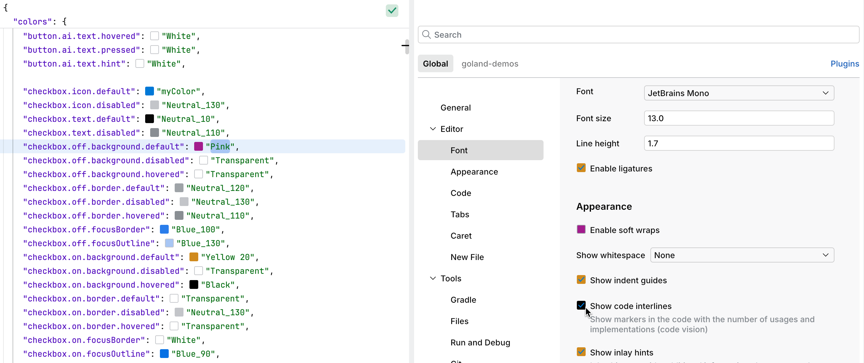
The checkbox section defines the colors for checkboxes.
The provided keys define the visual styling for checkboxes, including their states (on, off, disabled, hovered) and specific visual elements (icon, text, background, border, focus outlines).
Checkboxes are styled to reflect their current state:
off: this represents an unchecked checkbox with neutral and transparent colors for the background and border.on: when a checkbox is selected.disabled: when the checkbox is unavailable for interaction.hovered: when the mouse pointer is over the checkbox.
Each checkbox consists of several visual components with specific styling for different states:
icon: the check icon inside the checkbox.text: the label text color.background: the checkbox background.focusBorder: borders of checkboxes.focusOutline: when the checkbox is in focus.
Key | Value | Type |
|---|---|---|
|
|
|
|
|
|
|
|
|
|
|
|
|
|
|
|
|
|
|
|
|
|
|
|
|
|
|
|
|
|
|
|
|
|
|
|
|
|
|
|
|
|
|
|
|
|
|
|
|
|
|
|
|
|
|
|
|
|
|
|
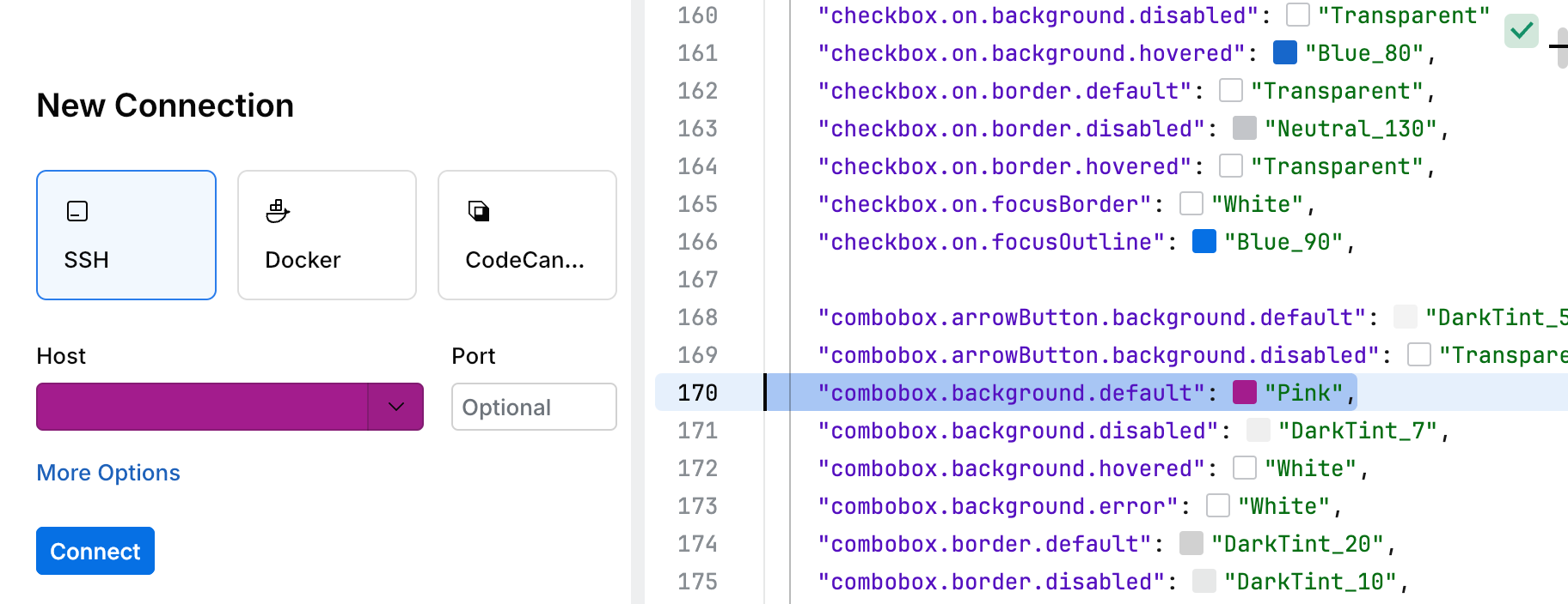
Comboboxes combine text input and dropdown functionality. They support multiple visual and functional states. For example, consider the SSH connect page (refer to the screenshot in this section).
The combobox supports several visual states:
default: the normal state of the component.hovered: when the mouse pointer is over the component.focused: when the component is focused for input.disabled: when the component is unavailable for interaction.error: indicates invalid input with specific styling.
Key | Value | Type |
|---|---|---|
|
|
|
|
|
|
|
|
|
|
|
|
|
|
|
|
|
|
|
|
|
|
|
|
|
|
|
|
|
|
|
|
|
|
|
|
|
|
|
|
|
|
|
|
|
|
|
|
|
|
|
|
|
|
The completion list is a UI component that displays a list of suggestions for the current context.
The completion list includes the following visual elements:
text: the color of the text.background: the color of the text highlight.

Key | Value | Type |
|---|---|---|
|
|
|
|
|
|
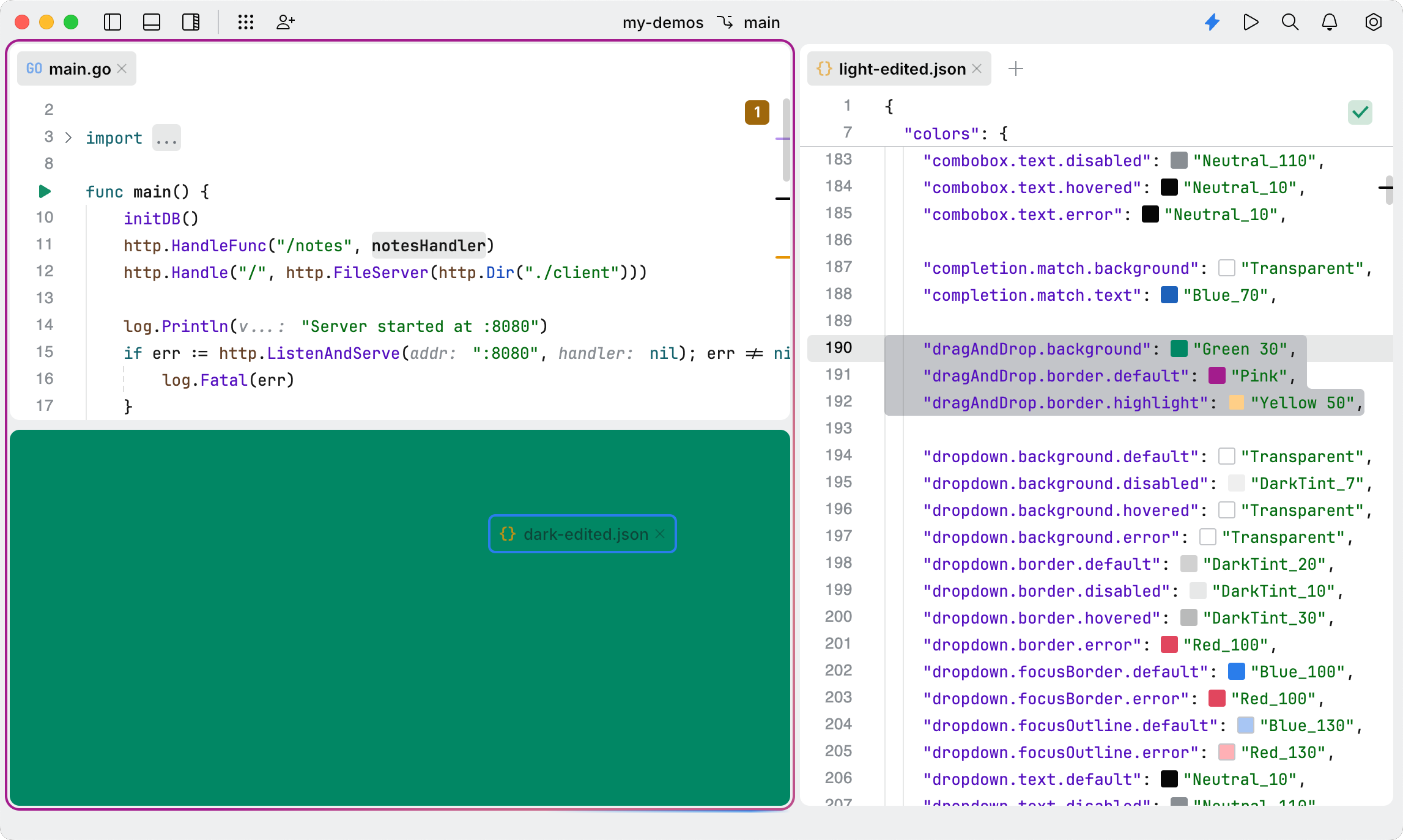
The drag-and-drop feature enables the movement of items between components of the code editor. For example, you can drag a tab to position it below another tab or beside it.
The drag and drop has the following styling options:
background: defines the main color of the draggable item.border.default: specifies the color used to visually indicate the area where the item is being dragged.border.highlight: defines an additional color used to highlight the area where the item is being dragged. On the following screenshot, it appears as a gradient ofborder.default.
Key | Value | Type |
|---|---|---|
|
|
|
|
|
|
|
|
|
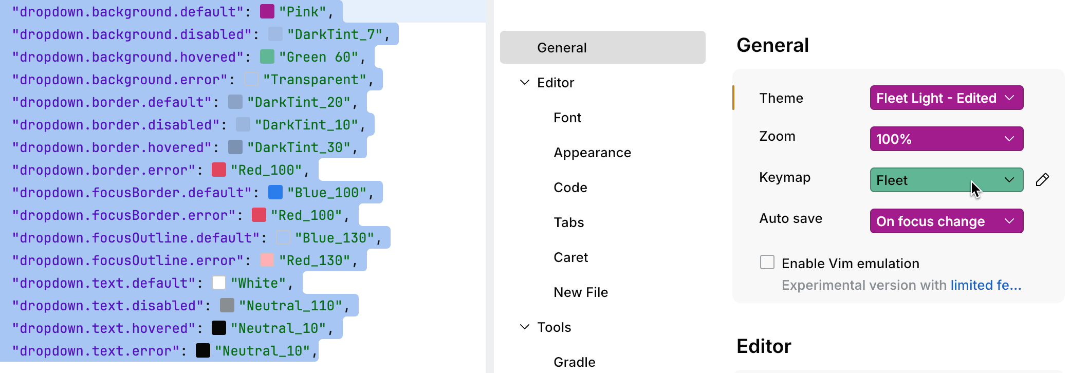
A dropdown is a user interface (UI) element that displays a list of options or actions when activated.
The dropdown includes the following components:
background: the dropdown background.border: the border of the dropdown.text: the text displayed within the dropdown.focus: the color applied to the dropdown when it gains focus (for example, when a user interacts with it using the mouse or keyboard).error: the color is used for the dropdown when it has an erroneous value.
The dropdown component supports several visual states:
default: the normal state when a user does not interact with the dropdown.hovered: highlighted when the mouse pointer is over the dropdown.disabled: visually muted to show that the dropdown is not interactive.error: the color is used for the dropdown when it has an erroneous value.focused: highlights the dropdown to indicate it has focus, often used for navigation or selection.
Key | Value | Type |
|---|---|---|
|
|
|
|
|
|
|
|
|
|
|
|
|
|
|
|
|
|
|
|
|
|
|
|
|
|
|
|
|
|
|
|
|
|
|
|
|
|
|
|
|
|
|
|
|
|
|
|
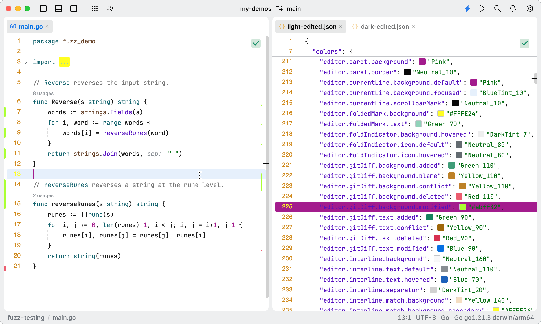
The editor.* keys configure colors for various editor elements, including line numbers, the caret, code foldings, and Git information about changed lines in the gutter.
The following screenshot demonstrates different color modifications for the editor.* keys. The modified keys are listed below:
"editor.caret.background": "Pink": changes the caret's background color toPink."editor.currentLine.background.default": "Pink": colors the background of the currently selected line inPink."editor.foldedMark.background": "#FFFE24"and"editor.foldedMark.text": "Green 70": adjusts the colors for code folding marks. Refer to theimportsection on the screenshot."editor.gitDiff.background.modified": "#abff32": highlights modified lines in the gutter, showing code insight information about changes tracked by Git."editor.lineNumber.current": "#FFFE24"and"editor.lineNumber.default": "Yellow 20": colors line numbers in the gutter.
Key | Value | Type |
|---|---|---|
|
|
|
|
|
|
|
|
|
|
|
|
|
|
|
|
|
|
|
|
|
|
|
|
|
|
|
|
|
|
|
|
|
|
|
|
|
|
|
|
|
|
|
|
|
|
|
|
|
|
|
|
|
|
|
|
|
|
|
|
|
|
|
|
|
|
|
|
|
|
|
|
|
|
|
|
|
|
|
|
|
|
|
|
|
|
|
|
|
|
|
|
|
|
|
|
|
|
|
|
|
|
|
|
|
|
|
|
|
|
|
|
|
|
|
|
|
|
|
|
|
|
|
|
|
|
|
|
|
|
|
|
|
|
|
|
|
|
|
|
|
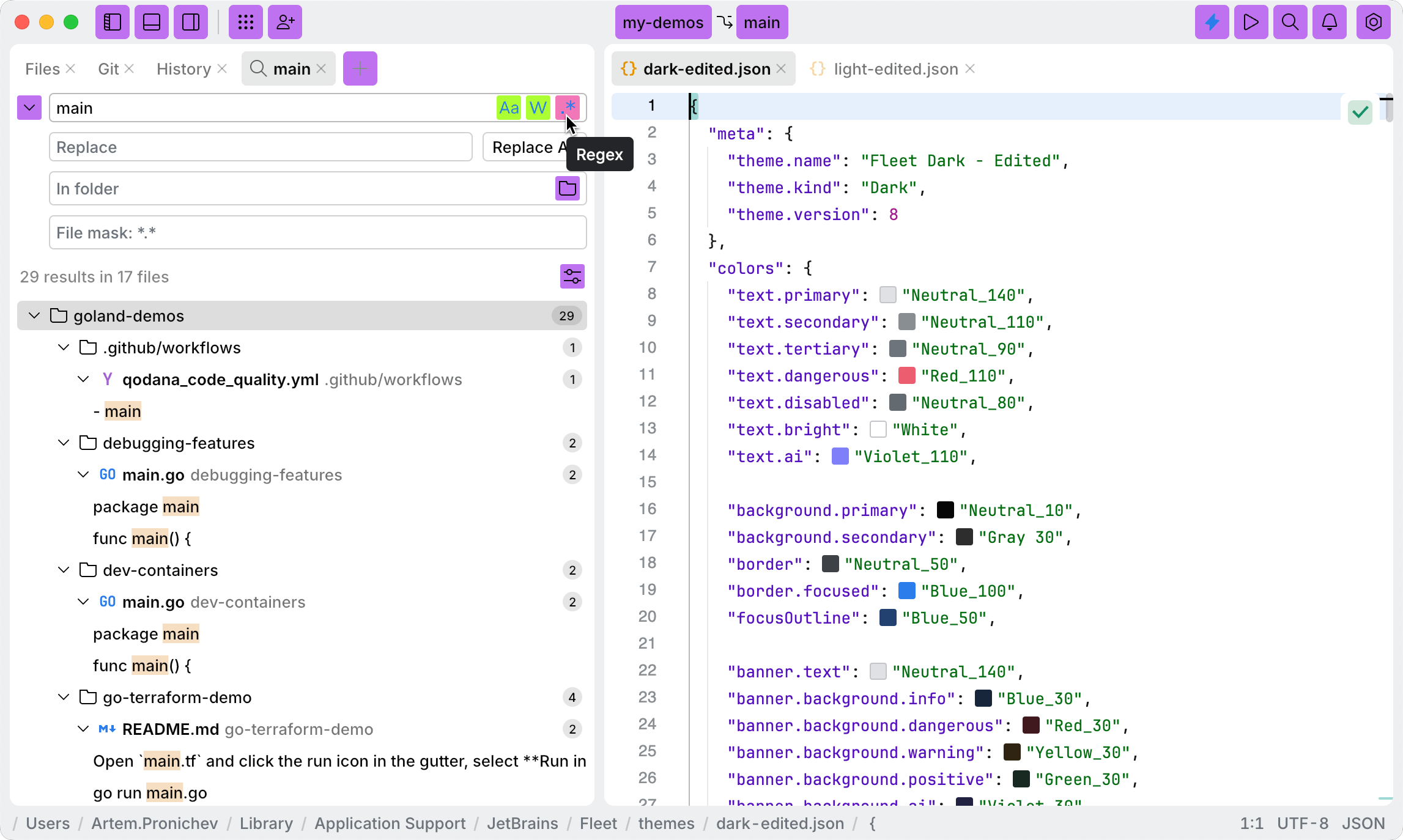
Ghost buttons are UI components intended for secondary or tertiary actions. They are commonly used in toolbars or areas with multiple buttons.
In JetBrains Fleet, ghost buttons are used in the following scenarios:
Buttons for panels, tools, Git support, workspace, and similar functions in the toolbar.
Filtering options in the Search/Replace tool.
The following screenshot illustrates various color modifications for the ghostButton.* keys. The modified keys are detailed below:
"ghostButton.off.background.default": "#be73f0": specifies the background color of all ghost buttons in the top toolbar, such as Panel, Tools, Collaboration, Workspace, Current branch, and others."ghostButton.off.focusBorder": "#fdff32": defines the color of the border around ghost buttons."ghostButton.on.background.default": "#abff32": sets the background color of ghost buttons when there is no user interaction."ghostButton.on.background.hovered": "#f277b7": specifies the background color of ghost buttons when hovered over with a mouse.
Key | Value | Type |
|---|---|---|
|
|
|
|
|
|
|
|
|
|
|
|
|
|
|
|
|
|
|
|
|
|
|
|
|
|
|
|
|
|
|
|
|
|
|
|
|
|
|
|
|
|
|
|
|
|
|
|
|
|
|
|
|
|
|
|
|
|
|
|
|
|
|
|
|
|
|
|
|
|
|
|
|
|
|
|
|
|
|
|
|
|
|
|
Git branch tags are UI elements used in the Git view to display branch information. They visually represent local and remote branches, highlighting differences and aiding in version control workflows.
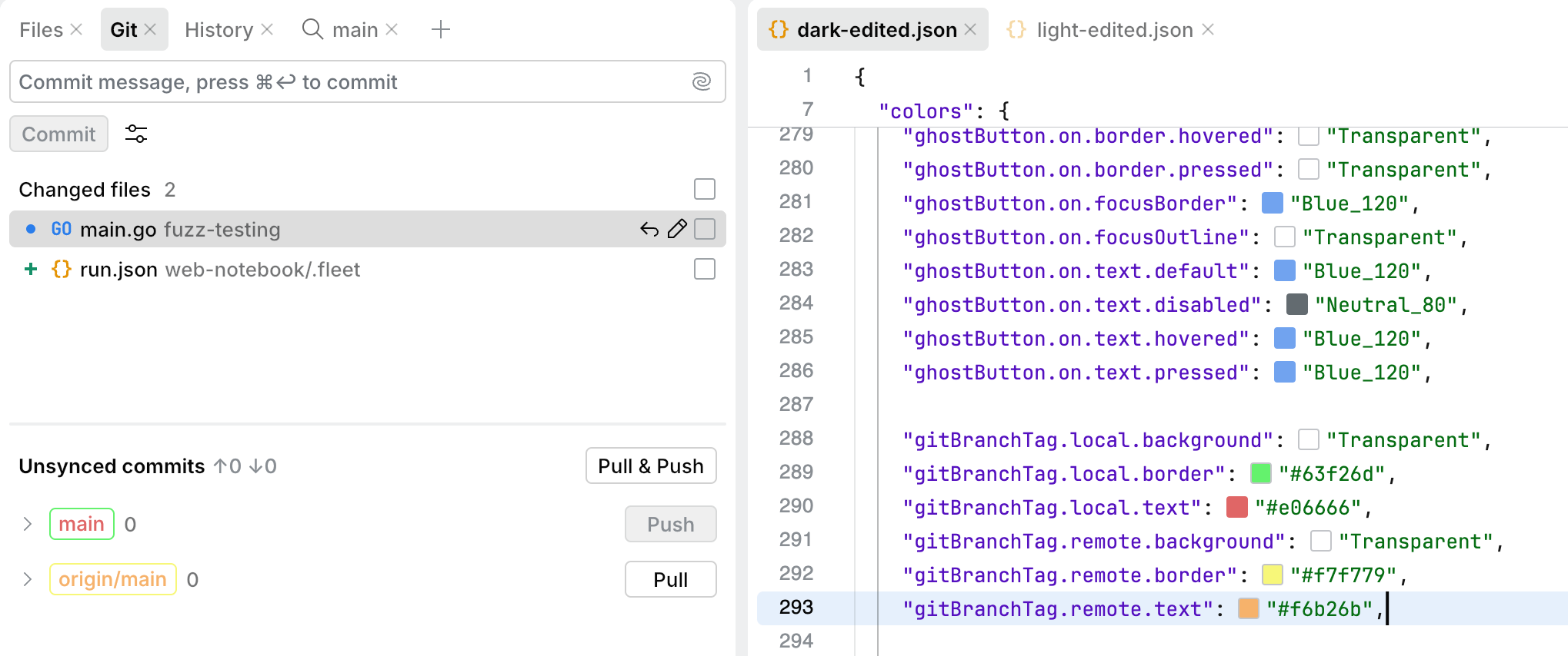
Key | Value | Type |
|---|---|---|
|
|
|
|
|
|
|
|
|
|
|
|
|
|
|
|
|
|
The highlight key defines the visual style for separators when users interact with them to resize windows.

Key | Value | Type |
|---|---|---|
|
|
|
|
|
|
|
|
|
|
|
|
The icon.* keys define colors for different icons: Gradle, number of notifications, and so on.

Key | Value | Type |
|---|---|---|
|
|
|
|
|
|
|
|
|
|
|
|
|
|
|
An input field refers to a text input component, a UI element that allows users to input, edit, and interact with text.

Key | Value | Type |
|---|---|---|
|
|
|
|
|
|
|
|
|
|
|
|
|
|
|
|
|
|
|
|
|
|
|
|
|
|
|
|
|
|
|
|
|
|
|
|
|
|
|
|
|
|
|
|
|
|
|
|
|
|
|
|
|
|
|
|
|
|
|
|
|
|
|
|
|
|
|
|
|
|
|
|
|
|
|
|
|
|
The island.background key controls the background of the editor and tool panels.
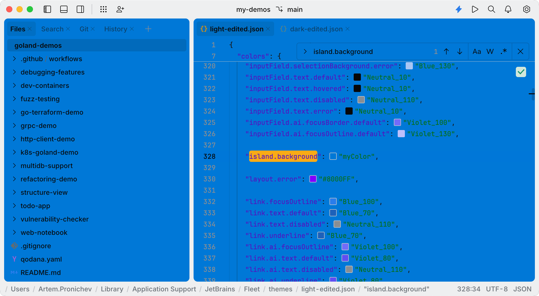
Key | Value | Type |
|---|---|---|
|
|
|
The layout key highlights errors in the layout.
Key | Value | Type |
|---|---|---|
|
|
|
The link key defines the visual style for hyperlinks, including their text, focus outline, and underline styling. It also includes specific styling for AI-related links.
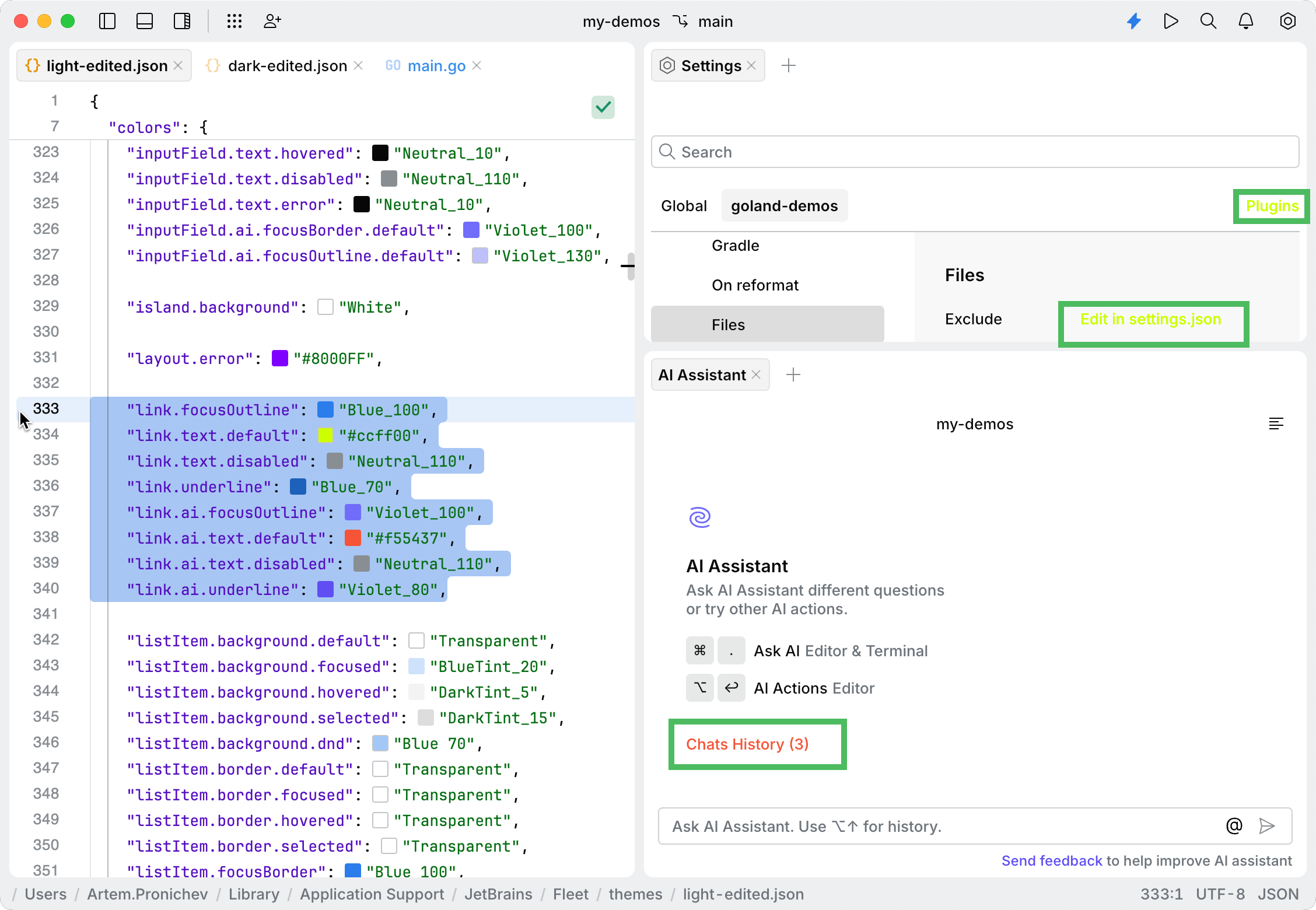
Key | Value | Type |
|---|---|---|
|
|
|
|
|
|
|
|
|
|
|
|
|
|
|
|
|
|
|
|
|
|
|
|
A list item is a visual element in a user interface that represents an entry in a list. It consists of different states and properties that define its appearance and behavior depending on user interactions. On the following screenshot, list items are items in the context menu and filenames in the File tab.
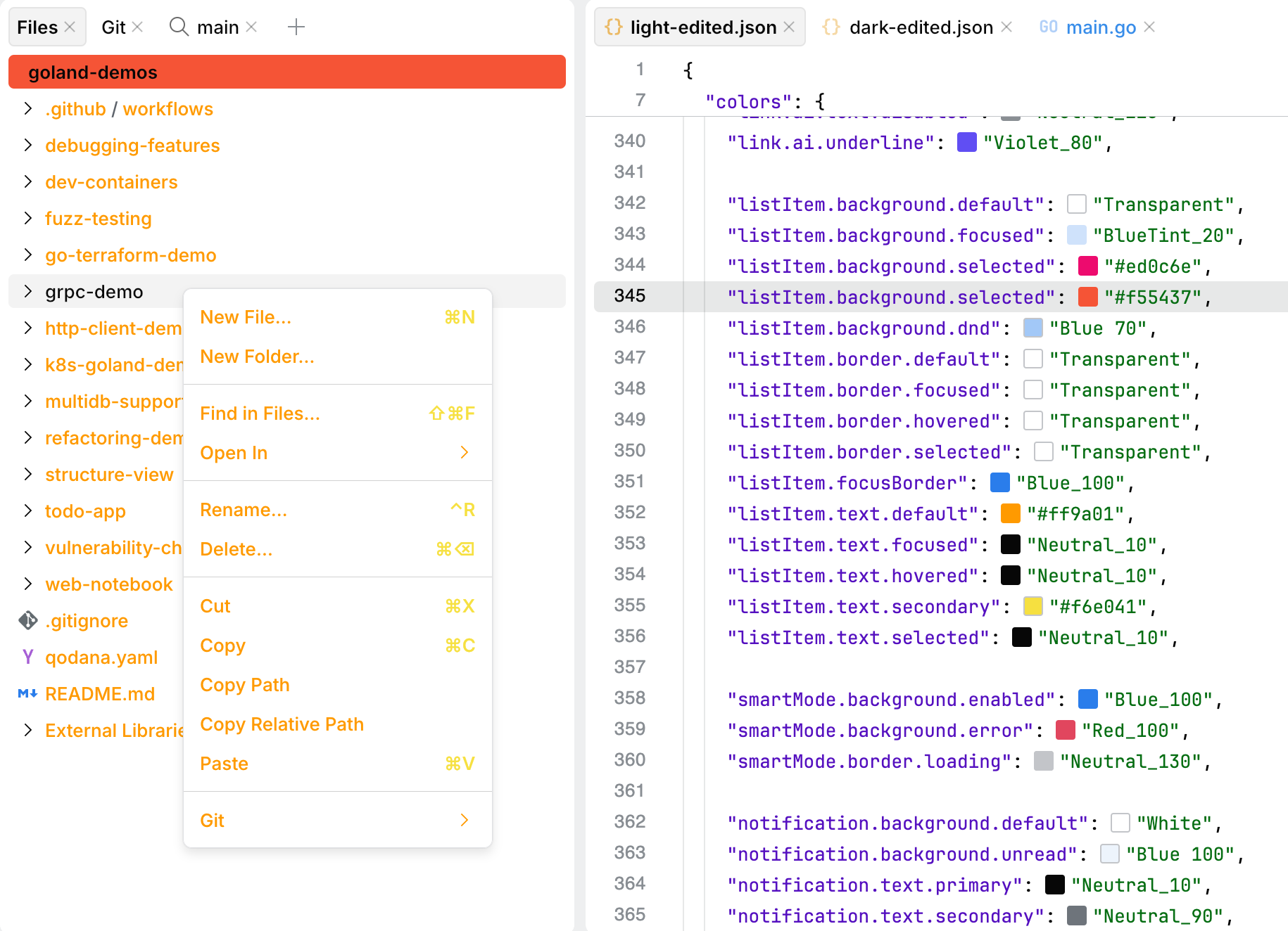
Key | Value | Type |
|---|---|---|
|
|
|
|
|
|
|
|
|
|
|
|
|
|
|
|
|
|
|
|
|
|
|
|
|
|
|
|
|
|
|
|
|
|
|
|
|
|
|
|
|
|
|
|
|
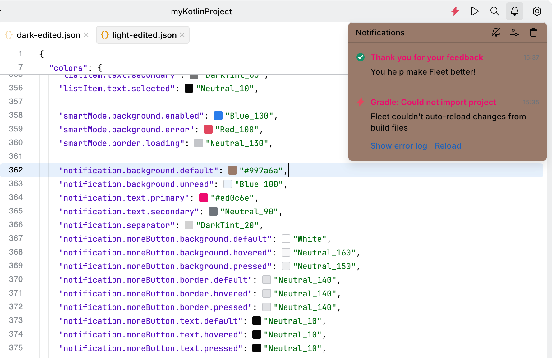
Notifications are messages that inform you about events or actions. They can appear in different forms: as standard notifications in a notification center, floating notifications that appear temporarily, or notification bubbles with a configurable delay (10 seconds by default).
Use the following keys to configure the appearance of notifications. Notifications include settings for background colors, text colors, separators, and the More button.
Key | Value | Type |
|---|---|---|
|
|
|
|
|
|
|
|
|
|
|
|
|
|
|
|
|
|
|
|
|
|
|
|
|
|
|
|
|
|
|
|
|
|
|
|
|
|
|
|
|
|
The parameter information popup displays the names of parameters in method and function calls. It helps you understand the required arguments while you write or review code.
To call the popup, press when the caret is within the parentheses of a function or a method.

Key | Value | Type |
|---|---|---|
|
|
|
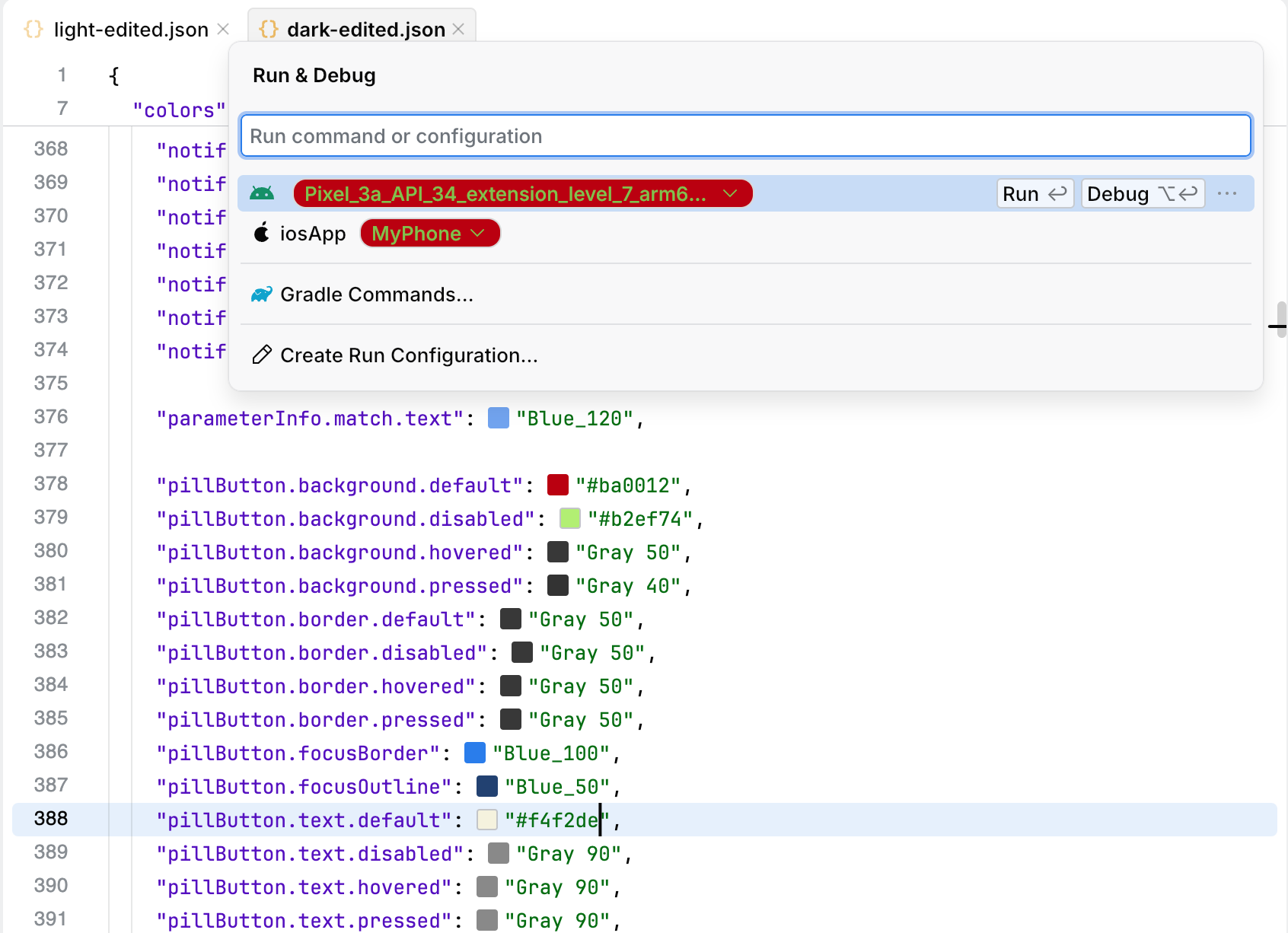
Pill buttons are a variant of standard buttons with fully rounded corners. These buttons are used in the Run & Debug window.
Use the following keys to configure the appearance of pill buttons, including background, border, and text states.
Key | Value | Type |
|---|---|---|
|
|
|
|
|
|
|
|
|
|
|
|
|
|
|
|
|
|
|
|
|
|
|
|
|
|
|
|
|
|
|
|
|
|
|
|
|
|
|
|
|
|
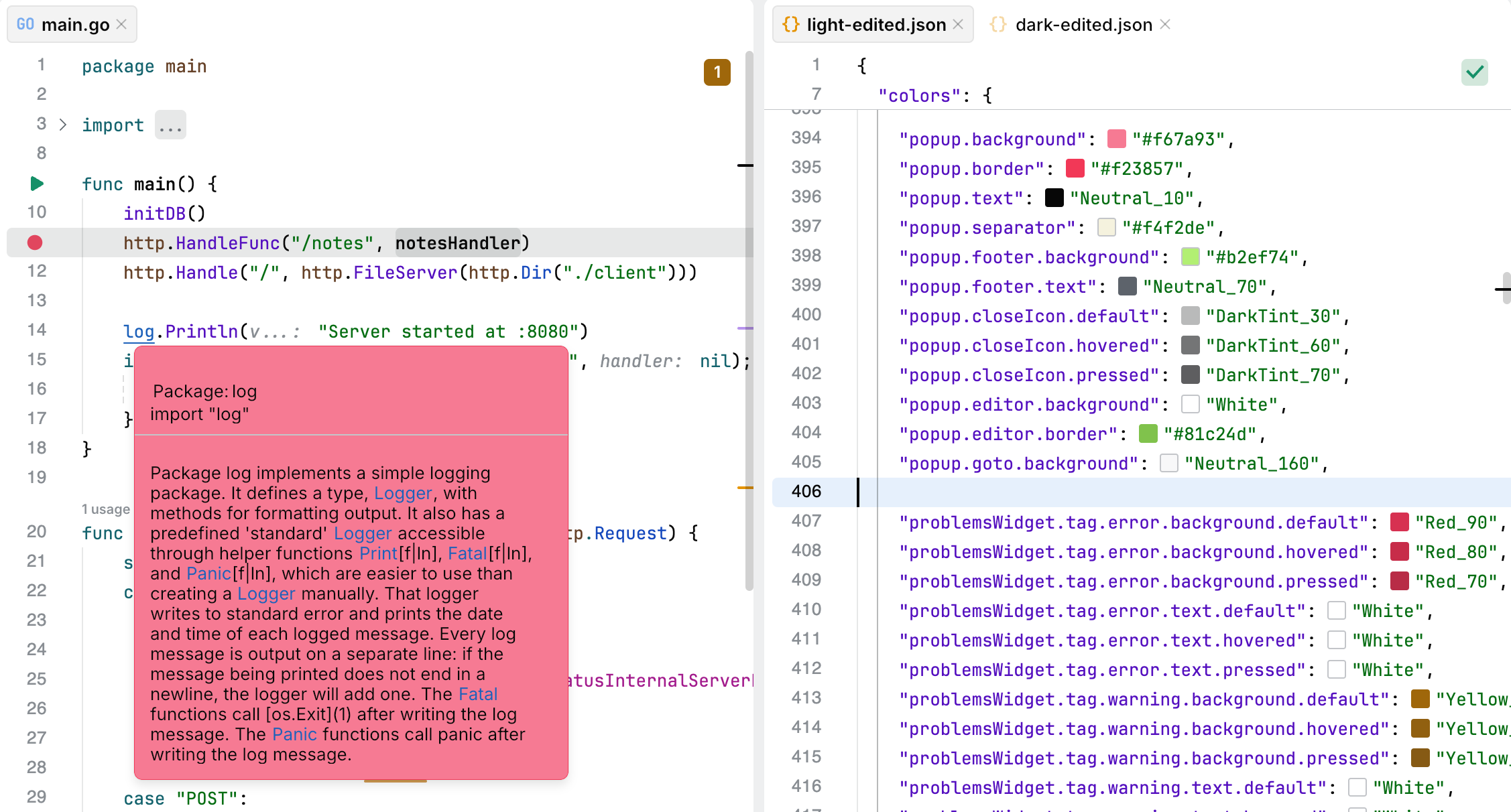
Popups provide contextual information and actions within the editor. They might display quick documentation, usages, quick-fixes, code completion suggestions, or other relevant information.
Use the following keys to configure the appearance of popups, including background, text, borders, separators, and close icon states.
Key | Value | Type |
|---|---|---|
|
|
|
|
|
|
|
|
|
|
|
|
|
|
|
|
|
|
|
|
|
|
|
|
|
|
|
|
|
|
|
|
|
The Problems widget displays issues that JetBrains Fleet detects in your project. The widget, located in the top-right corner of the editor, shows the number of problems categorized by severity (errors, warnings, and weak warnings) detected in the current file.
You can click the widget to open a list of problems for the file. Also, you can expand individual problem cards to see more details.

Key | Value | Type |
|---|---|---|
|
|
|
|
|
|
|
|
|
|
|
|
|
|
|
|
|
|
|
|
|
|
|
|
|
|
|
|
|
|
|
|
|
|
|
|
|
|
|
|
|
|
|
|
|
|
|
|
|
|
|
|
|
|
|
|
|
|
|
|
|
|
|
|
|
|
|
|
|
|
|
|
|
|
|
|
|
|
|
|
|
|
|
|
A progress bar is a visual indicator that shows the progression of an ongoing operation. It can display either a determinate or indeterminate state. Determinate progress bars indicate the known percentage of work completed, while indeterminate progress bars convey ongoing activity when the exact progress cannot be determined.
The progress bar supports two types:
Determinate progress bar: displays the progress as a known percentage and animates smoothly between progress updates.
Indeterminate progress bar: used when the progress cannot be determined and displays an animated gradient effect to indicate ongoing activity.

Key | Value | Type |
|---|---|---|
|
|
|
|
|
|
|
|
|
|
|
|
The inline progress indicator is especially useful when you need to show progress without blocking or significantly altering the UI layout, as it overlays the existing content with a subtle animation. To see an example of inline progress animation, disable and then enable the Smart Mode.

Key | Value | Type |
|---|---|---|
|
|
|
Color of the progress spinner. For example, during the analysis of your code in the editor.

Key | Value | Type |
|---|---|---|
|
|
|
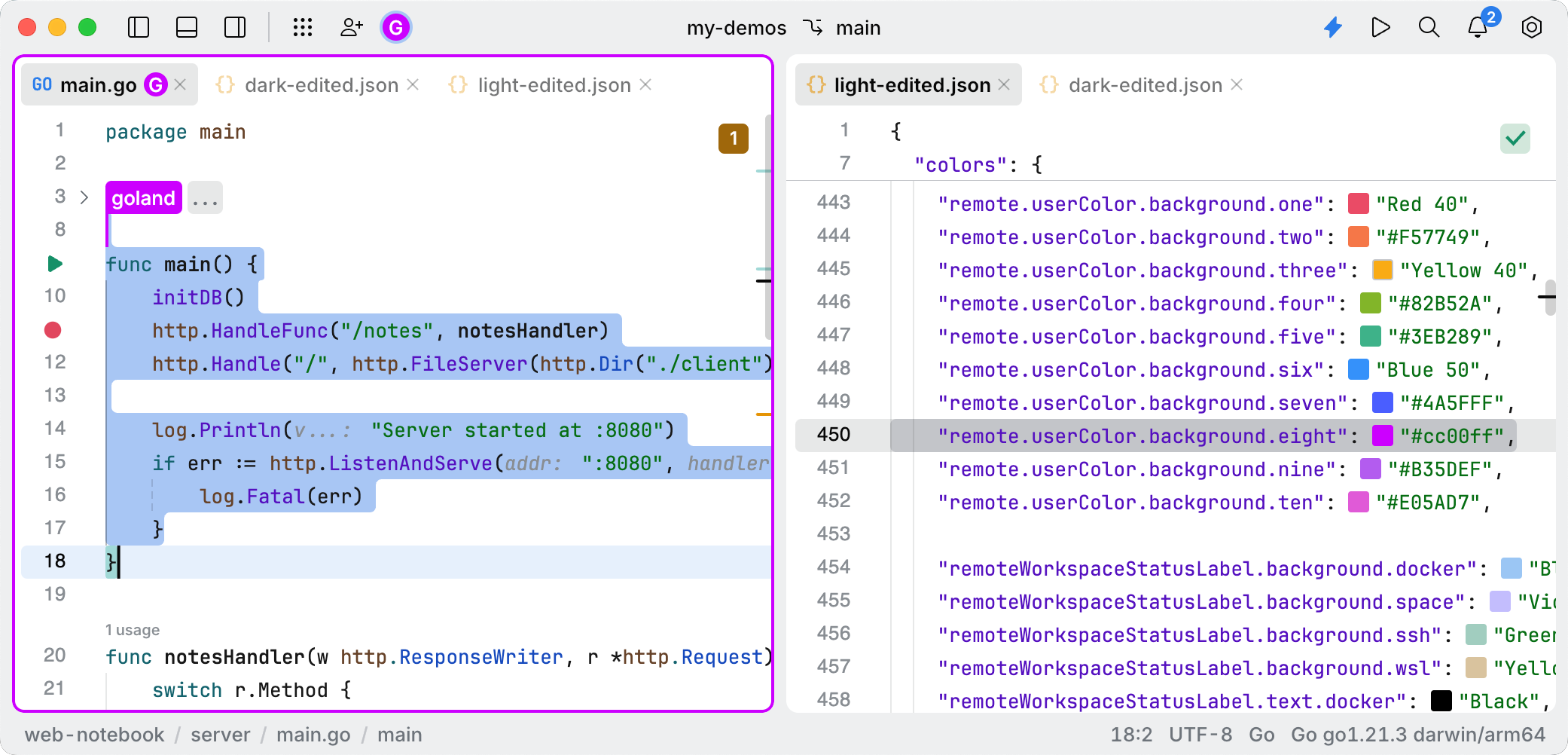
The remote.userColor.* keys define user colors during a collaborative development session. User colors are randomly selected but follow a predictable pattern.
The user color implementation has the following characteristics:
Random but deterministic: meaning that the selection appears random but follows a consistent and predictable pattern. The user's ID hash code is used as a seed for randomization.
Predefined color set: uses a fixed set of 10 theme-defined colors, identified by the keys:
remote.userColor.background.onethroughremote.userColor.background.tenColors are selected from these theme keys.
Usage context: used primarily in user icons or avatars. The colors serve as a background for circular user avatars and are paired with white text showing user initials. Additionally, the colors are used to highlight panels that the user is interacting with.
Colors are assigned to users in the following way:
Each user gets a consistent color based on their user ID.
The same user always gets the same color across sessions.
Colors are theme-aware and come from the application's theme system.
Key | Value | Type |
|---|---|---|
|
|
|
|
|
|
|
|
|
|
|
|
|
|
|
|
|
|
|
|
|
|
|
|
|
|
|
|
|
|
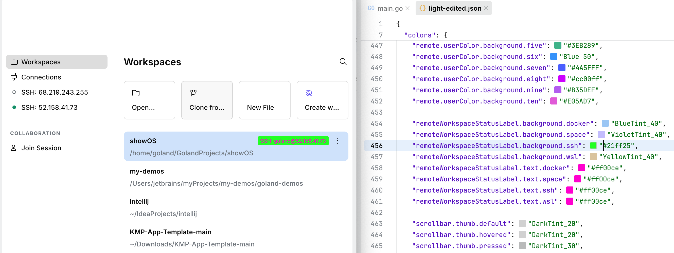
The remoteWorkspaceStatusLabel identifies the type of remote connection. Supported types include SSH, Remote Development, Docker, and WSL (Windows Subsystem for Linux). Each type is visually distinguished with its own specific icon and color scheme to ensure clarity and ease of identification.
Key | Value | Type |
|---|---|---|
|
|
|
|
|
|
|
|
|
|
|
|
|
|
|
|
|
|
|
|
|
|
|
|
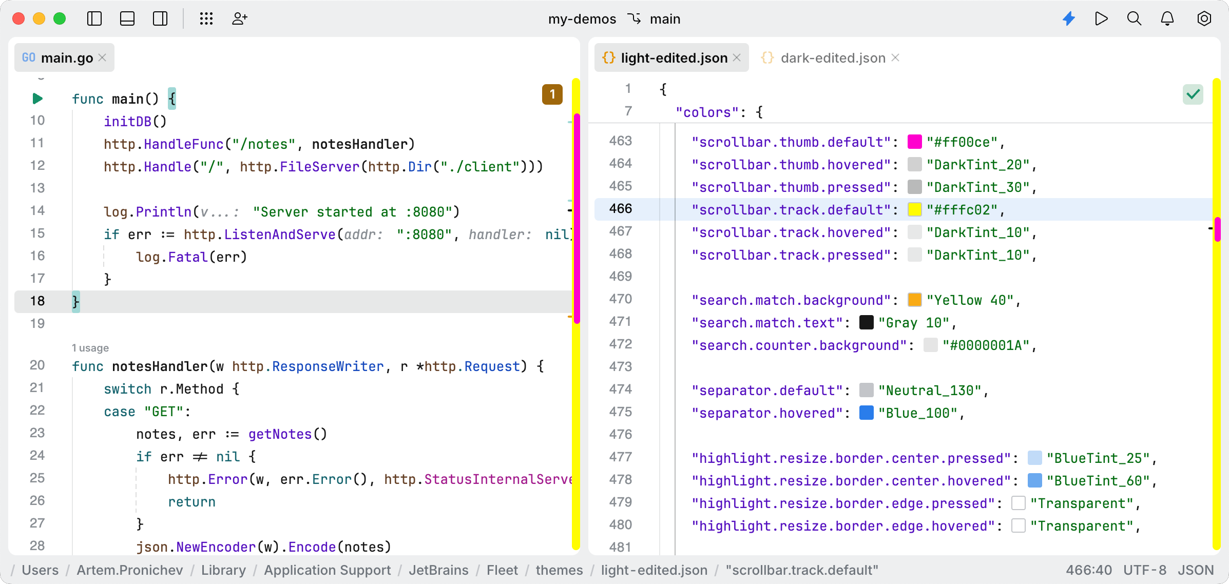
The scrollbar provides a visual indicator of the current scroll position within a scrollable area. It allows users to navigate through content efficiently. The appearance of the scrollbar can be customized to match the application's theme, including the thumb and track components.
Key | Value | Type |
|---|---|---|
|
|
|
|
|
|
|
|
|
|
|
|
|
|
|
|
|
|
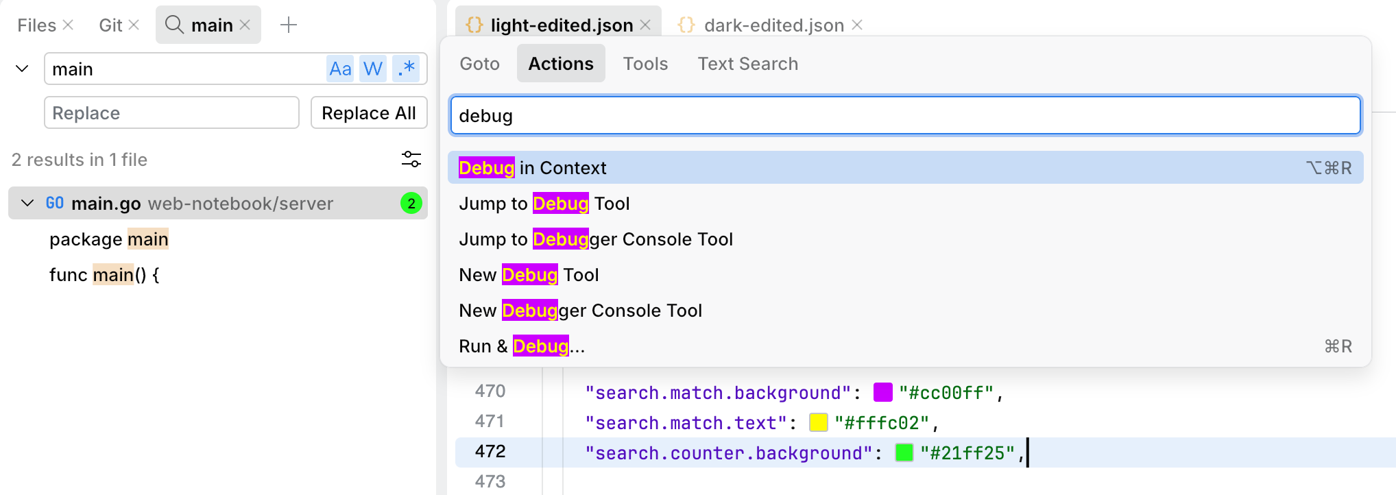
The search keys define the colors for found matches when you perform a search in the Tools window. The *.counter.* key configures the color of the counter that displays the number of found matches.
Key | Value | Type |
|---|---|---|
|
|
|
|
|
|
|
|
|
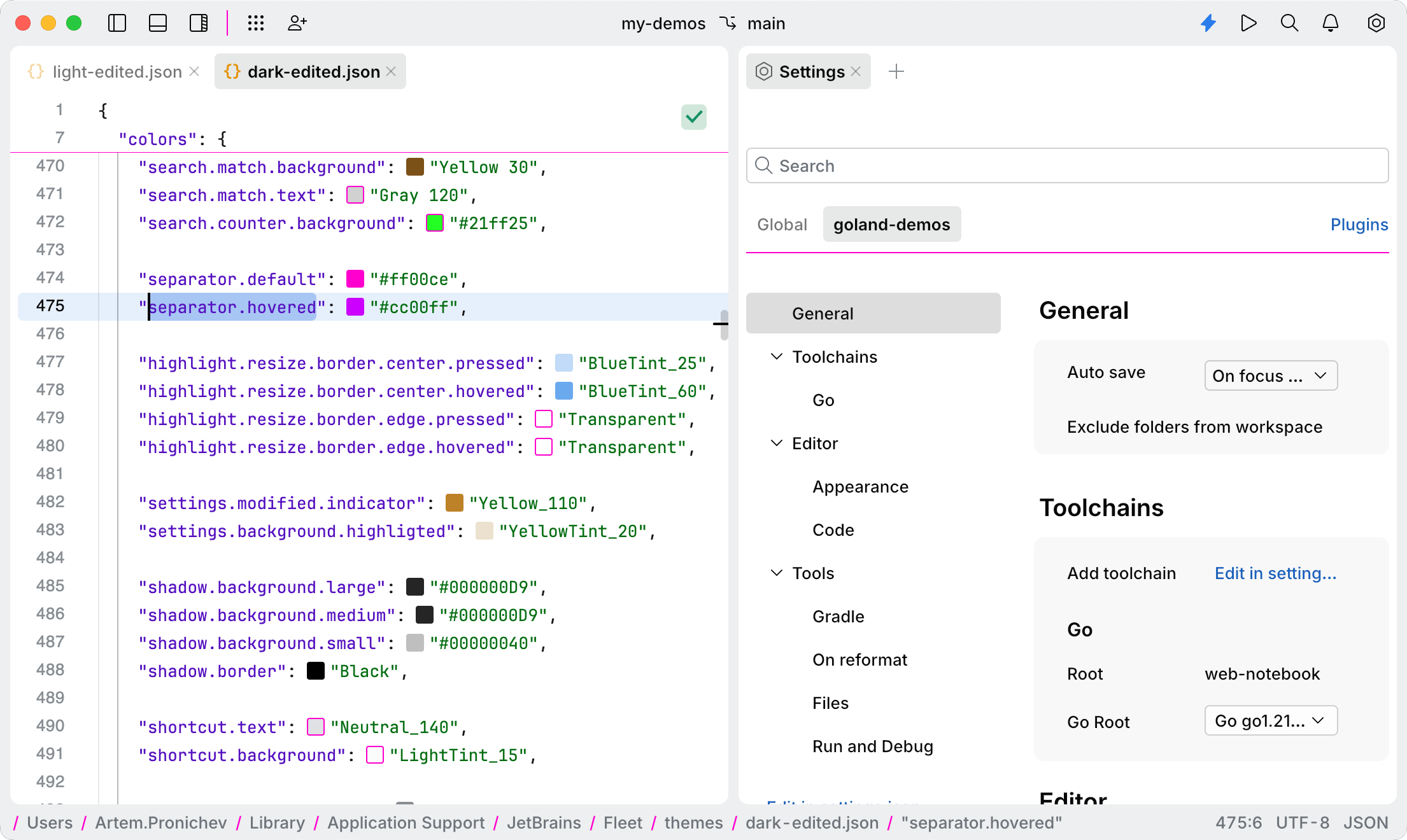
The separator keys define the colors of various separators in JetBrains Fleet, such as sticky lines, breadcrumbs, settings, and more.
Key | Value | Type |
|---|---|---|
|
|
|
|
|
|
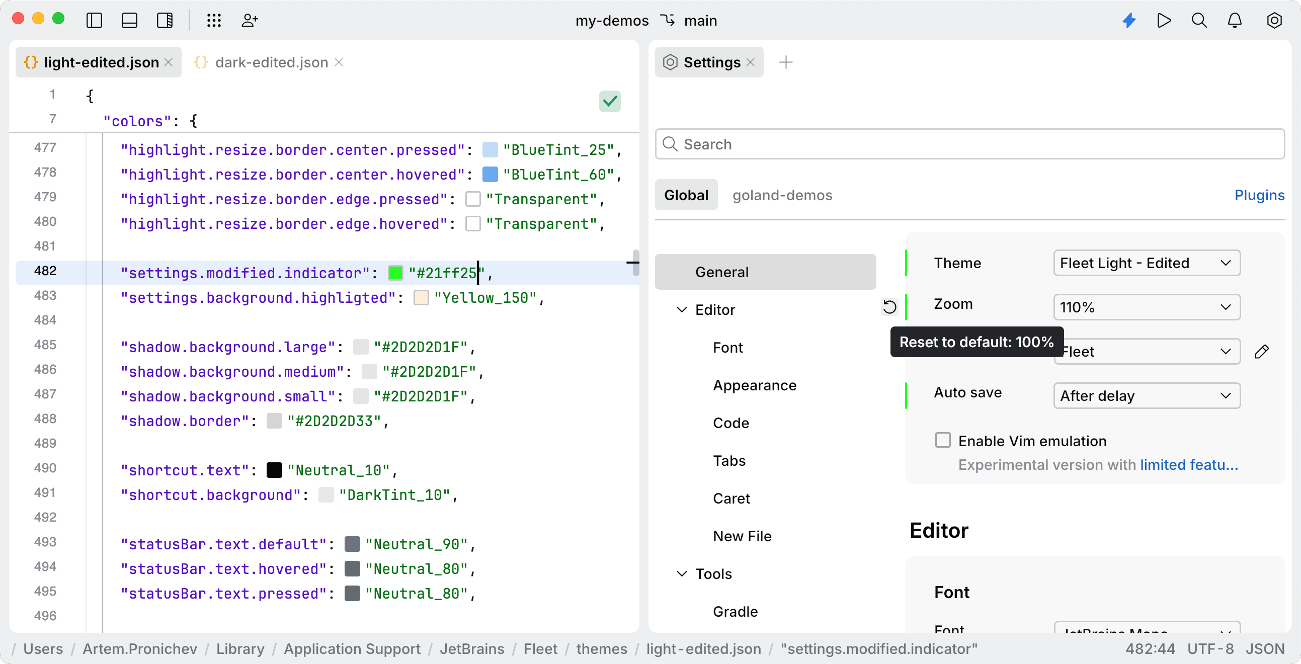
The settings keys control the color of the indicator in the settings that shows when a setting has been modified.
Key | Value | Type |
|---|---|---|
|
|
|
|
|
|
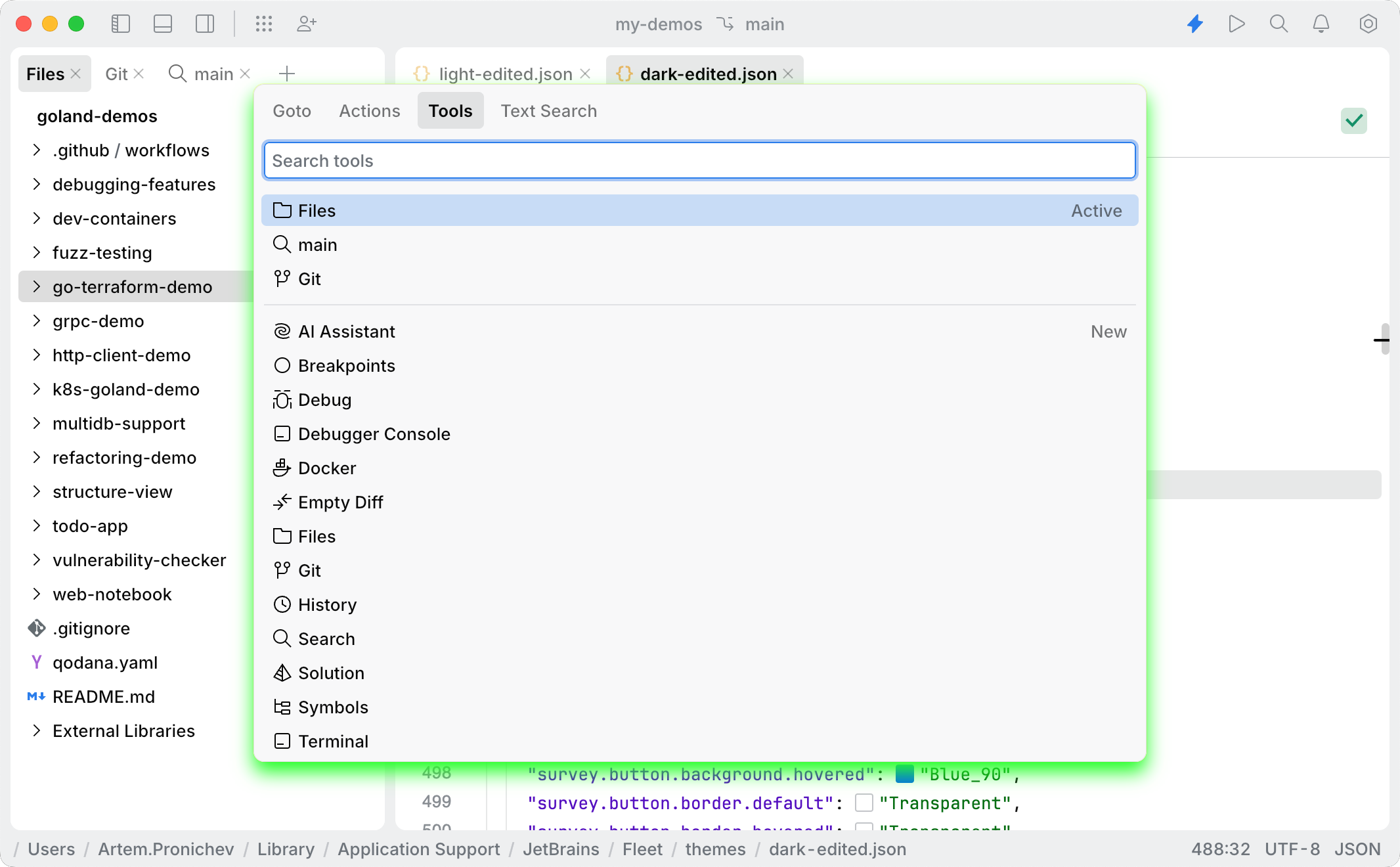
The shadow keys control the color of the shadow gradient for various menus and popups, such as search in the Tools window, quick documentation popups, quick-fix popups, and more.
Key | Value | Type |
|---|---|---|
|
|
|
|
|
|
|
|
|
|
|
|
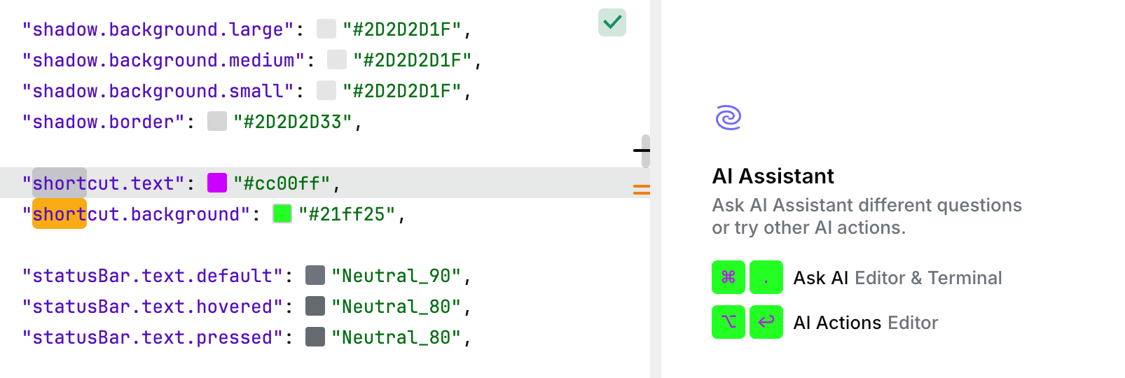
The shortcut keys define the colors for shortcuts in some UI components (for example, AI Assistant).
Key | Value | Type |
|---|---|---|
|
|
|
|
|
|
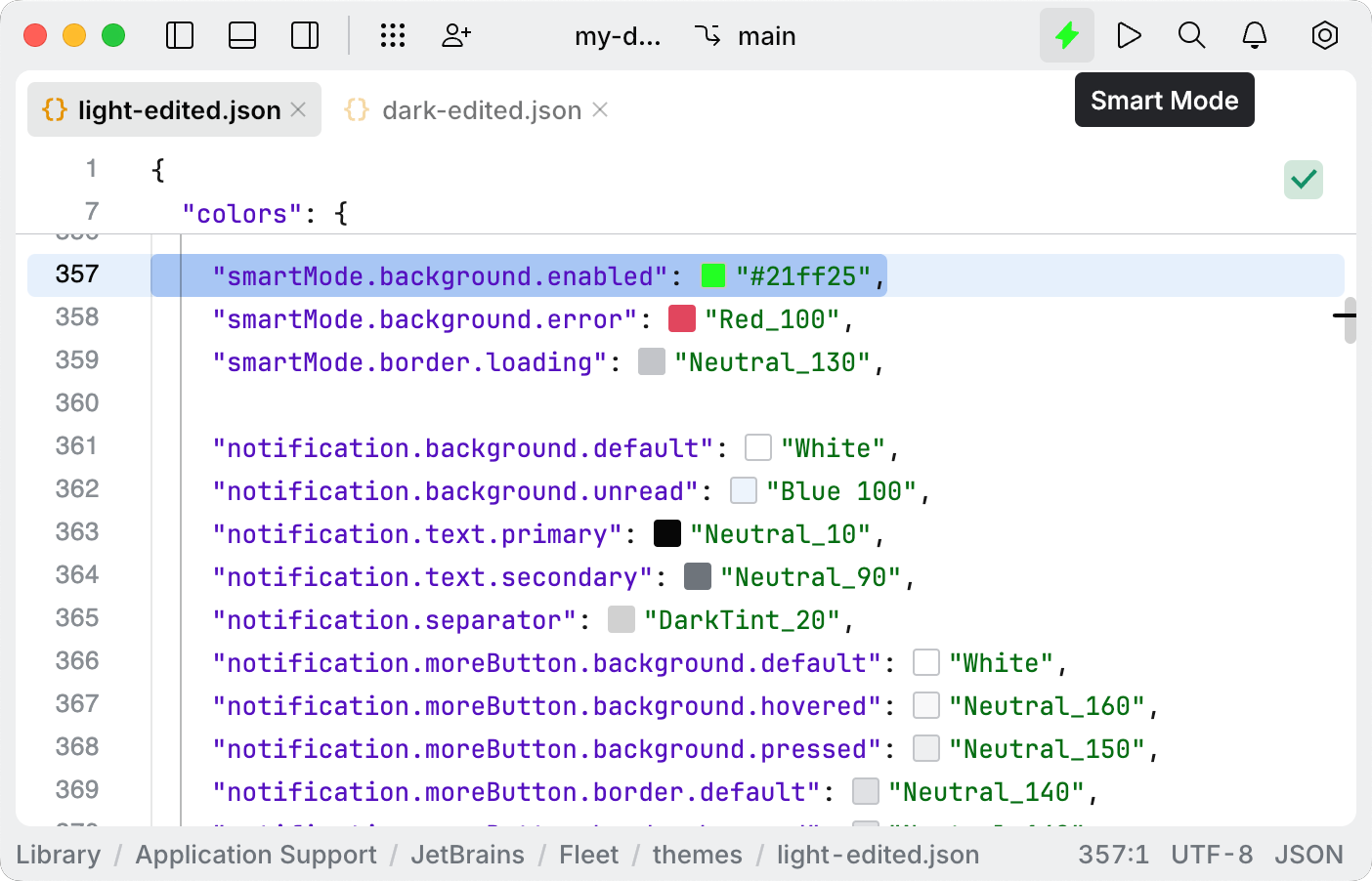
The smartMode keys control the color of the Smart Mode icon.
Key | Value | Type |
|---|---|---|
|
|
|
|
|
|
|
|
|
The statusBar keys control the color of the status bar at the bottom of the code editor.
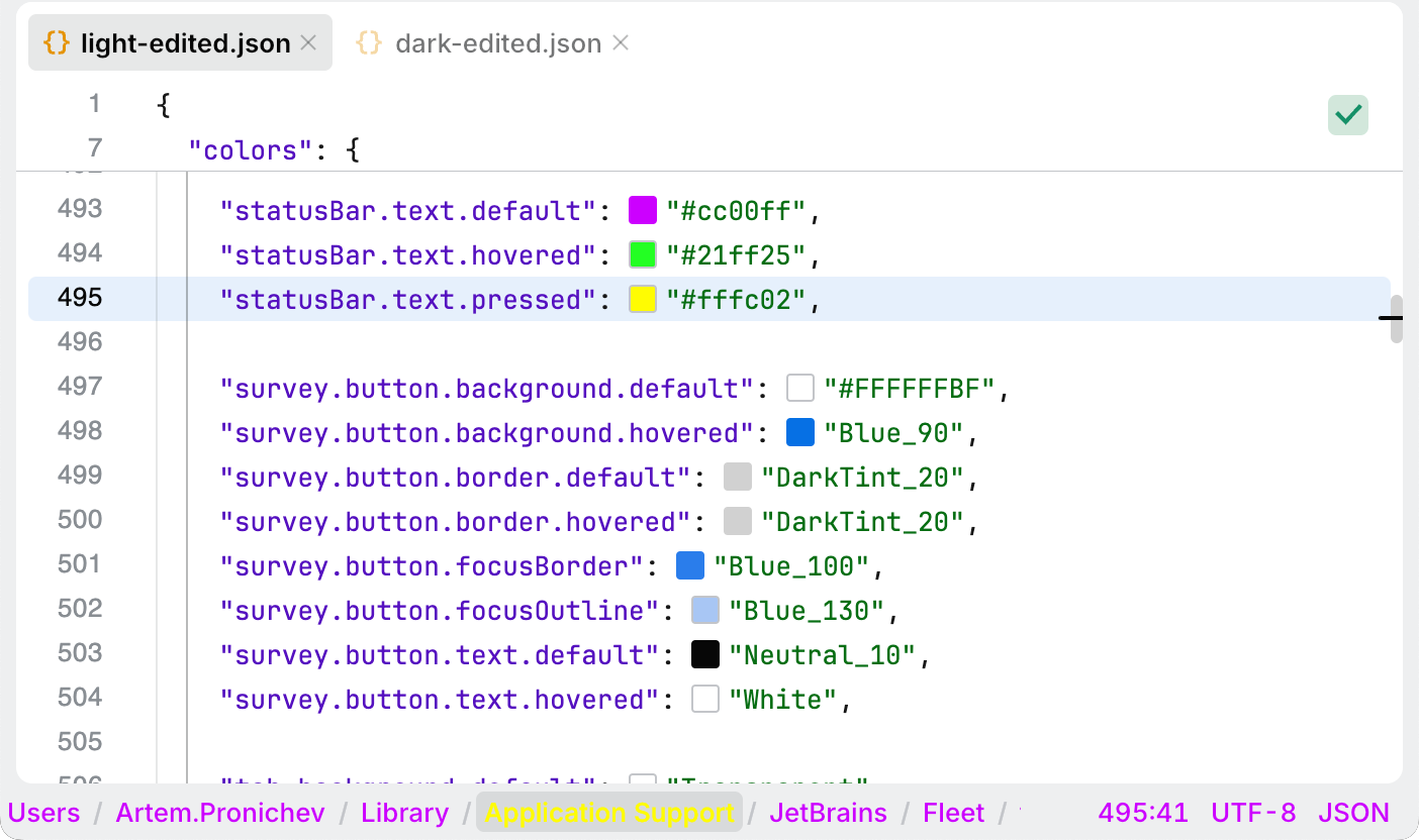
Key | Value | Type |
|---|---|---|
|
|
|
|
|
|
|
|
|
The survey keys configure the appearance of various surveys. These surveys are typically displayed as popup notifications to gather user feedback.
Surveys appear basing on specific usage conditions:
After a certain period of IDE usage
Upon reaching specific usage milestones
Following major feature interactions
After version updates
Key | Value | Type |
|---|---|---|
|
|
|
|
|
|
|
|
|
|
|
|
|
|
|
|
|
|
|
|
|
|
|
|
The tab keys configure the visual appearance of tabs, defining their background, border, text, close icon, and hint colors across various interaction states.
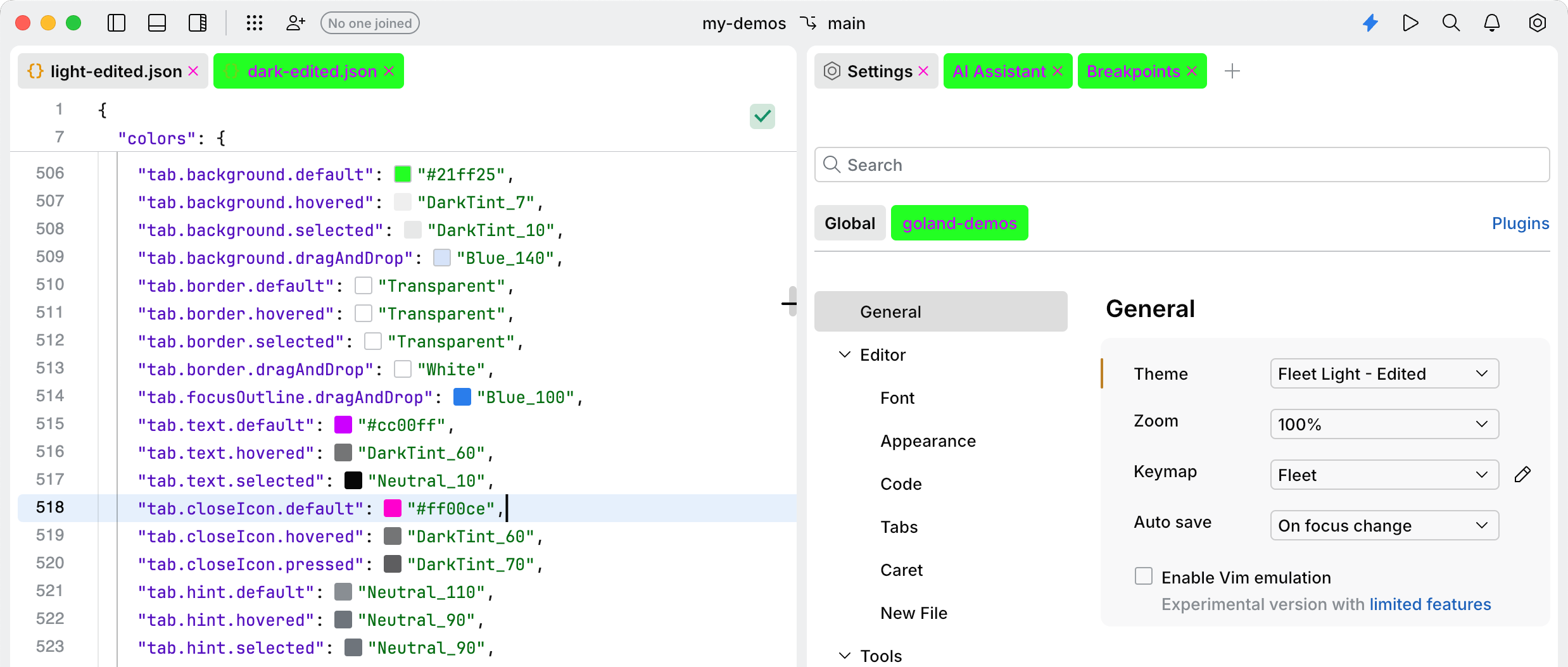
Key | Value | Type |
|---|---|---|
|
|
|
|
|
|
|
|
|
|
|
|
|
|
|
|
|
|
|
|
|
|
|
|
|
|
|
|
|
|
|
|
|
|
|
|
|
|
|
|
|
|
|
|
|
|
|
|
|
|
|
|
|
|
The terminal keys configure the visual appearance of text in the terminal.
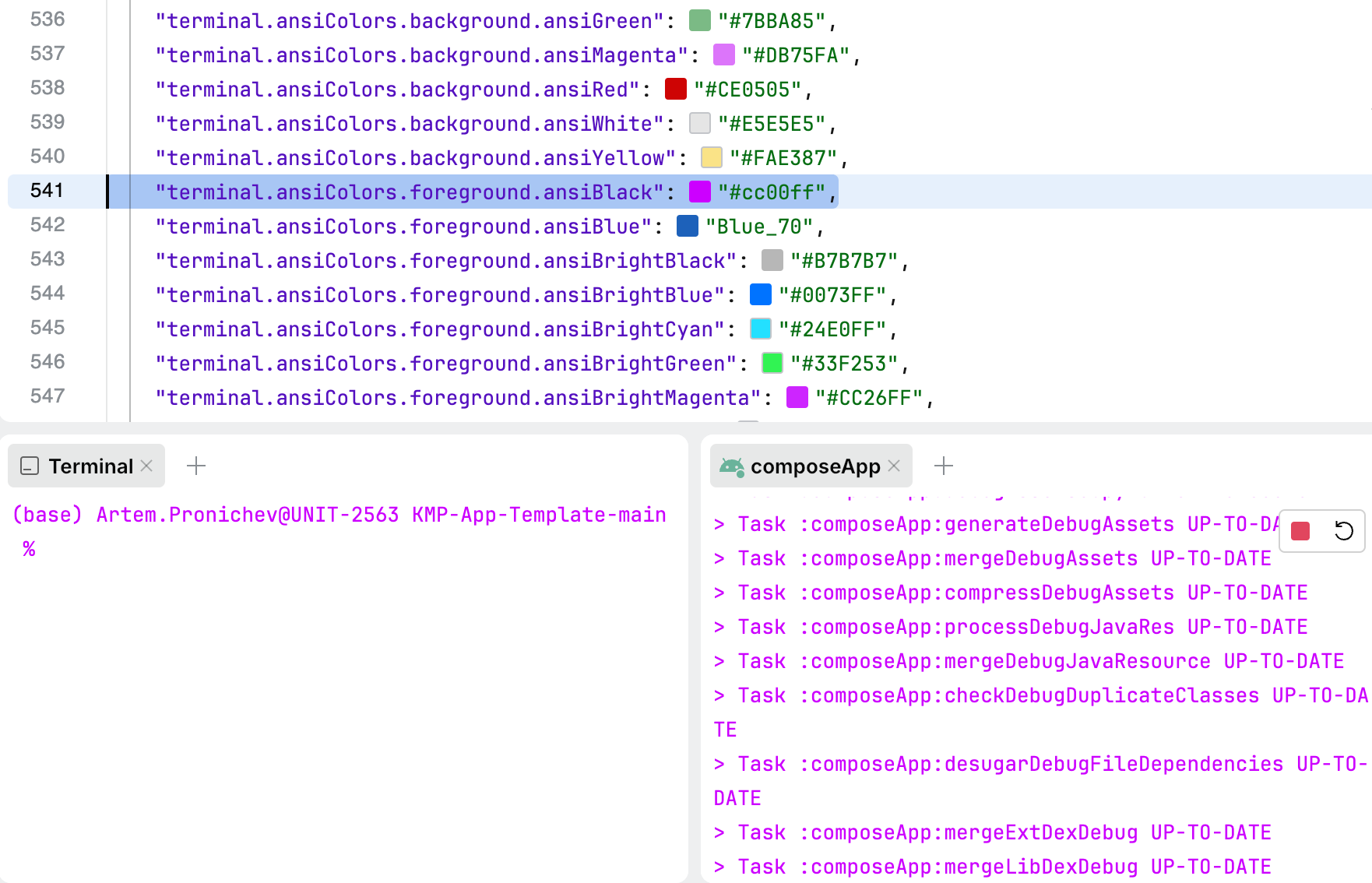
Key | Value | Type |
|---|---|---|
|
|
|
|
|
|
|
|
|
|
|
|
|
|
|
|
|
|
|
|
|
|
|
|
|
|
|
|
|
|
|
|
|
|
|
|
|
|
|
|
|
|
|
|
|
|
|
|
|
|
|
|
|
|
|
|
|
|
|
|
|
|
|
|
|
|
|
|
|
|
|
|
|
|
|
|
|
|
|
|
|
|
|
|
|
|
|
|
|
|
|
|
|
|
|
|
The text keys configure the visual appearance of text elements in the IDE. These keys define the colors for various text styles.
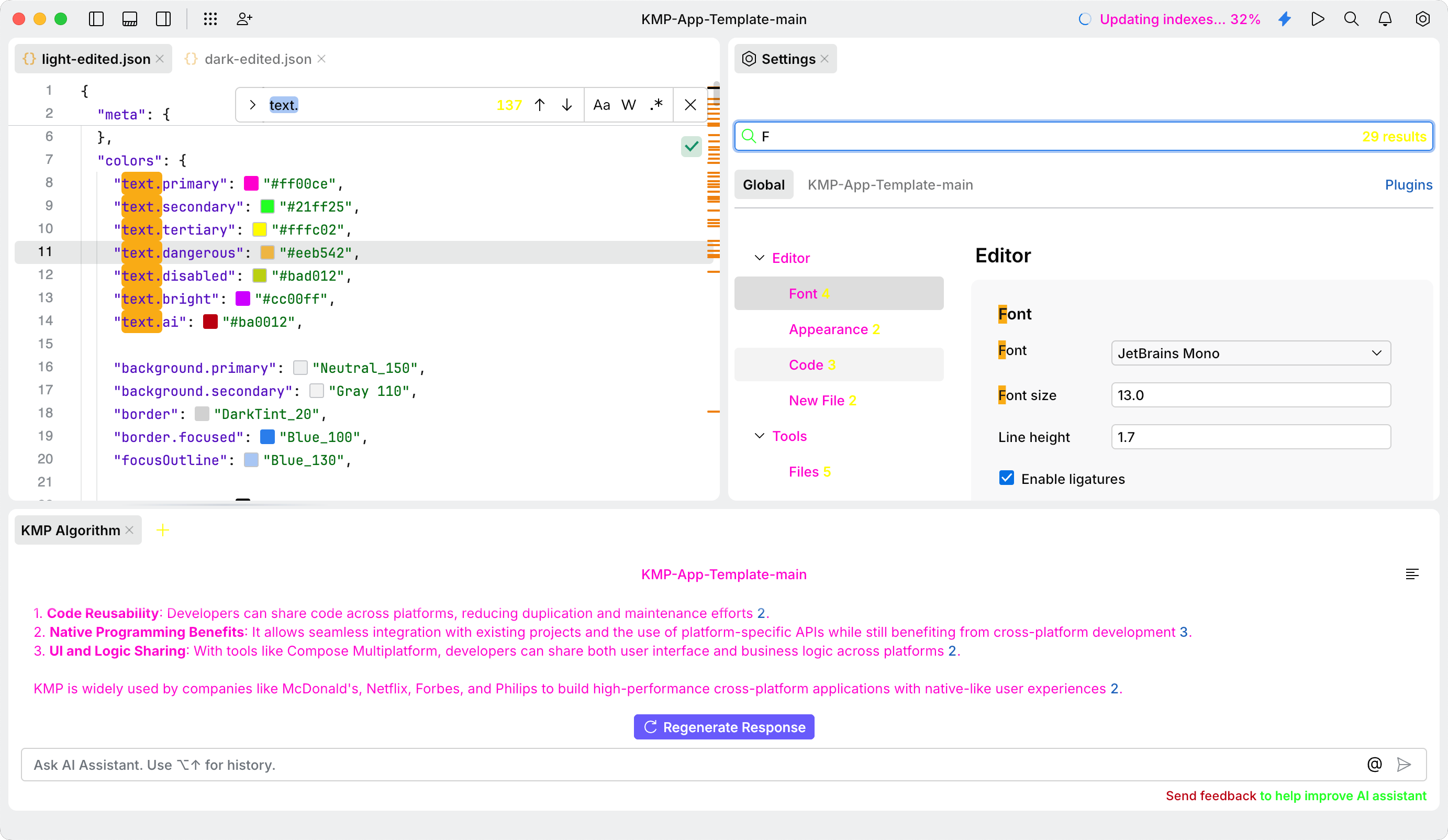
Key | Value | Type |
|---|---|---|
|
|
|
|
|
|
|
|
|
|
|
|
|
|
|
|
|
|
|
|
|
The tileButton keys configure the colors for tile buttons displayed on the Welcome screen.

Key | Value | Type |
|---|---|---|
|
|
|
|
|
|
|
|
|
|
|
|
|
|
|
|
|
|
|
|
|
|
|
|
|
|
|
|
|
|
|
|
|
|
|
|
|
|
|
|
|
|
|
|
|
|
|
|
|
|
|
|
|
|
|
|
|
|
|
|
|
|
|
|
|
|
|
|
|
|
|
|
|
|
|
|
|
|
|
|
|
|
|
|
|
|
|
|
|
|
|
|
|
|
|
|
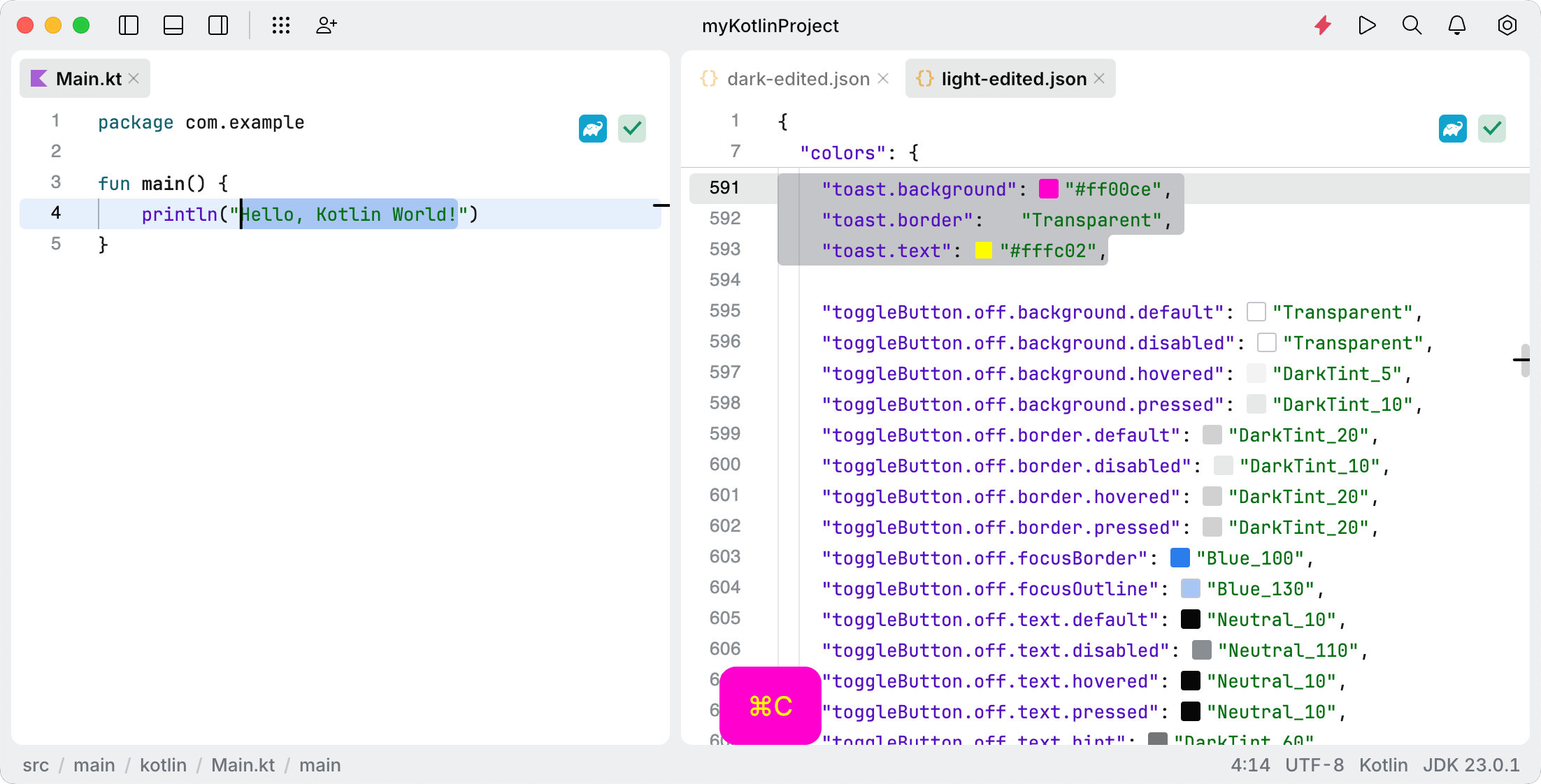
The toast popup appears in the editor and displays a shortcut that the user has used.
To enable the toast popup, open the settings by pressing . Then navigate to Application | Appearance and select the Show key combinations when using shortcuts option.
Key | Value | Type |
|---|---|---|
|
|
|
|
|
|
|
|
|
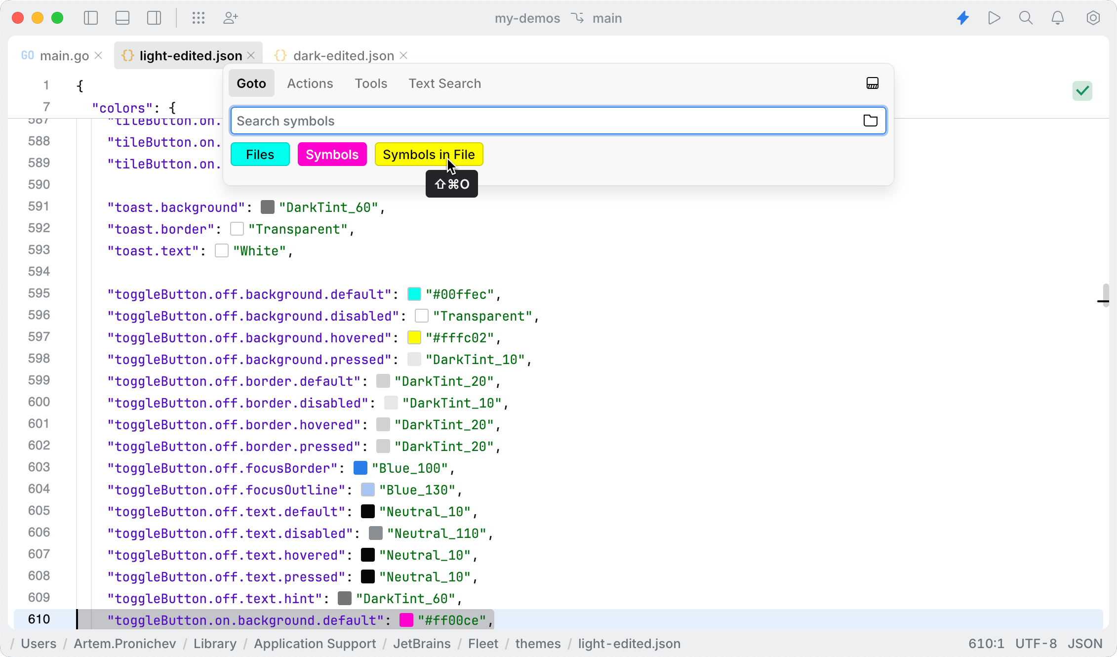
A toggle button is a UI component that allows users to switch between two states, typically "on" and "off." It is commonly used to enable or disable features, settings, or actions within an application. The toggle button provides visual feedback to indicate its current state. In JetBrains Fleet, examples of toggle buttons can be found in the Tools search window.
Key | Value | Type |
|---|---|---|
|
|
|
|
|
|
|
|
|
|
|
|
|
|
|
|
|
|
|
|
|
|
|
|
|
|
|
|
|
|
|
|
|
|
|
|
|
|
|
|
|
|
|
|
|
|
|
|
|
|
|
|
|
|
|
|
|
|
|
|
|
|
|
|
|
|
|
|
|
|
|
|
|
|
|
|
|
|
|
|
|
|
|
|
|
|
|
|
|
|
A tooltip is a UI component that displays brief contextual information when users hover over or focus on an element. Tooltips provide clarity and additional guidance without cluttering the interface.
To see an example of a tooltip, hover your mouse over the tab of an open file.

Key | Value | Type |
|---|---|---|
|
|
|
|
|
|
|
|
|
|
|
|
|
|
|
|
|
|
|
|
|
|
|
|
The tree keys configure the appearance of tree structures in the IDE, such as the nested folder structures displayed in the Files tool.

Key | Value | Type |
|---|---|---|
|
|
|
|
|
|
|
|
|
|
|
|
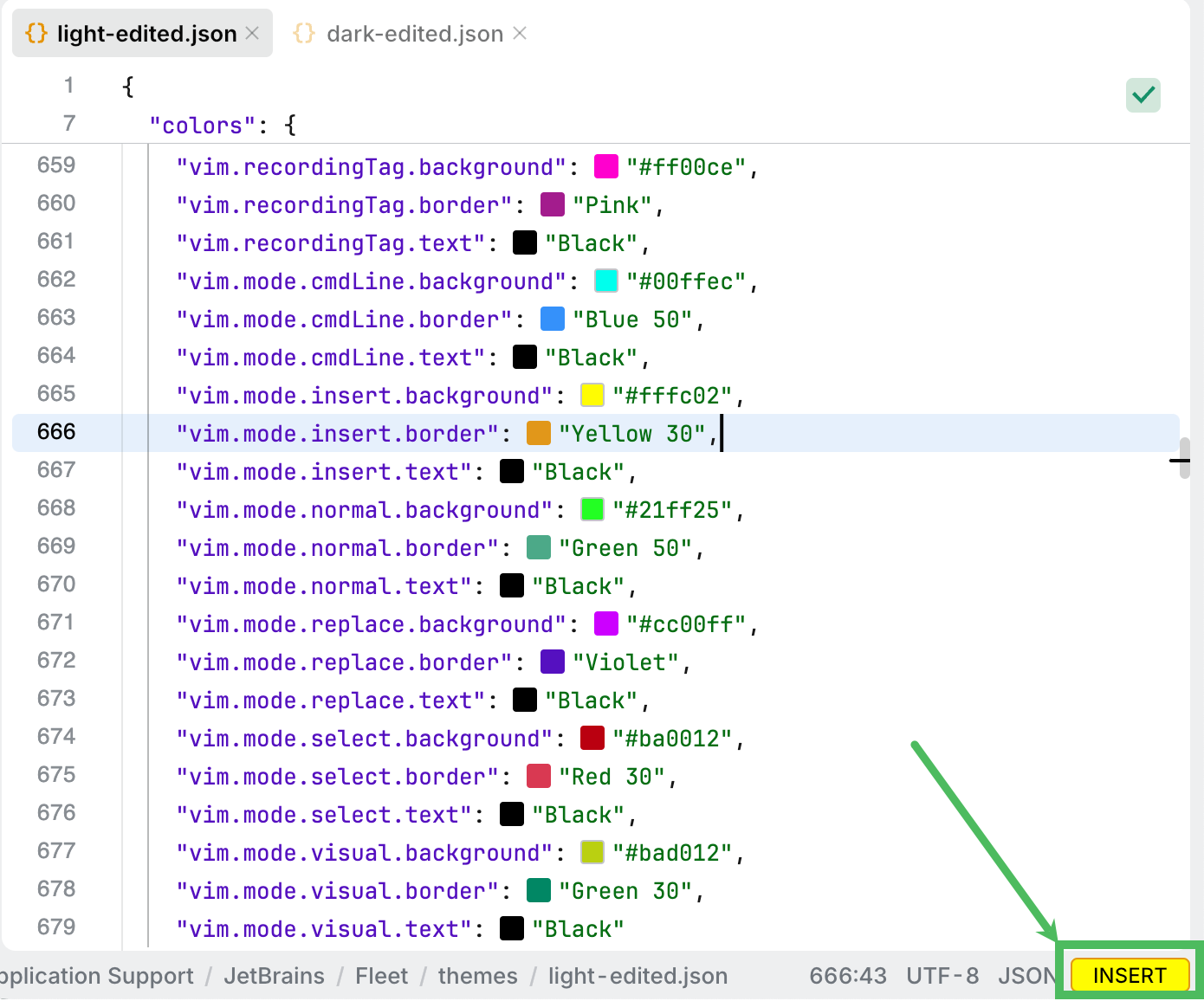
The vim keys configure the appearance of tags and indicators for different Vim modes in the code editor. The current Vim mode is displayed in a tag at the lower-right corner of the code editor, providing users with a visual representation of the active mode.
Key | Value | Type |
|---|---|---|
|
|
|
|
|
|
|
|
|
|
|
|
|
|
|
|
|
|
|
|
|
|
|
|
|
|
|
|
|
|
|
|
|
|
|
|
|
|
|
|
|
|
|
|
|
|
|
|
|
|
|
|
|
|
|
|
|
|
|
|
|
|
|
Defines text attributes used for syntax highlighting in the editor. This block is optional.
The following fallback rules are applied to this block:
If the
textAttributesblock is missing, the text attributes from the default Light or Dark theme are used (depending on thetheme.kindkey inmeta).If the
textAttributesblock is present, text attributes will not fall back to the parent theme. If an attribute is not found, it tries to fall back on another attribute in the same theme by dropping the last segment. If there is no fallback, the default text color is used.
Fallback example: "problem.warning.weak"-> "problem.warning"-> "problem"-> using default text color
The ai.generated key defines a background color for the code generated by AI Assistant.

Key | Value |
|---|---|
|
|
The attribute.css key defines a color of the attribute name in C++.

Key | Value |
|---|---|
|
|
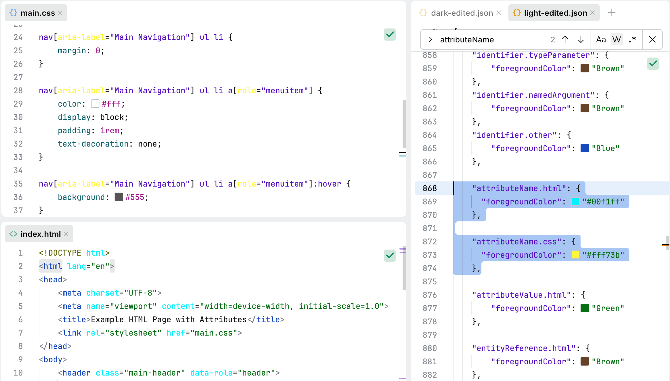
The attributeName keys specify colors for attribute names in HTML and CSS.
Key | Value |
|---|---|
|
|
|
|
The attributeValue.html key specifies the color for attribute values in HTML.

Key | Value |
|---|---|
|
|
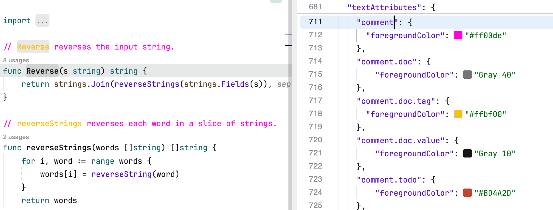
The comment.* keys define the visual styles applied to comments in code.
comment.buildConstraint.go: specifies the color for build constraint comments in Go code.comment.doc: sets the color for standard documentation comments.comment.doc.tag: defines the color for tags within documentation comments.comment.doc.value: determines the color for values associated with tags in documentation comments.comment.todo: assigns the color for TODO comments, making them easily identifiable.
Key | Value |
|---|---|
|
|
|
|
|
|
|
|
|
|
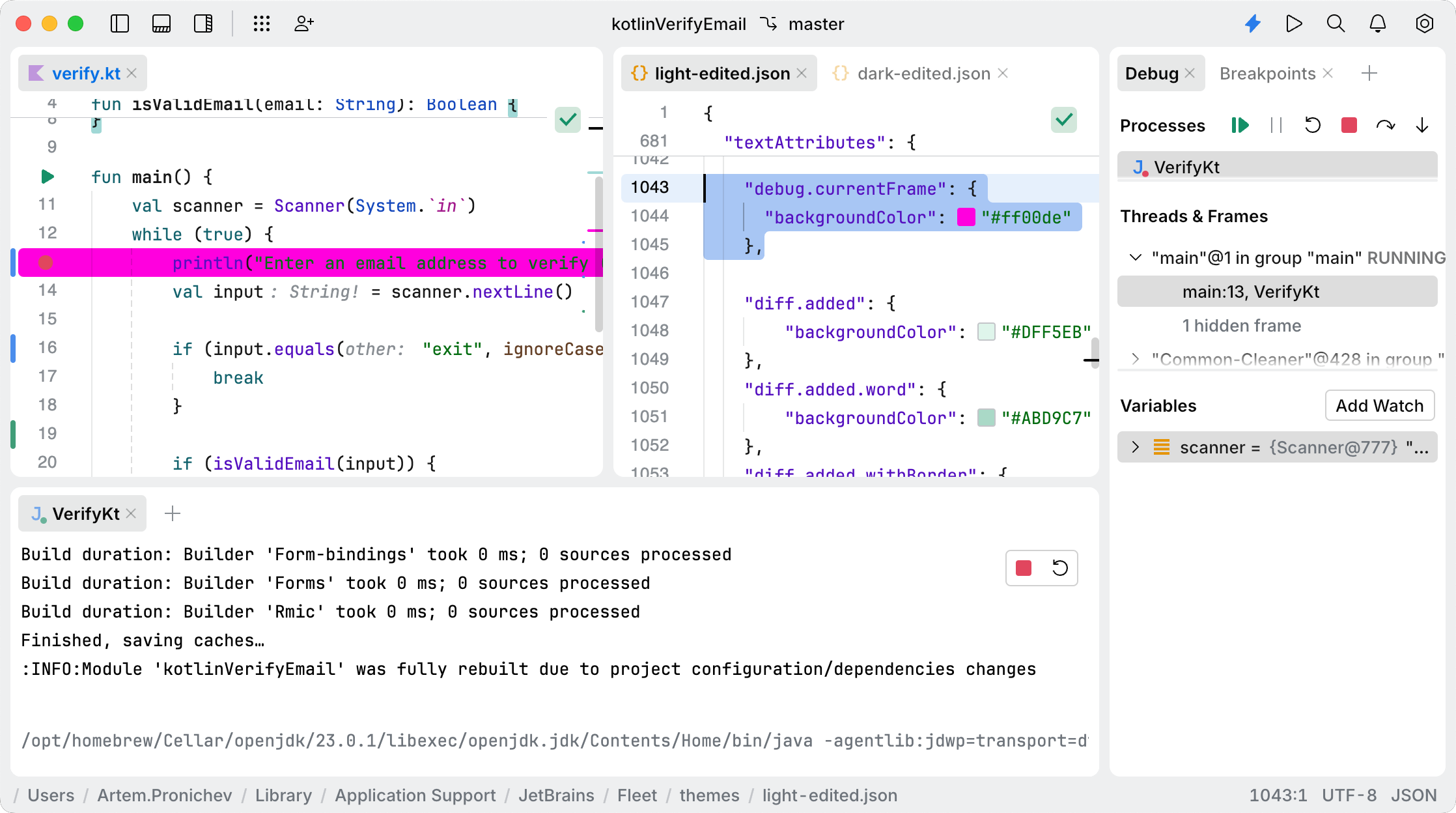
The debug key defines the visual style applied to the background of the current line in the editor during debugging.
Key | Value |
|---|---|
|
|
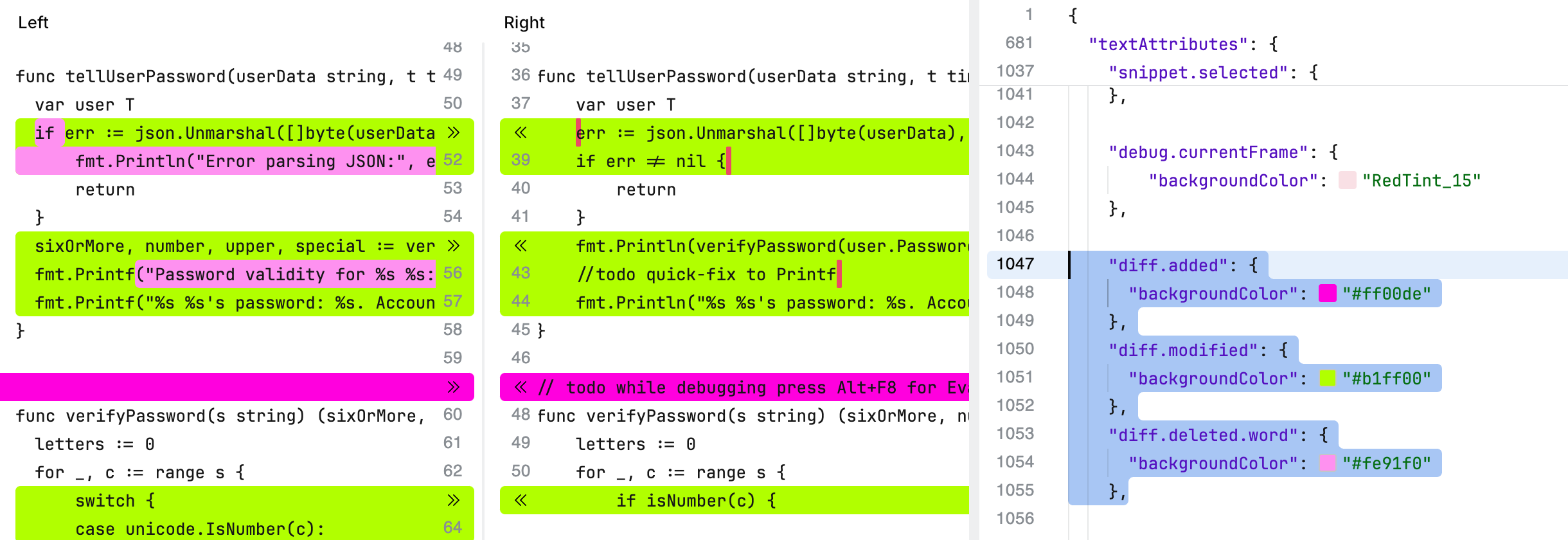
The diff.* keys define the visual styles applied to changes in code during comparison operations in the Empty Diff view. For more information about Empty Diff, refer to Compare files and text sources.
Key | Value |
|---|---|
|
|
|
|
|
|
|
|
|
|
|
|
|
|
|
|
|
|
|
|
|
|
|
|
|
|
|
|
|
|
|
|
|
|
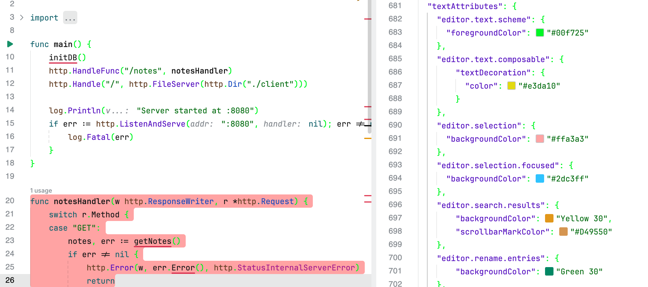
The editor.* keys define the visual styles applied to text and related elements within the code editor, such as brackets, parentheses, search results, and selections.
Key | Value |
|---|---|
|
|
|
|
|
|
|
|
|
|
|
|
|
|
|
|
|
|
|
|
|
|
|
|
The entityReference key defines the visual styles for HTML entities.

Key | Value |
|---|---|
|
|
The error.hovered key defines the visual style applied to error indicators when they are hovered over.
Key | Value |
|---|---|
|
|
The generic.php key defines the visual style applied to generic elements in PHP code, such as generic type annotations or constructs.
Key | Value |
|---|---|
|
|
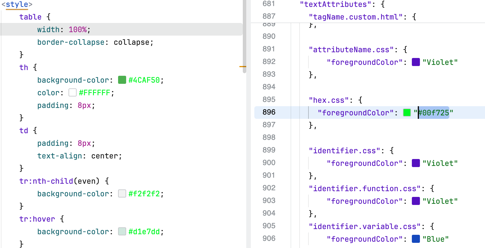
The hex.css key defines the visual style applied to hexadecimal color values in CSS code.
Key | Value |
|---|---|
|
|
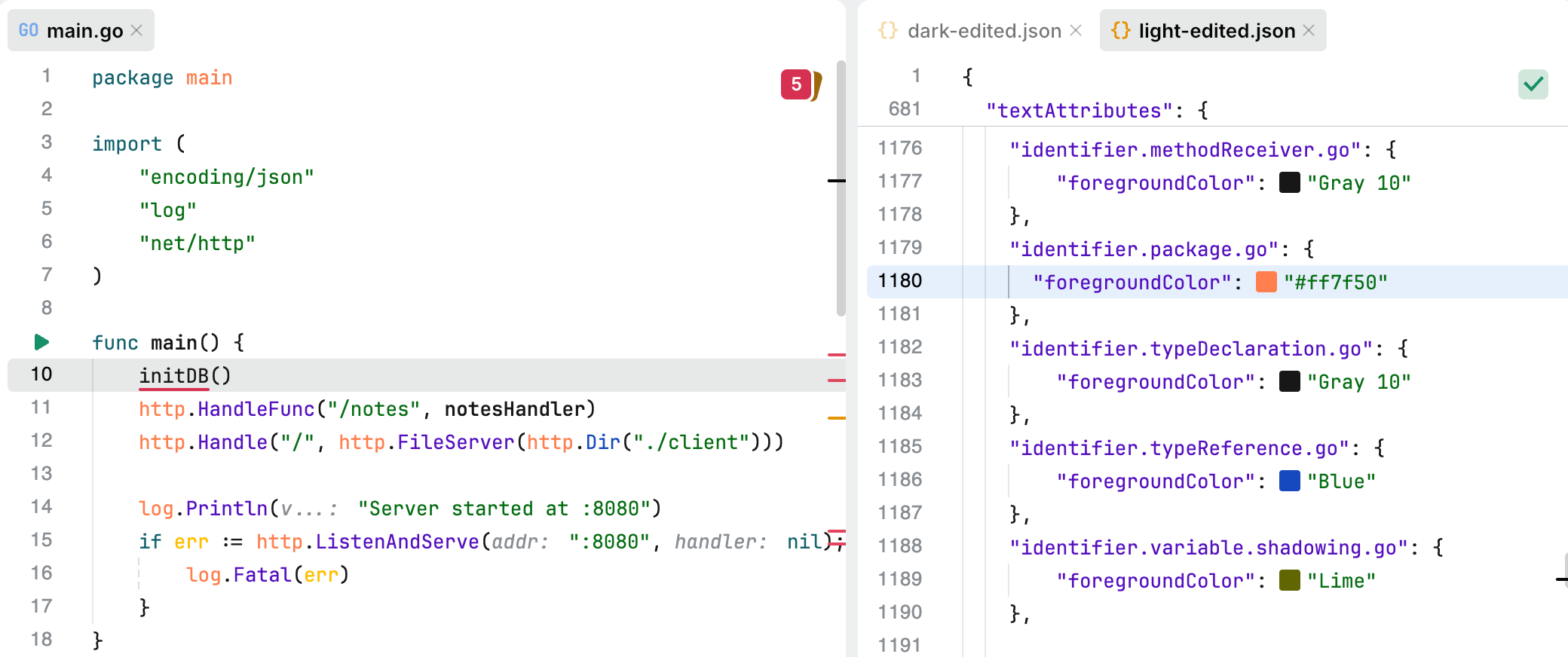
The identifier section defines the visual styles applied to various types of identifiers in code, such as variables, functions, types, and constants.
Key | Value |
|---|---|
|
|
|
|
|
|
|
|
|
|
|
|
|
|
|
|
|
|
|
|
|
|
|
|
|
|
|
|
|
|
|
|
|
|
|
|
|
|
|
|
|
|
|
|
|
|
|
|
|
|
|
|
|
|
|
|
|
|
|
|
|
|
|
|
|
|
|
|
|
|
|
|
|
|
|
|
|
|
|
|
The interpolation.css key defines the visual style applied to interpolated values in CSS code. Interpolation refers to the process of embedding dynamic content, such as variables or expressions, within CSS constructs.

Key | Value |
|---|---|
|
|
The jsCodeDelimiter.css key defines the visual style applied to JavaScript code delimiters embedded within CSS.
Key | Value |
|---|---|
|
|
The jsCodeInjection.css key defines the visual style applied to instances where JavaScript code is injected into CSS-like syntax.
Key | Value |
|---|---|
|
|
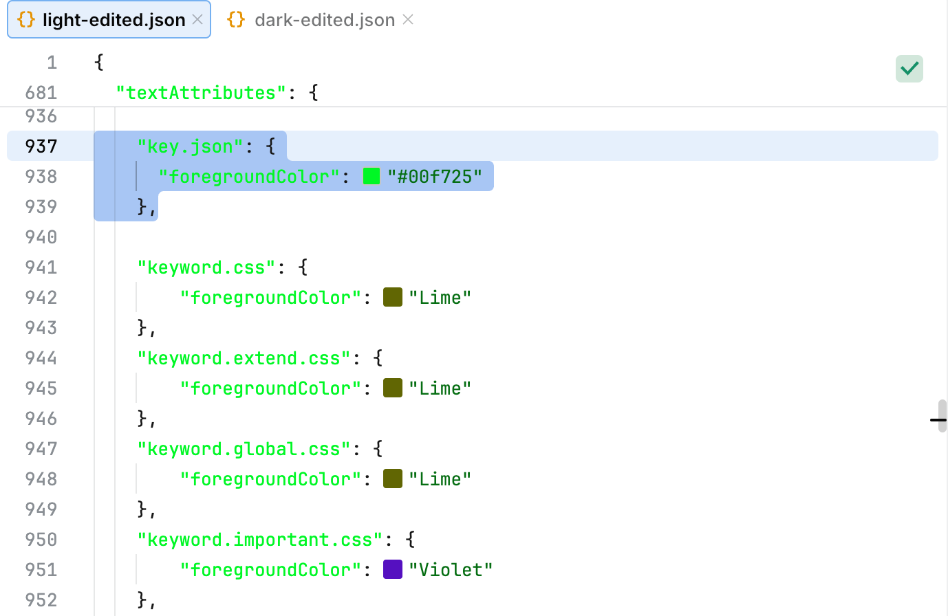
The key keys define the visual appearance of keys in JSON and YAML files.
Key | Value |
|---|---|
|
|
|
|
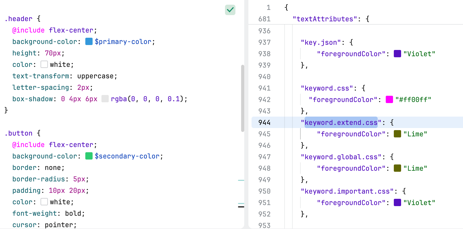
The keyword keys define the visual appearance of specific keywords in CSS and related contexts.
Key | Value |
|---|---|
|
|
|
|
|
|
|
|
|
|
The link keys define the visual appearance and behavior of links in the editor.

Key | Value |
|---|---|
|
|
|
|
The markup keys define the visual appearance of elements commonly used in markup languages, such as headings, bold or italic text, code blocks, and hyperlinks.
Key | Value |
|---|---|
|
|
|
|
|
|
|
|
|
|
The metadata key defines the visual style applied to metadata elements in code or configuration files.
Key | Value |
|---|---|
|
|
|
|
|
|
The mixin.css key defines the visual style applied to mixins in CSS or CSS preprocessors like SCSS or Less.
Key | Value |
|---|---|
|
|
The number keys define the visual appearance of numeric values and units in CSS code.
Key | Value |
|---|---|
|
|
|
|
The problem styles define the visual appearance of various types of problems, warnings, and informational markers in the code editor.
Key | Value |
|---|---|
|
|
|
|
|
|
|
|
|
|
|
|
|
|
|
|
The property keys define the visual appearance of properties in PHP code.
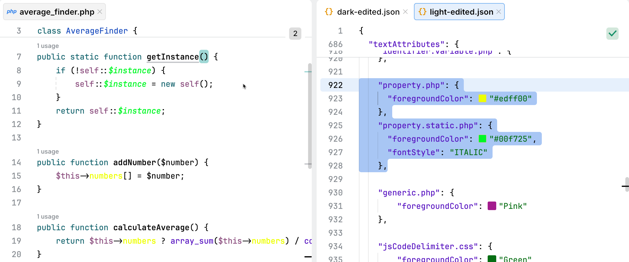
Key | Value |
|---|---|
|
|
|
|
The propertyName.css key defines the visual style applied to property names in CSS.
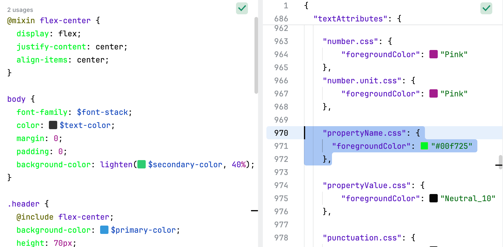
Key | Value |
|---|---|
|
|
The propertyValue.css key defines the visual style applied to property values in CSS.

Key | Value |
|---|---|
|
|
The punctuation keys define the visual appearance of punctuation elements in code.
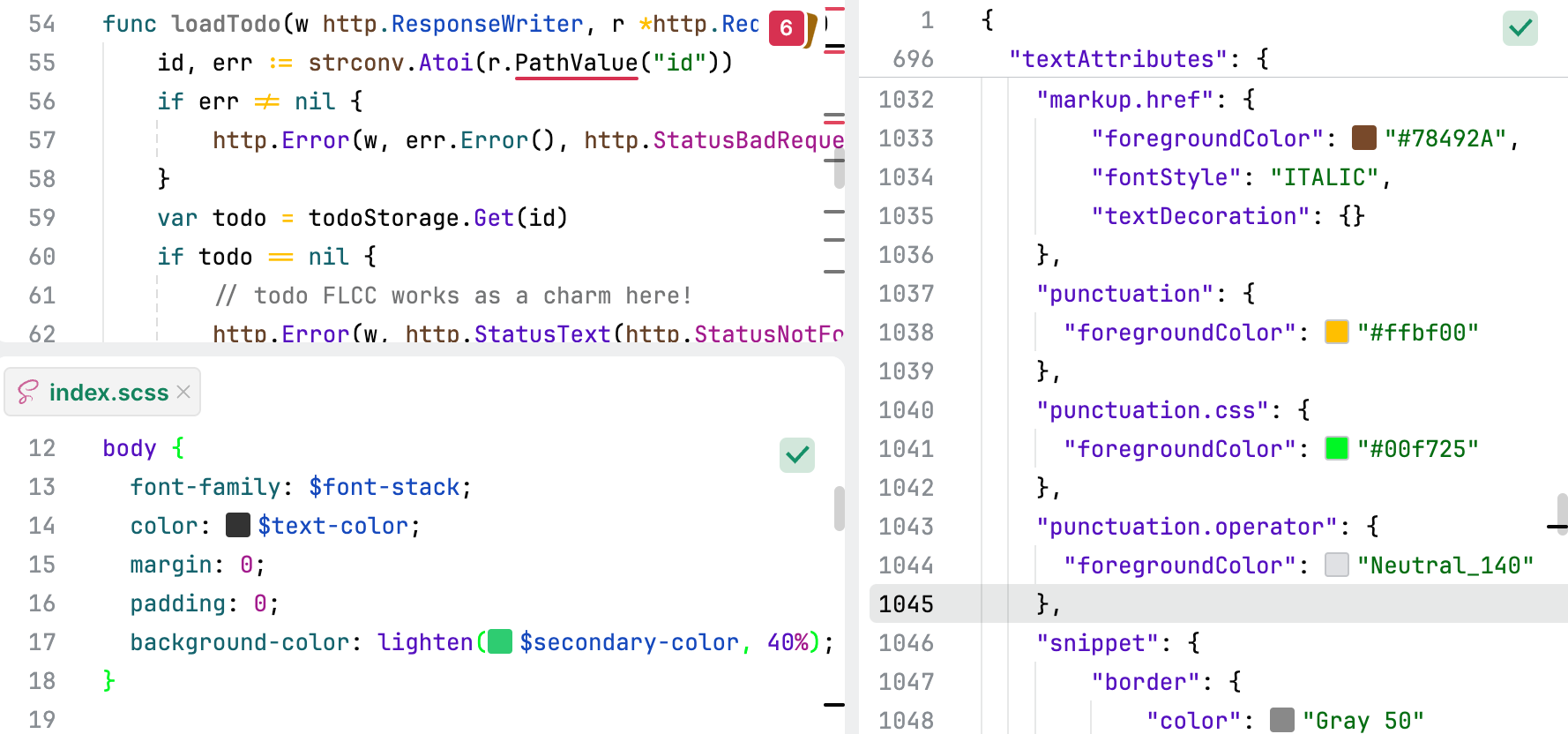
Key | Value |
|---|---|
|
|
|
|
|
|
The refactoring.modified.code key defines the visual style applied to code that has been modified during a refactoring operation. For example, the Unhandled error quick-fix was applied to the Go code in the following screenshot. The modified part is highlighted.

Key | Value |
|---|---|
|
|
The schema.yaml key defines the visual style applied to schema elements in YAML files.
Key | Value |
|---|---|
|
|
The selector keys define the visual appearance of various types of selectors in CSS.
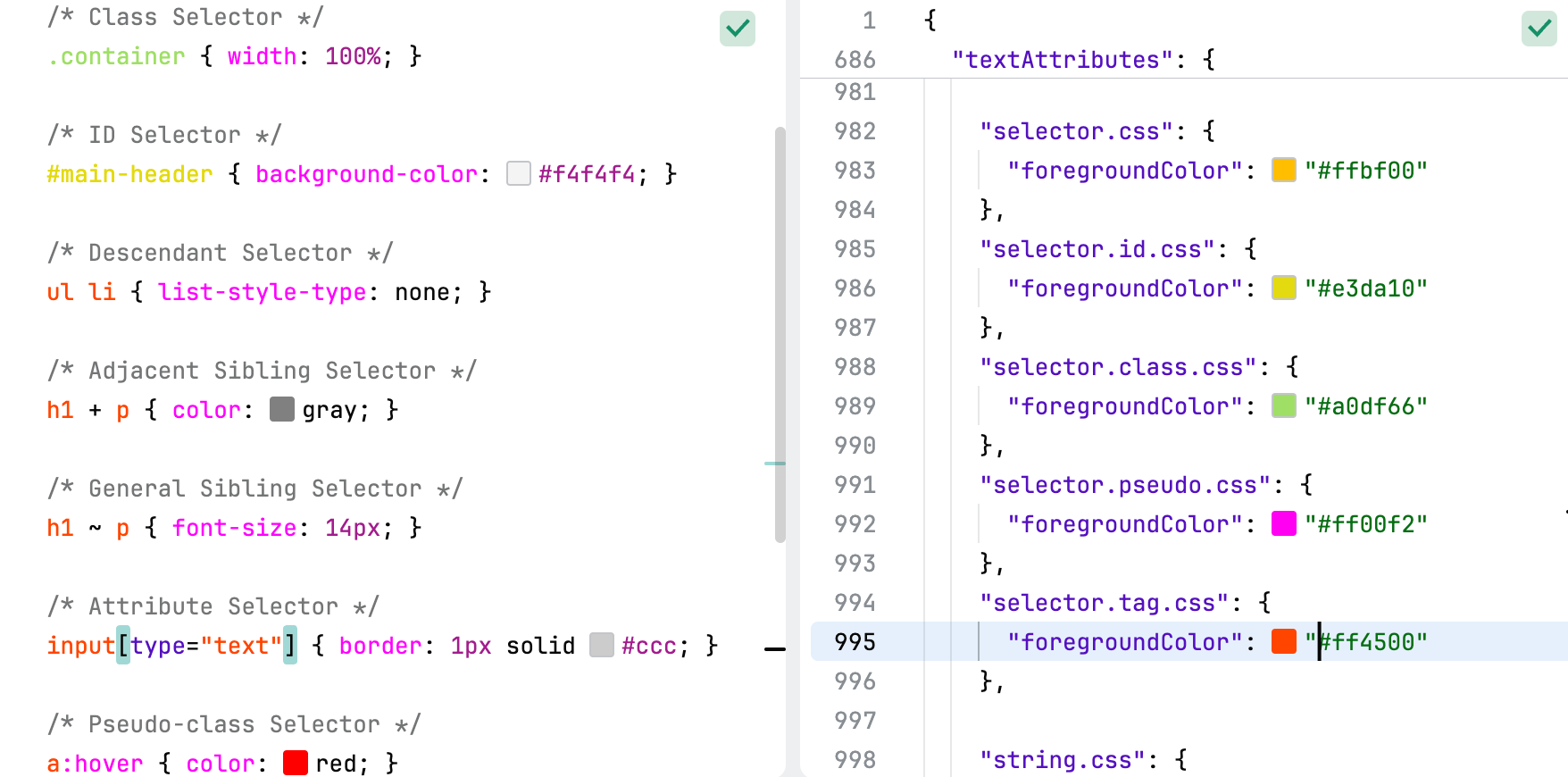
Key | Value |
|---|---|
|
|
|
|
|
|
|
|
|
|
The snippet keys define the visual appearance of snippets in Markdown files.
Key | Value |
|---|---|
|
|
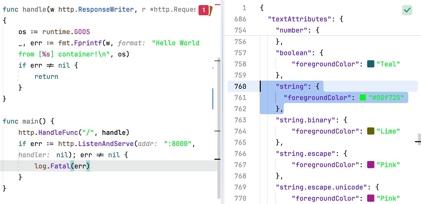
The string keys define the visual appearance of string literals and related constructs across various contexts.
Key | Value |
|---|---|
|
|
|
|
|
|
|
|
|
|
|
|
|
|
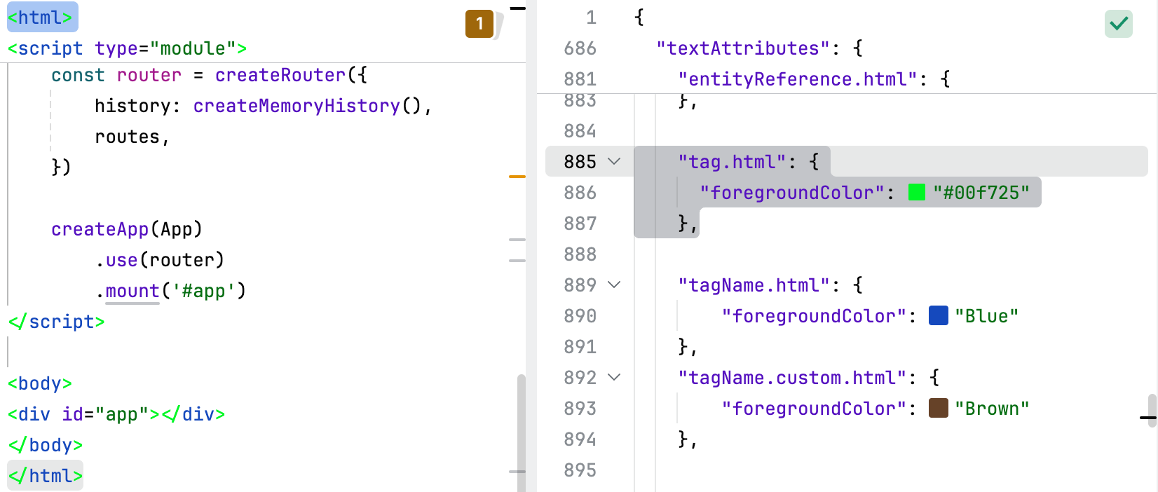
The tag.html key defines the visual style applied to HTML tags.
Key | Value |
|---|---|
|
|
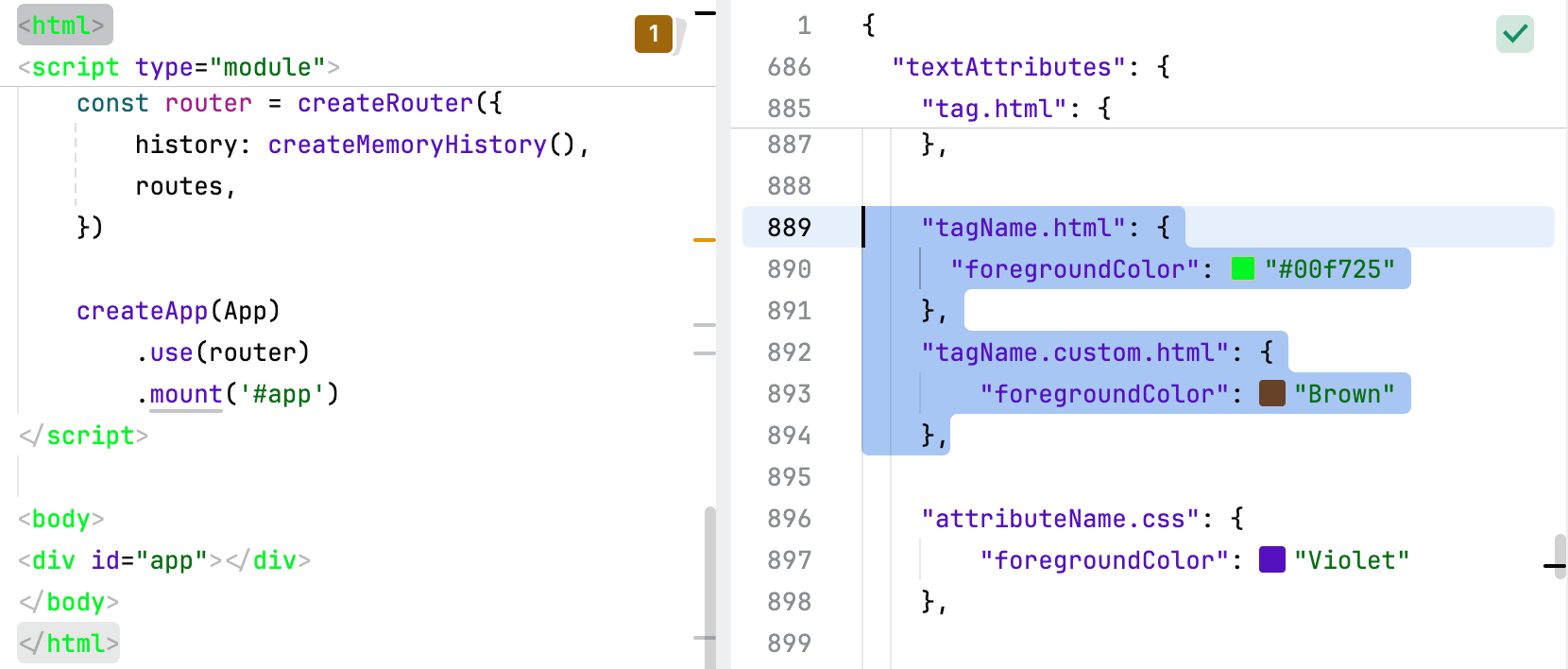
The tagName keys define the visual appearance of tag names in HTML code.
Key | Value |
|---|---|
|
|
|
|
The target.match keys define the visual appearance of matched text or words in various contexts, such as search results or highlights.
Key | Value |
|---|---|
|
|
|
|
The url.css key defines the visual style applied to URLs within CSS code.

Key | Value |
|---|---|
|
|
The value.yaml key defines the visual style applied to values in YAML files.
Key | Value |
|---|---|
|
|
Defines named colors that can be used in the theme. This block is optional.
Key | Value |
|---|---|
|
|
|
|
|
|
|
|
|
|
|
|
|
|
|
|
|
|
|
|
|
|
|
|
|
|
|
|
|
|
|
|
|
|
|
|
|
|
|
|
|
|
|
|
|
|
|
|
|
|
|
|
|
|
|
|
|
|
|
|
|
|
|
|
|
|
|
|
|
|
|
|
|
|
|
|
|
|
|
|
|
|
|
|
|
|
|
|
|
|
|
|
|
|
|
|
|
|
|
|
|
|
|
|
|
|
|
|
|
|
|
|
|
|
|
|
|
|
|
|
|
|
|
|
|
|
|
|
|
|
|
|
|
|
|
|
|
|
|
|
|
|
|
|
|
|
|
|
|
|
|
|
|
|
|
|
|
|
|
|
|
|
|
|
|
|
|
|
|
|
|
|
|
|
|
|
|
|
|
|
|
|
|
|
|
|
|
|
|
|
|
|
|
|
|
|
|
|
|
|
|
|
|
|
|
|
|
|
|
|
|
|
|
|
|
|
|
|
|
|
|
|
|
|
|
|
|
|
|
|
|
|
|
|
|
|
|
|
|
|
|
|
|
|
|
|
|
|
|
|
|
|
|
|
|
|
|
|
|
|
|
|
|
|
|
|
|
|
|
|
|
|
|
|
|
|
|
|
|
|
|
|
|
|
|
|
|
|
|
|
|
|
|
|
|
|
|
|
|
|
|
|
|
|
|
|
|
|
|
|
|
|
|
|
|
|
|
|
|
|
|
|
|
|
|
|
|
|
|
|
|
|
|
|
|
|
|
|
|
|
|
|
|
|
|
|
|
|
|
|
|
|
|
|
|
|
|
|
|
|
|
|
|
|
|
|
|
|
|
|
|
|
|
|
|
|
|
|
|
|
|
|
|
|
|
|
|
|
|
|
|
|
|
|
|
|
|
|
|
|
|
|
|
|
|
|
|
|
|
|
|
|
|
|
|
|
|
|
|
|
|
|
|
|
|
|
|
|
|
|
|
|
|
|
|
|
|
|
|
|
|
|
|
|
|
|
|
|
|
|
|
|
|
|
|
|
|
|